
Temenos Lifecycle Management Suite - Collection Product Guide
Screens
| Administrator Guide > Screens |
Screens allow users to create, edit, and view account, and person information. The Screens page within System Management provides a complete list of all screens within the Lifecycle Management Suite. From this page administrators are able to manage existing screens and define new screens that optimize usability and reduce service time.
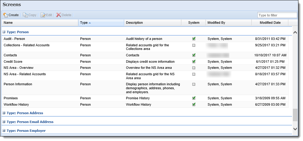
By default, the Screens page groups and sorts all screens according to type and displays information about each screen within the following columns:
| Column Name | Description |
| Name | Displays the name of the screen. |
| Type | Displays the type of the screen. |
| Description | If provided, displays details about the screen. |
| System | Displays a  if the screen is system-defined. if the screen is system-defined. |
| Modified | Denotes who made the last modification. |
| Modified Date | Denotes the date and time of the last modification. |
There are three categories of screens within the Lifecycle Management Suite: System-Defined, Custom, and User-Defined.
Custom screens are coded by the financial institution, or by Temenos on behalf of the institution, and installed on the customer’s site.
 |
Custom screens are not deployed in a Lifecycle Management Suite general release. |
System-Defined screens are pre-built by Temenos to provide out-of-the-box functionality and do not require (or allow) any configuration.
|
The content and description of System-Defined screens, such as the Ticket Screen, cannot be modified or deleted; however, users are able to change the name of the screen, add supporting instructions, and assign security groups. |
A User-Defined screen is created by the customer within Screens.
The following topic provides an overview of Screen attributes and instructions for creating, copying, and editing a user-defined screen.
|
Each time the details within a user-defined screen are saved during the create, copy, or edit process, a screen definition including the panel layout, fields, and Editability properties is stored in the database. To ensure the security of the information in user-defined screens, a unique token is generated each time a manually created screen is saved in the Lifecycle Management Suite. During the save process, the token reviews the screen definition, and then reviews Editability to determine which fields are editable in the screen, and should be included in the token. Any fields from the screen definition that are not editable, or fields from the screen DTO that are not a part of the screen definition, are excluded from the token to ensure they are ignored during the save process, and prevented from being accessed in the screen.
|
Listed below are the screen attributes and the actions that can be taken while managing screens in System Management:
All screens share common attributes that are defined when creating, copying, or editing a screen.
|
Certain attributes are not available for all screen types, if the attribute is not available it is disabled. For example, the Buttons attribute is not available for all screen types, hence the Buttons tab is disabled when the attribute is not available. |
General attributes include the basic information pertaining to user-defined screens.
General attributes are located on the General tab:
| Attribute | Description | ||||
| Type | Denotes the type of screen being designed. For more information on screen types, see the Main Screens and Edit Screens sections of this guide. | ||||
| Name | Enter a unique name for the user-defined screen. | ||||
| Column |
Enter the number of columns in which the panels display.
|
||||
| Description | Provide details about the purpose of the screen. The description is made available to administrators in the System Management > Screens page. | ||||
| Instructions |
Enter instructions for users to complete the screen. When instructions are configured for the screen, an  appears within the screen header. Clicking this icon displays the instructions to the user. appears within the screen header. Clicking this icon displays the instructions to the user.
To configure hyperlinks to open in a new window:
|
Panels are added to user-defined screens to organize screen data into logical groupings. Panels can be used not only to display information, but also to provide the ability to gather data in the Workspace, Workflow, or Case. Panels are categorized as System-Defined or User-Defined.
System-Defined panels provide pre-configured functionality that cannot be modified.
User-Defined panels have various configurable attributes, such as the title and the number of columns displayed, as well as the specific fields that appear within the panel.
For each panel configured in the screen, an overview of the panel's General attributes are displayed in a grid on the Panels tab. Administrators can also add, edit, and delete panels from the Panels tab.
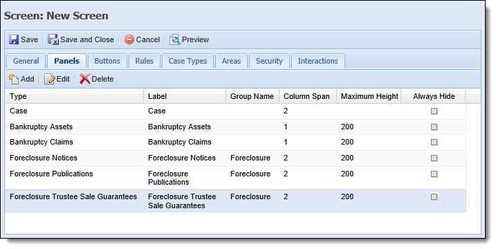
The below table provides an overview of each panel type:
| Panel Type | Description | Required Edit Screen Type | Required Fields | Can Have Multiple | System Defined | ||
| Account Screen | |||||||
| Account | A panel used to capture account information. | X | |||||
| Cash Flows | A user-defined grid panel that displays all cash flows associated with the account in context. | Post-Petition Pre-Petition |
|||||
| Collaterals | A grid panel used to view and edit account collaterals. | Account Collateral | |||||
| Credit Card Sub Records | A grid panel used to view and edit credit card sub records. | Account Credit Card Sub Record | |||||
| Report | A panel used to display a report. | X | X | ||||
| Rich Text | A panel used to display rich text messages to users, such as instructions. | X | |||||
| Cash Flow Details | |||||||
| Cash Flow Petition | User-defined panel used to capture cash flow information. | ||||||
| Cash Flow Scheduled Payments | User-defined grid used to view scheduled payments for a cash flow. | ||||||
| Cash Flow Transactions | Grid panel used to view all transactions for a petition. | X | X | ||||
| Rich Text | A panel used to display rich text messages to users, such as instructions. | X | |||||
| Account Collateral Screen | |||||||
| Collaterals | A panel used to capture account collaterals. | Collateral Type | X | ||||
| Equity Analyses | A grid panel used to view, add, and edit equity analyses. Permissions must be granted at the user level in order to create and edit equity analyses. For more information, please see the Equity Analysis Panel topic of the User Guide. | ||||||
| Insurances | A grid panel used to view and edit account collateral insurances. | Account Collateral Insurance | |||||
| Liens | A grid panel used to view and edit account collateral liens. | Account Collateral Lien | |||||
| Listings | A grid panel used to view and edit case collateral listings. | Account Collateral Lien | |||||
| Offers | A grid panel used to view and edit collateral offers. | Account Collateral Offer | |||||
| Sales | A grid panel used to view and edit collateral sales. | Account Collateral Sale | |||||
| Taxes | A grid panel used to view and edit collateral taxes. | Account Collateral Tax | |||||
| Valuations | A grid panel used to view and edit collateral valuations. | Account Collateral Valuation | |||||
| Account Collateral Insurance Screen | |||||||
| Claims | A grid panel used to view and edit insurance claims on a collateral. | Account Collateral Insurance Claim | |||||
| Insurances | A panel used to capture insurances for a collateral. | ||||||
| Account Collateral Insurance Claim Screen | |||||||
| Claims | A panel used to capture insurance claims on a collateral. | ||||||
| Account Collateral Lien Screen | |||||||
| Liens | A panel used to capture Liens for a collateral. | ||||||
| Account Collateral Listing Screen | |||||||
| Listings | A panel used to capture account collateral listings. | ||||||
| Account Collateral Offer Screen | |||||||
| Offers | A panel used to capture account collateral offers. | ||||||
| Account Collateral Sale Screen | |||||||
| Sales | A panel used to capture collateral sales. | ||||||
| Account Collateral Tax Screen | |||||||
| Taxes | A panel used to capture collateral taxes. | ||||||
| Account Collateral Valuation Screen | |||||||
| Valuations | A panel used to capture collateral valuations. | ||||||
| Account Credit Card Sub Record Screen | |||||||
| Credit Card Sub Record | A panel used to capture account credit card sub records. | ||||||
| Case Screen | |||||||
| Bankruptcy Assets | A grid panel used to view and edit case bankruptcy assets. | Case Bankruptcy Asset | |||||
| Bankruptcy Claims | A grid panel used to view and edit case bankruptcy claims. | Case Bankruptcy Claim | |||||
| Bankruptcy Hearings | A grid panel used to view and edit case bankruptcy hearings. | Case Bankruptcy Hearing | |||||
| Bankruptcy Liabilities | A grid panel used to view and edit case bankruptcy liabilities. | Case Bankruptcy Liability | |||||
| Bankruptcy Parties | A grid panel used to view and edit case bankruptcy parties. | Case Bankruptcy Party | |||||
| Bankruptcy Payments | A grid panel used to view and edit case bankruptcy payments. | Case Bankruptcy Payment | |||||
| Bankruptcy Reaffirmations | A grid panel used to view and edit case bankruptcy reaffirmations. | Case Bankruptcy Reaffirmation | |||||
| Case | A panel used to capture case information. | X | |||||
| Foreclosure Notices | A grid panel used to view and edit case foreclosure notices. | ||||||
| Foreclosure Publications | A grid panel used to view and edit case foreclosure publications. | ||||||
| Foreclosure Trustee Sale Guarantees | A grid panel used to view and edit case foreclosure trustee sale guarantees. | ||||||
| Legal Filings | A grid panel used to view and edit case legal filings. | ||||||
| Legal Hearings | A grid panel used to view and edit case legal hearings. | ||||||
| Legal Parties | A grid panel used to view and edit case legal parties. | ||||||
| Legal Summons | A grid panel used to view and edit case legal summons. | ||||||
| Parties | A grid panel used to view and edit parties for a case. | ||||||
| Related Accounts | A grid panel that allows users to view, add, and remove case account relationships. | ||||||
| Related Cases | A grid panel that allows users to view, add, and remove case relationships. | ||||||
| Related Collaterals | A grid panel that allows users to view and edit the collaterals for a case. | Case Collateral | |||||
| Related Persons | A grid panel that allows users to view, add, and remove case person relationships. | ||||||
| REO Invoices | A grid panel used to view and edit case REO invoices. | Case REO Invoices | |||||
| REO Rental Terms | A grid panel used to view and edit case REO rental terms. | Case REO Rental Terms | |||||
| Report | A panel used to display a report. | X | X | ||||
| Repossession Assignments | A grid panel used to view and edit case repossession assignments. | Case Repossession Assignments | |||||
| Repossession Conditions | A grid panel used to view and edit case repossession conditions. | Case Repossession Conditions | |||||
| Repossession Locations | A grid panel used to view and edit case repossession locations. | Case Repossession Locations | |||||
| Repossession Notices | A grid panel used to view and edit case repossession notices. | Case Repossession Notices | |||||
| Rich Text | A panel used to display rich text messages to users, such as instructions. | X | |||||
| Service Request | A grid panel used to view and edit case service requests. | Case Service Request | |||||
| Case Bankruptcy Asset Screen | |||||||
| Assets | A panel used to capture bankruptcy assets associated with a case. | ||||||
| Case Bankruptcy Claim Screen | |||||||
| Claims | A panel used to capture claims for a case. | ||||||
| Case Bankruptcy Hearing Screen | |||||||
| Hearings | A panel used to capture case bankruptcy hearing information. | ||||||
| Case Bankruptcy Liability Screen | |||||||
| Liabilities | A panel used to capture case liabilities. | ||||||
| Case Bankruptcy Party Screen | |||||||
| Parties | A panel used to capture parties associated with a bankruptcy case. | ||||||
| Case Bankruptcy Payment Screen | |||||||
| Payments | A panel used to capture case payments. | ||||||
| Case Bankruptcy Reaffirmation Screen | |||||||
| Reaffirmations | A panel used to capture case reaffirmations. | ||||||
| Case Collateral Screen | |||||||
| Collaterals | A panel used to capture case collaterals. | Collateral Type | X | ||||
| Insurances | A grid panel used to view and edit case collateral insurances. | Case Collateral Insurance | |||||
| Equity Analyses | A grid panel used to view, add, and edit equity analyses. Permissions must be granted at the user level in order to create and edit equity analyses. For more information, please see the Equity Analysis Panel topic of the User Guide. | ||||||
| Case Collateral Insurance Screen | |||||||
| Insurance | A panel used to capture case collateral insurances. | ||||||
| Case Collateral Lien Screen | |||||||
| Lien | A panel used to capture case collateral liens. | ||||||
| Case Collateral Listing Screen | |||||||
| Listings | A panel used to capture case collateral listings. | ||||||
| Case Collateral Offer Screen | |||||||
| Offer | A panel used to capture case collateral offers. | ||||||
| Case Collateral Sale Screen | |||||||
| Sale | A panel used to capture collateral sales. | ||||||
| Case Collateral Tax Screen | |||||||
| Taxes | A panel used to capture collateral taxes. | ||||||
| Case Collateral Valuation Screen | |||||||
| Valuations | A panel used to capture collateral valuations. | ||||||
| Case Foreclosure Notice Screen | |||||||
| Notices | A panel used to capture case foreclosure notices. | ||||||
| Case Foreclosure Publication Screen | |||||||
| Publications | A panel used to capture case publications. | ||||||
| Case Foreclosure Trustee Sale Guarantee Screen | |||||||
| Trustee Sale Guarantee | A panel used to capture case trustee sale guarantees. | ||||||
| Case Legal Filing Screen | |||||||
| Filings | A panel used to capture case filings. | ||||||
| Case Legal Hearing Screen | |||||||
| Hearings | A panel used to capture case hearings. | ||||||
| Case Legal Party Screen | |||||||
| Parties | A panel used to capture parties associated with a case. | ||||||
| Case Legal Summon Screen | |||||||
| Summons | A panel used to capture case summons. | ||||||
| Case REO Invoices Screen | |||||||
| Invoices | A panel used to capture case invoices. | ||||||
| Case REO Rental Income Screen | |||||||
| Rental Incomes | A panel used to capture rental incomes for a REO rental term. | ||||||
| Case REO Rental Terms Screen | |||||||
| Rental Incomes | A grid panel used to view and edit case rental incomes | Case REO Rental Income | |||||
| Rental Terms | A panel used to view and edit case rental terms. | ||||||
| Case Repossession Assignments Screen | |||||||
| Assignment | A panel used to capture case assignments. | ||||||
| Case Repossession Conditions Screen | |||||||
| Conditions | A panel used to capture case conditions. | ||||||
| Case Repossession Locations Screen | |||||||
| Location | A panel used to capture case locations. | ||||||
| Case Repossession Notices Screen | |||||||
| Notices | A panel used to capture case repossession notices. | ||||||
| Case Service Request Screen | |||||||
| Service Requests | A panel used to capture case service requests. | ||||||
| Collateral Details Screen | |||||||
| Liens | A grid panel used to view and edit case collateral liens. | Case Collateral Lien | |||||
| Listings | A grid panel used to view and edit collateral listings. | Case Collateral Listing | |||||
| Sales | A grid panel used to view and edit collateral sales. | Case Collateral Sale | |||||
| Taxes | A grid panel used to view and edit collateral taxes. | Case Collateral Tax | |||||
| Valuations | A grid panel used to view and edit collateral valuations. | Case Collateral Valuation | |||||
| Person Screen | |||||||
| Account | A panel used to capture account information. | X | |||||
| Addresses | A grid panel used to view all addresses associated with a person | Person Address | |||||
| Case | A panel used to view case information. | X | |||||
| Email Addresses | A grid panel used to view and edit a person’s email addresses. | Person Email Address | |||||
| Employers |
A grid panel used to view and edit a person’s employers. |
Person Employer | |||||
| Financial Statements | A grid panel used to view and edit a person’s financial statements. | ||||||
| Messages | A panel used to display good, bad, warning, or information messages regarding the person in context. The messages within this panel are driven by Business Rules configured under the Presentation category in System Management > Collections > Rules Management. For more information regarding rule configuration for the Messages panel, please see Properties within the Panels section of this topic. | X | |||||
| Notepad | A panel used to view and edit free-form comments. | ||||||
| Payrolls | A grid panel used to view and edit a person’s payrolls. | Person Payroll | |||||
| Person | A panel used to capture person information. | X | |||||
| Phones | A grid panel used to view and edit a person’s phone numbers. | Person Phone | |||||
| Phone Classification History | A grid panel used to view phone classification history information for the person in context. | X | |||||
| Promise History | A panel used to view promise history information. Promises displayed may be edited, but not added. Promises are added by running a workflow and cannot be added directly through a screen. | X | |||||
| Related Accounts | A grid panel used to view related accounts. If restricted persons are related to an account, the account does not display in the Related Accounts panel. | ||||||
| Related Cases | A grid panel used to view cases related to a person. If restricted persons are related to a case the case does not display in the Related Cases panel. | X | |||||
Related Loan Applications
|
A grid panel used to view loan applications related to a person, based on the person’s TIN in the Loan Origination module. | X | |||||
| Related Persons | A grid panel used to view persons related to a person. If a person is restricted, they do not display in the Related Persons grid. | X | |||||
| Report | A panel used to display a report. | X | X | ||||
| W2’s | A grid panel used to view and edit a person’s W2’s. | Person W2 | |||||
| Workflow History | A grid panel used to view workflow history. | X | |||||
| Person Address Screen | |||||||
| Person Address | A panel used to capture person address information. | Address Type | X | ||||
| Rich Text | A panel used to display rich text messages to users, such as instructions. | X | |||||
| Person Email Address Screen | |||||||
| Email Addresses | A panel used to capture person email address information. | X | |||||
| Person Employer Screen | |||||||
| Person Employer | A panel used to capture a person’s employer information. | X | |||||
| Person Financial Statement Screen | |||||||
| Person Financial Statement | A panel used to capture a person’s financial statement information. | X | |||||
| Person Payroll Screen | |||||||
| Person Payroll | A panel used to capture a person's payroll information. | X | |||||
| Person Phone Screen | |||||||
| Person Phone | A panel used to capture a person’s phone information. | Phone Type | X | ||||
| Rich Text | A panel used to display rich text messages to users, such as instructions. | X | |||||
| Person W2 Screen | |||||||
| Person W2 | A panel used to capture a person’s W2 information. | X | |||||
 |
If a host has write-back capabilities, using a screen with the Change Address panel and Ticket Property fields of the Ticket panel can capture an address change in real-time. |
|
The Lifecycle Management Suite prevents administrators from assigning multiple instances of the same grid-panel to a screen. |
The following attributes can be defined while adding, copying, and/or editing panels:
General panel attributes allow administrators to edit the appearance of the panel as well as provide instructions to users.
|
Depending on the type of panel being configured, additional fields may appear within the General tab. Please see the table below for more information. |
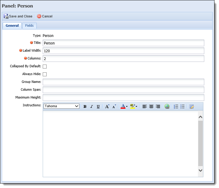
The General panel attributes are defined within the following fields on the General tab for each panel type:
| Field Name | Description | ||||||||||||||||||||||||
| Title | Enter the title assigned to the panel within the user-defined screen. | ||||||||||||||||||||||||
| Reports |
Select a value from the drop-down list to identify the report to populate within the Report panel. This drop-down includes a list of all system-defined and custom reports configured for the institution within the Reports page in the Ribbon Bar.
|
||||||||||||||||||||||||
| Label Width |
Enter the maximum number of pixels the label width is not to exceed. The lower the number, the more area available for entries in the associated fields.
|
||||||||||||||||||||||||
| Columns |
Enter the number of columns in which fields are organized.
|
||||||||||||||||||||||||
| Collapse By Default | Select the check box if this panel is to be collapsed by default. | ||||||||||||||||||||||||
| Always Hide |
Select the check box if this panel is never to be displayed on a screen.
|
||||||||||||||||||||||||
| Group Name |
If desired, enter the name of group that the panel is to be grouped in. All panels sharing the same Group Name are grouped into a tab layout. Users may select the tab to access the panel.
|
||||||||||||||||||||||||
| Column Span |
Enter the number of columns a panel spans within a screen.
|
||||||||||||||||||||||||
| Maximum Height |
Enter the maximum number of pixels the panel height may not exceed.
|
||||||||||||||||||||||||
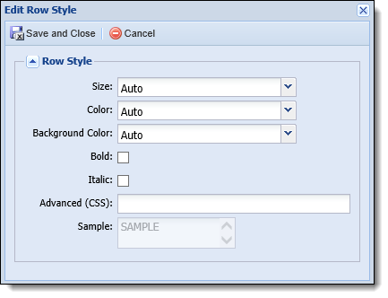
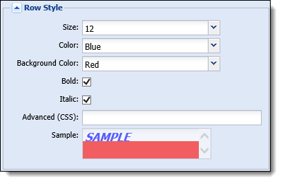
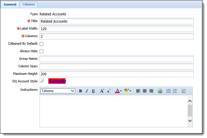
| DQ Account Style |
Click the
If no style is configured, the row for each delinquent account is displayed with a white background and black text, to align with all other accounts in the Related Accounts panel.
Reference the section below for an overview of the style parameters that are available to set for delinquent accounts in the Related Accounts panel: To edit the style of delinquent accounts in the Related Accounts panel:
|
||||||||||||||||||||||||
| Instructions |
Enter a Rich Text set of instructions to assist users complete the panel.
|
A field is a data element stored in the database, which corresponds to a record type compatible with the selected panel type. Fields can be added to a panel, on the Fields tab, while configuring a screen to allow users to view and change data. For example, a contact panel on a person screen is configured to include a phone number field, which allows users to view and change the phone number.
Field attributes provide administrators with the ability to configure the panel content and style by taking the following actions while adding a panel:
| Button | Description | ||||
 |
Enables users to select the fields to be added to the panel from the field list.
|
||||
 |
Enables users to add spacer fields to the panel. Spacer fields help organize and align fields into logical groupings. | ||||
 |
Enables users to add text fields to the panel. Text fields help organize panels into logical groupings by serving as headings within a panel. Text fields display information in bold font. | ||||
 |
Enables users to add a blank line that spans the width of a panel. Line fields help organize fields into logical groupings. |
|
The Fields attributes are only available when a user-defined panel is being created. If the Fields tab is available, at least one field must be assigned to the panel. For more information on user-defined panels and the screens that support them, please see the list of available Panel Types. |
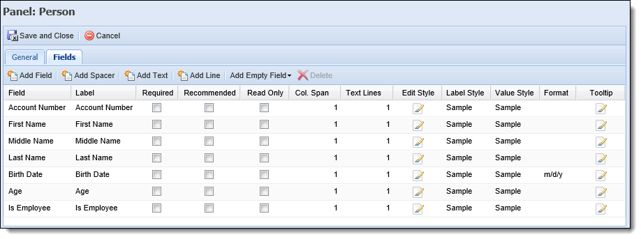
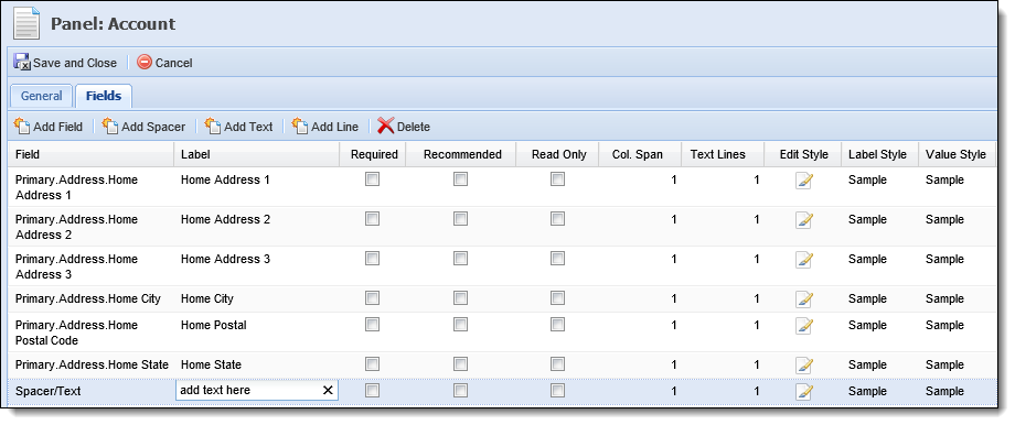
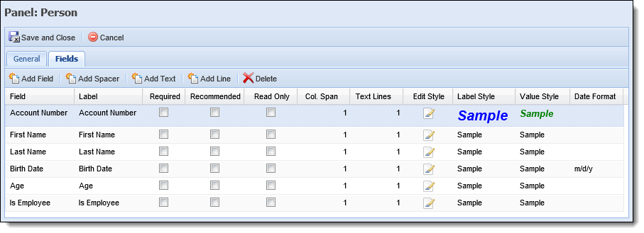
The Field attributes are defined within the fields grid:
| Attribute | Description | ||||||||||||||
| Field | A read-only column that displays the field selected. | ||||||||||||||
| Label |
Enter the title of the field to be displayed within the user-defined panel/screen. |
||||||||||||||
| Required |
Select this check box if the field must be completed in order to continue. Required fields display a
|
||||||||||||||
| Recommended | Select this check box if the completion of a field is suggested. Recommended fields display a  to the left of the field label which indicates to the user that a value, if available, should be entered in the field before saving the screen. Although the screen can be saved if recommended fields are left blank, this functionality can be beneficial in ensuring all information is obtained. to the left of the field label which indicates to the user that a value, if available, should be entered in the field before saving the screen. Although the screen can be saved if recommended fields are left blank, this functionality can be beneficial in ensuring all information is obtained. |
||||||||||||||
| Read-Only | Select this check box to restrict the user from editing the value contained within the field. | ||||||||||||||
| Col. Span |
Enter the number of columns the field spans within a panel.
|
||||||||||||||
| Text Lines | Enter the number of lines the field and its corresponding entry encompass. | ||||||||||||||
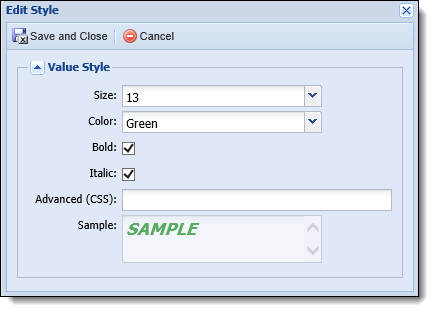
| Edit Style |
Click The Clicking
The following Style attributes are defined within the Edit Style window:
Upon saving the style attributes, samples of the Label Style and Value Style are displayed within the grid.
|
||||||||||||||
| Label Style | A non-editable column that allows the administrator to preview the Label text style defined in the Edit Style window. | ||||||||||||||
| Value Style | A non-editable column that allows the administrator to preview the Value text style defined in the Edit Style window. | ||||||||||||||
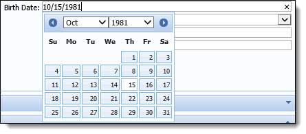
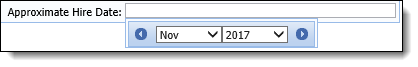
| Format |
Select the format to be applied to a date field in the panel. This field defaults to a format of m/d/y for all date fields, but can be changed to a format of m/y using the drop-down list.
If set to m/d/y, users are able to select a month, day, and year for the field, and the date populates in the following format: 11/02/2017. When set to m/y, users are only able to select a month and year for the field, and the date populates as follows: 11/2017. Reference the following section for an overview of how these date formats appear in an application:
If a date field is set to a format of m/d/y, when the field is selected in a screen, users are able to select a date from the following calendar:
When set to a format of m/y, the following calendar appears to allow users to select only the month and year for the field value:
To see these date formats in action, watch the following video:
|
||||||||||||||
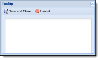
| Tooltip |
An editable column that allows the administrator to enter a description or directions for each field added to a panel. Click
Reference the following section for an overview of the Tooltip window: Upon clicking
Once the desired text has been entered, click
|
|
It is recommended to consider the following tips when configuring fields to appear in screen panels:
|
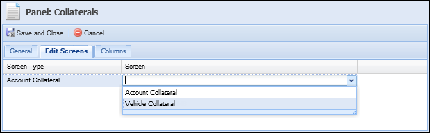
Edit Screens provide the ability to edit a record displayed in a grid panel, as well as to view additional detail information not displayed in the panel. This feature allows an institution to only display key information in a panel to reduce scrolling while but still provide the ability to view and edit all pertinent information on a record by double-clicking a grid record.
Edit Screen attributes allow an administrator to select the screen that opens when an end-user double-clicks a record within the grid panel to view more information, update information, or add a new record.

The below Edit Screen attributes are defined within the grid that displays in the Edit Screens tab:
| Attribute | Description |
| Screen Type | A read-only attribute that displays the screen type available to be selected as the Edit Screen. |
| Screen | Select the Edit Screen that opens when an end-user adds or updates information within the panel. This drop-down only displays screens matching the screen type associated with the panel. |
|
The Edit Screen attribute is only available for grid panels. For more information about grid panels and the screens that support them, please see the list of available Panel Types. |
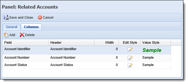
Column attributes enable administrators to customize the columns that appear within the grid panel.
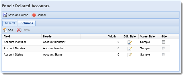
The below Column attributes are defined within the Columns tab:
| Attribute | Description | ||||||||||||||||||
| Field | A read-only attribute that displays the column selected. | ||||||||||||||||||
| Header | Enter the title of the column to be displayed within the user-defined panel/screen. | ||||||||||||||||||
| Width | Select the default pixel width of the column. | ||||||||||||||||||
| Edit Style |
Click
To edit the style of text within a panel column:
|
||||||||||||||||||
| Value Style | A non-editable column that allows the administrator to preview the Value text style defined in the Edit Style window. | ||||||||||||||||||
| Hide |
Select the check box if this column is never to be displayed within the panel.
|
Property attributes only display when configuring Account, Case, and Messages panels on Person screens. Property attributes for a panel are defined on the Properties tab.
For Account and Case panels, the properties tab allows administrators to assign Account types and Case Types to the panel. The panel only displays on the screen if the account in context is assigned to the panel type.
|
For more information about accounts in context, please see the Overview Screen section in the Workspace topic in the user guide. |
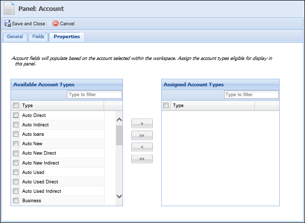
| Attribute | Description |
| Available | Displays a list of all the Account Types configured in System Management > Account Types. Assign access to the panel by selecting the desired account type(s) from the list and moving the account type(s) to the Assigned Account Type list using the arrows that are displayed. |
| Assigned | Displays a list of all Account Types that have been assigned to the panel. |
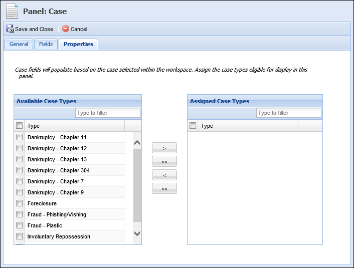
| Attribute | Description |
| Available | Displays a list of all the Case Types configured in System Management > Case Types. Assign access to the panel by selecting the desired case type(s) from the list and moving the case type(s) to the Assigned Case Type list using the arrows that are displayed. |
| Assigned | Displays a list of all Case Types that have been assigned to the panel. |
For Message panels, the properties tab allows administrators to assign rules to the panel. The rules assigned to the message panel execute when the screen is opened or refreshed. If the assigned rules result in displaying content, the content displays within the panel.
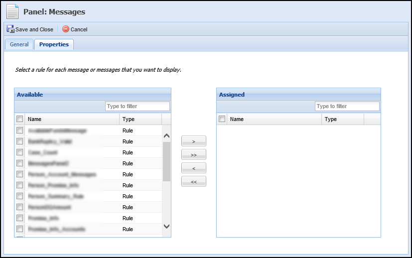
| Attribute | Description |
| Available | Displays a list of all the Rules configured in System Management > Rules. Assign access to the panel by selecting the desired rule(s) from the list and moving the rule(s) to the Assigned list using the arrows that are displayed. |
| Assigned | Displays a list of all Rules that have been assigned to the panel. |
|
In order to assign rules to the Messages Panel, the ability to author Business Rules must be enabled for the financial institution. For more information about Rules, please see the Rules Management section of this guide. |
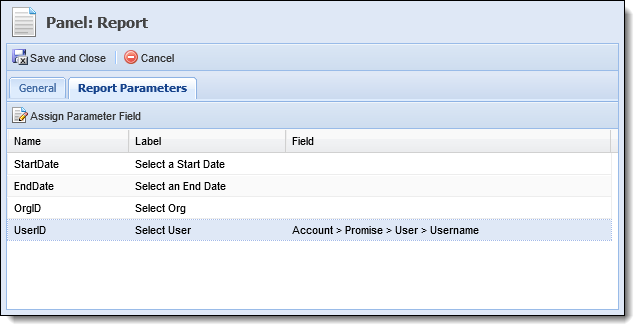
Report Parameter attributes only display when configuring Report panels on Account, Case, and Person screens. Report parameter attributes for a panel are defined on the Report Parameters tab.
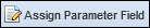
The Report Parameters tab allows administrators to define the fields that are used as the default report criteria. Assigning parameter fields when creating the panel provides the ability for administrators to determine the account, case, and person fields from which report data is pulled and eliminates the need for users to manually select parameters at runtime.
For example, the User ID parameter can be defined for the Promises To Pay (Person) report. Upon selection, the administrator is able to choose the field in which the User ID is stored at the Account > Promise level on the account. When the panel and report renders in the workspace, the data displayed in the report would default to include the value in the selected field for the person/account in context.
|
Defining parameter fields is optional. If parameter fields are not defined, the parameters are presented to the user for selection when the panel and report is rendered in the workspace. |
|
The parameters populate within the Report Parameters tab based on the report selected for the panel within the General tab. |
|
To ensure the entire report is displayed in the panel when rendered in the workspace, set the Maximum Height to 1500 on the panel's General tab. |
|
When a field is double-clicked, the Field Selector closes automatically. When selecting a field and clicking  , the Field Selector must be closed manually by clicking , the Field Selector must be closed manually by clicking  . . |
|
The Buttons attribute is available when configuring attributes for Case screen types. |
Buttons provide the ability to perform an action directly within a screen. Button attributes enable administrators to add and delete screen buttons, as well as customize the button label that appears within the screen.
The following Button attributes are defined on the Buttons tab:
| Attribute | Description |
| Button | Displays the name of the Button. This attribute is read-only. |
| Label | Enter the button label to appear within the application. To add a custom label, click within the Label column of the corresponding button and add custom text. |
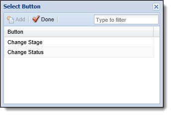
The below table provides an overview of the buttons that are available for each screen type.
| Button | Description | ||
| Finalize Recovery Account | Provides the ability to end the life cycle of a recovery account. Clicking this button performs validations to confirm that the sum of the recovery ledger balances equals zero and that the recovery account does not have any component balances with a fractional amount below a penny. If the recovery account passes the validations, the Recovered Date is set to today's date. | ||
| Case Screens | |||
| Change Stage |
Provides the ability to change the stage of a case. Clicking this button displays a Change Stage window that allows a user to select the desired Case Stage from a drop-down.
|
||
| Change Status |
Provides the ability to maintain the status of a case. Clicking this button displays a Change Status window that allows a user to select the desired Case Status from a drop-down.
|
||
|
This tab is only displayed for screens of the following screen types:
|
Validation Rules can be assigned to a screen to present a message to the user. Upon adding or modifying data within the screen in the workspace and clicking  , these rules automatically execute to perform the desired action.
Rule attributes enable administrators to select Validation Rules from a list and assign them to the screen.
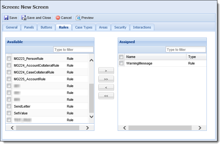
The following Rule attributes are defined within the Rules tab:
| Attribute | Description |
| Available | Displays a list of all Validation Rules configured in System Management > Collections > Rules Management. To assign a Validation Rule to the screen, select a rule from the list and move it to the Assigned box using the arrows that display. |
| Assigned | Displays a list of the Validation Rules assigned to the screen. The assigned Validation Rules execute when is clicked after data is added or modified within the screen in the workspace. |
 |
In order to assign rules to a screen, the ability to author Business Rules must be enabled for the institution. For more information about how to enable this functionality, please contact a Temenos Customer Care Representative. |
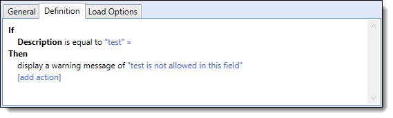
Validation Rules are configured in System Management > Collections > Rules Management. The following table provides an example of a validation rule that can be configured to execute within a screen:
| Action Template | What it Does |
| Display a Warning Message |
Displays a warning message to the user.
|
For more information on Validation Rules and other Rule Categories, please see the Getting Started with Rules Management topic within this guide.
Account Types allow administrators to assign screens to specific account types. The screen is only available if the account in context is an account type that is assigned to the screen.
|
For more information about accounts in context, please see the Overview Screen section in the Workspace topic in the user guide. |
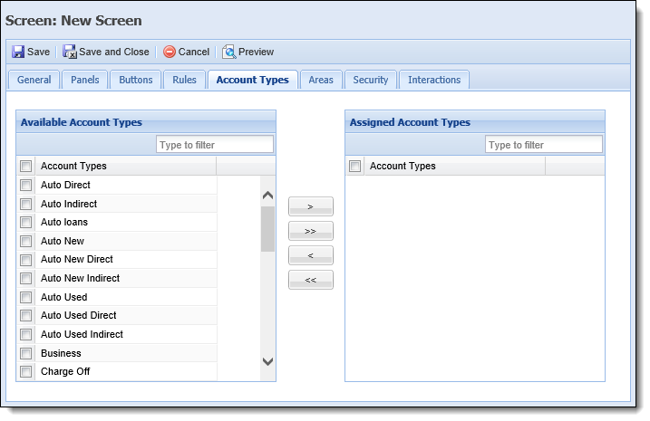
The Account Type attribute is defined on the Account Type tab:
| Attribute | Description |
| Available | Displays a list of all the Account Types configured in System Management > Account Types. Assign access to the panel by selecting the desired account type(s) from the list and moving the account type(s) to the Assigned Account Type list using the arrows that are displayed. |
| Assigned | Displays a list of all Account Types that have been assigned to the screen. |
The Areas attribute allows administrators to assign the areas in which a screen is available. If the screen is not assigned to an area, users will not be able to utilize the screen while working in that area.
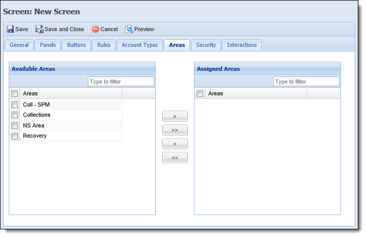
The Area attribute is defined on the Areas tab:
| Attribute | Description |
| Available | Displays a list of all the Areas configured in System Management > Areas. Assign access to the screen by selecting the desired area(s) from the list and moving the area(s) to the Assigned Areas list using the arrows that are displayed. |
| Assigned | Displays a list of all Areas that have been assigned to the screen. |
Case types allow administrators to assign screens to be available within specific case types.
|
Case types attributes are only available while creating Case screens. |
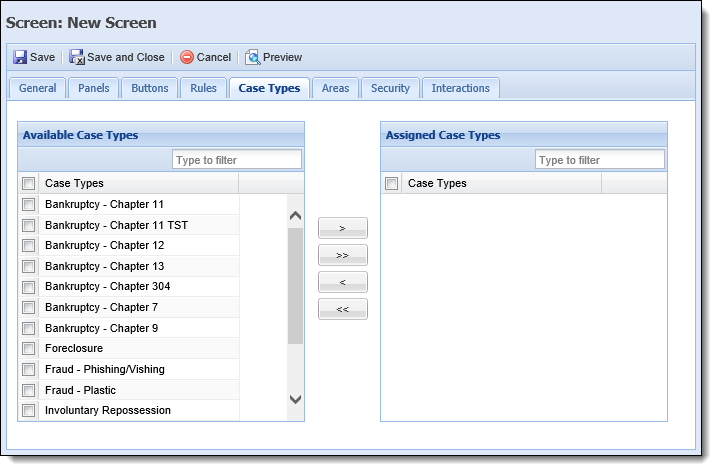
The Case Type attribute is defined on the Case Type tab:
| Attribute | Description |
| Available | Displays a list of all the Case Types configured in System Management > Case Types. Assign access to the panel by selecting the desired case type(s) from the list and moving the case type(s) to the Assigned Case Type list using the arrows that are displayed. |
| Assigned | Displays a list of all Case Types that have been assigned to the screen. |
Security attributes allow administrators to assign the user-defined screen to specific Users and Security Groups.
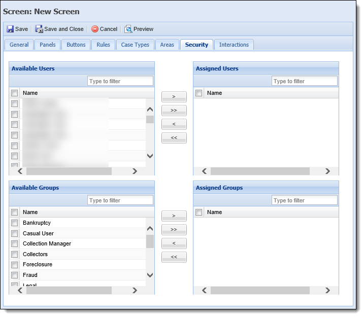
Security attributes are located within the Security Tab:
| Attribute | Description |
| Available | Displays a list of all Users configured in System Management > Users and all Security Groups created in System Management > Groups > Security Groups. Assign access to the screen by selecting the desired user(s) and group(s) from the list and moving the name(s) to the Assigned Users/Groups boxes using the arrows that display. |
| Assigned | Displays a list of the Users and Groups assigned access to the screen. Once the screen is saved, it is accessible to the assigned Users and Groups. |
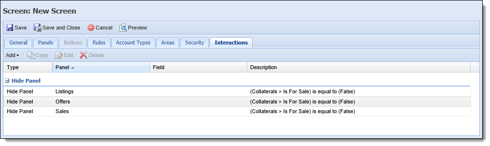
Interactions provide the ability to configure the conditions in which a screen's fields and panels are hidden from the workspace. This configuration allows institutions to ensure that only relevant fields and panels are displayed in the workspace.
Screen interactions are maintained using the following action buttons:
| Button | Description | ||||||||||||||||||||||
 |
Allows the administrator to create a new Interaction. Clicking
|
||||||||||||||||||||||
 |
Allows the administrator to copy an existing Interaction. | ||||||||||||||||||||||
 |
Allows the administrator to edit an existing Interaction. | ||||||||||||||||||||||
 |
Allows the administrator to delete an existing Interaction. |
The following attributes are defined within the grid that displays in the Interactions tab:
|
All interactions for a screen are grouped together by type. Users are able to expand a grouping by clicking |
| Attribute | Description |
| Type | Identifies whether the interaction Type is Hide Field, Hide Panel, Hide Row, or Field Validation. |
| Panel |
The value within the Panel attribute is determined by the interaction Type:
|
| Field |
The value within the Field attribute is determined by the interaction Type:
|
| Description | Indicates the Interaction condition(s). |
To access the condition and expression builder, click , , or . Within the condition and expression builder, administrators are able to identify the field or panel to be hidden as well as the condition(s) that must be met for the interaction to occur.
Upon clicking , administrators are prompted to:
|
If there are no user-defined grid panels assigned to the screen, the Choose a Panel window appears blank. |
Click on the desired field/panel/row to advance to the condition and expression builder.
|
If editing an existing interaction, administrators bypass the field/panel selection and are taken directly to the condition and expression builder. |
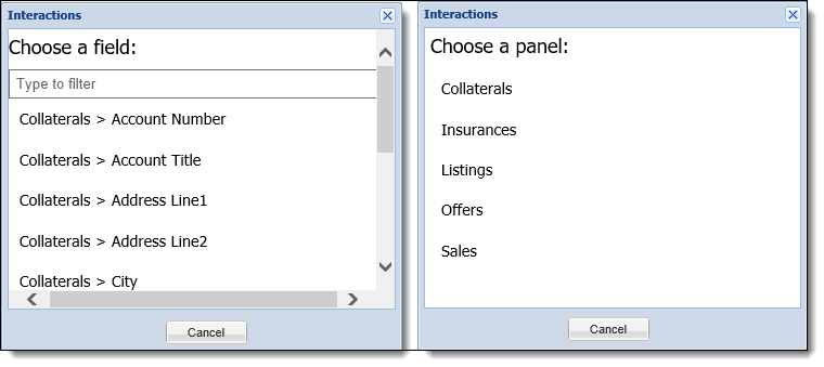
|
The fields that populate in the Choose a Field window are limited to the fields that appear within user-defined panels, which are assigned to the screen. The panels that populate in the Choose a Panel window are limited to the panels assigned to the screen. |
In the condition and expression builder, administrators may define one or more groups that may contain multiple conditions. If an interaction contains multiple groups, each group may be linked with an AND/OR relationship. Click  to begin authoring the hide condition(s). Once clicked, a new group is added to the Interactions pop-up window.
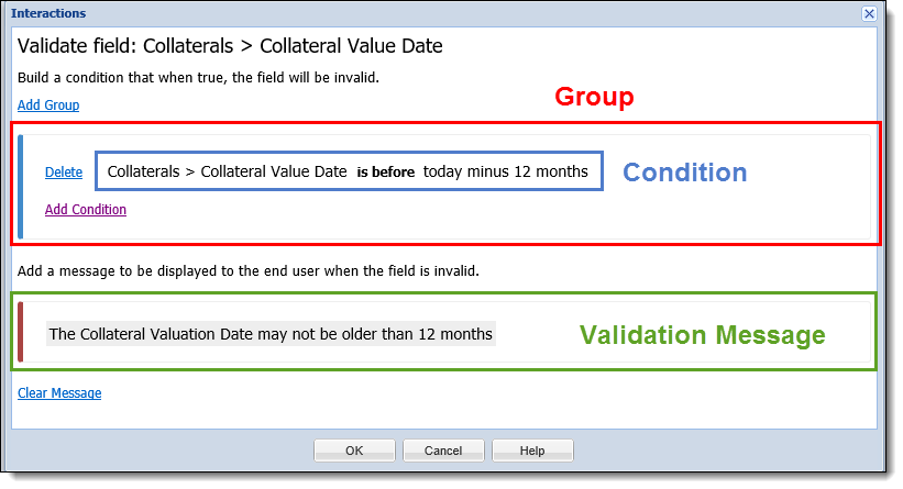
A group is a group of conditions, and at least one group must be defined for an interatction. Each group contains one or more condition, and administrators can define one or more groups that may contain multiple conditions. If an interaction contains multiple groups, each group may be linked with an AND/OR relationship.
|
A screen interaction may contain an unlimited number of groups, and each group may contain an unlimited number of conditions. |
Click to begin authoring the hide condition(s). Once clicked, a new group is added to the Interactions pop-up window.
|
When creating a new interaction, one group is automatically added. |
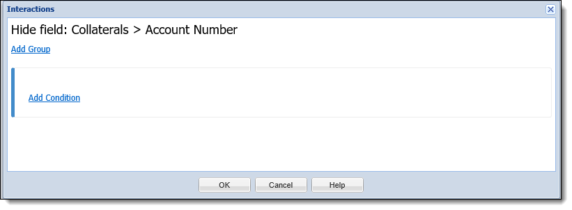
Within each group, administrators are able to perform the following actions:
| Action | Description |
 |
Allows administrators to add an interaction condition to the group. Upon clicking this button, a new condition is added to the group. When a new condition is added, the first field available in the screen populates in the left expression. Click on the left expression to open the field and function menu.
If a group contains multiple conditions, each condition may be linked with an AND/OR relationship. By default, the relationship is set to an AND relationship. Click on the AND to change it to OR. |
 |
Allows administrators to delete a condition from the group. Upon clicking this button, the condition is removed from the group. |
Each condition is comprised of two expressions (a left and a right) that are linked by a relationship operator.
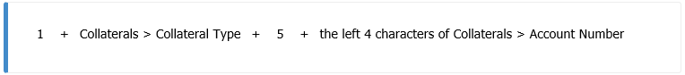
An expression is a calculation that returns a single value. Each expression can be comprised of one or more tokens, which may include a mixture of manually entered data, operators, fields, and functions. The following example contains seven tokens:
When building an expression, the following navigation capabilities are available:
|
The arrow keys cannot be used to navigate through the field/function menu. |
Additionally, the following keys are supported for data entry:
| Keys | Description |
| Letters | All upper and lowercase letters from A to Z |
| Numbers | All numbers 0-9 |
| Space | The space bar |
| ( | Begin grouping |
| ) | End grouping |
| + | Add |
| - | Subtract |
| * | Multiply |
| / | Divide |
| \ | Forward slash |
| . | Period or decimal |
| = | Equal sign |
| ! | Exclamation |
| @ | At symbol |
| # | Number sign, pound sign, hashtag |
| $ | Dollar sign |
| % | Percent |
| ^ | caret |
| & | And symbol, ampersand |
| , | Comma |
| < | Less than |
| > | Greater than |
| ? | Question mark |
|
Expressions are validated as they are authored. Invalid tokens are highlighted in red, and the errors are indicated in a tooltip when the cursor hovers over the exception.
|
When authoring an expression, administrators may select a field from the left side of the field and function menu. The fields available within this list are limited to those that are assigned to the screen.
|
The field and function menu is accessed by pressing the equal sign (=) on the keyboard within a blank token, or clicking on an existing field or function in a token. |
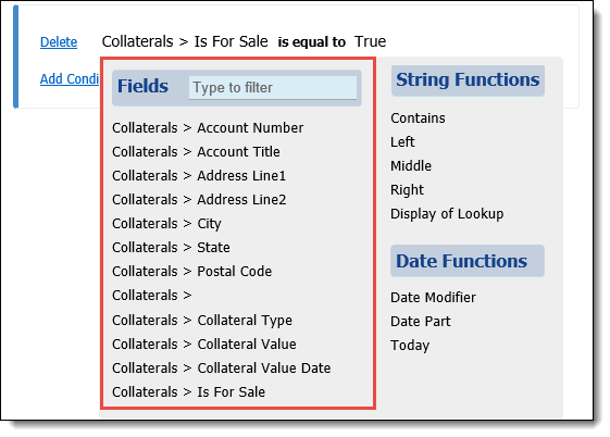
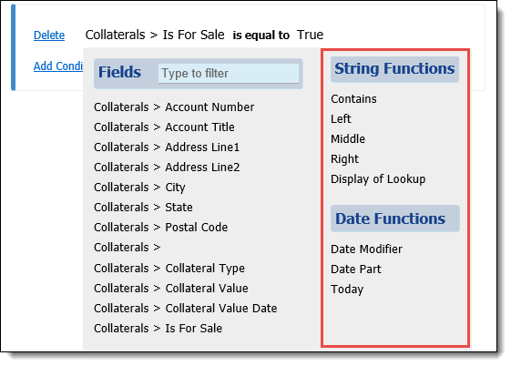
A Function is a token that uses one or more inputs to produce a single value. The following functions appear on the right side of the field and function menu:
Upon selecting a function, the corresponding pop-up window opens. Within the function pop-up window, administrators are able to set the inputs to the desired values.
|
The Today function does not require additional inputs to be configured; therefore, a pop-up window does not open. |
Review the following table for an overview of the functions available within the condition and expression builder:
| Function Name | Description | Function Logic and Inputs | Function | ||||
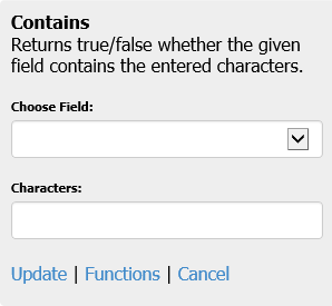
| String | |||||||
| Contains |
Returns true or false, given whether the field contains the entered characters.
|
Contains (b) within (a)
|
|
||||
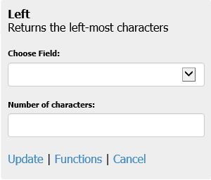
| Left | Returns the left-most characters. |
The left (b) characters of (a)
|
 |
||||
| Middle | Returns a portion of the string with a given starting point and length. |
The middle (c) characters of (a), starting with.
|
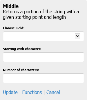 |
||||
| Right | Returns the right-most characters. |
The right (b) characters of (a)
|
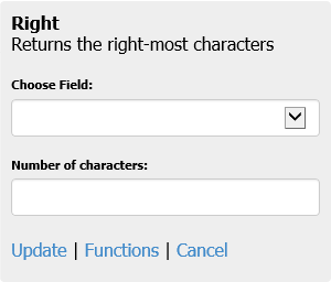 |
||||
| Display of Lookup | Returns the display of the lookup field. | Choose the lookup field. | 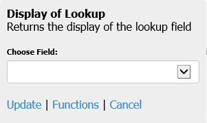 |
||||
| Date | |||||||
| Today | Returns today’s date. |
Today
|
|
||||
| Date Modifier | Returns a new date after applying modifiers to the original date. For example: Today minus 2 months, or BirthDate plus 18 years. |
(a)(b)(c)(d)
|
 |
||||
| Date Part | Returns an integer representing a part of a given date (month, day, or year). For example: The month of 4/1/77 is 4. |
The (b) of (a)
|
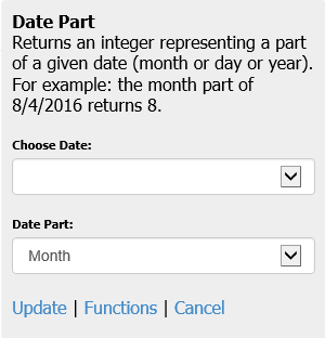 |
||||
In addition to setting the inputs, administrators are able to perform the following actions:
| Action | Description |
| Update | Saves the selections made in the function's pop-up window, and returns the administrator to the condition and expression builder. |
| Functions | Closes the function's pop-up window, discards all selections, and returns the administrator to the field and function menu. |
| Cancel | Closes the function's pop-up window, discards all selections, and returns the administrator to the condition and expression builder. |
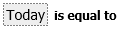
The relationship operators available in a condition are based on the left expression's data type. For example, in the following image, the left expression is a date field and operators available are limited accordingly.
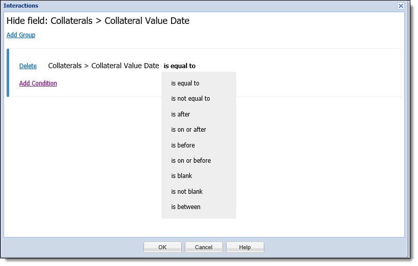
Refer to the following matrix for an overview of the relationship operators available with each data type:
| Operator | Data Type | |||
| Booleans | Dates | Strings and Lookups | Numerics | |
| Is equal to |  |
|
|
|
| Is not equal to | |
|
|
|
| Is greater than | |
|||
| Is greater than or equal to | |
|||
| Is after | |
|||
| Is on or after | |
|||
| Is less than | |
|||
| Is less than or equal to | |
|||
| Is before | |
|
||
| Is on or before | |
|||
| Is blank | |
|
|
|
| Is not blank | |
|
|
|
| Is between | |
|
||
|
Reference the following list for an overview of information for specific interactions and/or functions:
|
A Validation Message is a message that displays to the end user, if the value entered in the field does not meet the conditions identified in the Validate Field interaction.
|
The Validation Message section within the condition and expression builder only displays for Validate Field interaction types. |
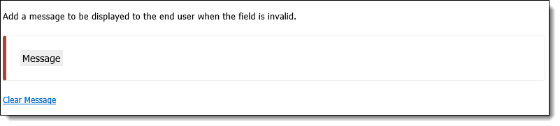
Click the mouse within the message text box or press the Tab button to select the Message text box.
|
Click |
|
For more information on creating Interactions, please see the How to Create Screen Interactions topic. |
The Create function enables administrators to define the structure of a user-defined screen. This function provides the ability to configure and customize all screen and panel attributes to meet an institution's needs.
To design a user-defined screen, navigate to System Management > Screens and click  .
.
A Select Screen Type window appears.
The Screen types available within the selection window are both Main Screens and Edit Screens.
Main Screens are screens used to collect account, case, and person information within a variety of user-defined panels.
The following screen types are classified as main screens:
| Screen | Description | Available Panels | ||
| Account | Screen type used to view and capture Account, Collateral, and Credit Card Sub Record information. |
|
||
| Case | Screen type used to view and capture case information such as bankruptcies, collaterals, foreclosures, legal matters, and repossessions. |
|
||
| Person |
Screen type used to view and capture person information such as addresses, employers, payrolls, phone numbers, and promises.
|
|
|
Custom Workflow fields can be added to any Person, Account, or Case screen. However, if the screen to which these fields are assigned is accessed outside of a workflow, the custom workflow fields are dimmed and unavailable. |
|
If address, phone and email panels are included in an Overview screen or top area of the workspace, information in these panels cannot be edited as they are read-only. |
Edit Screens are used to collect information for grid panels. When adding or editing information in a grid panel, an edit screen is used. Unlike main screens, edit screens are tied to panels and can only be accessed via the associated panels.
For information about the panels associated with Edit Screens, refer to the Panels Type section within this topic.
The following screen types are classified as Edit screens:
| Screen | Description | Available Panels |
| Account Collateral | Screen type used to capture Account Collateral information, such as insurance, liens, taxes, and valuations. |
|
| Account Collateral Insurance | Screen type used to capture insurance information for account collateral. | Insurances |
| Account Collateral Insurance Claim | Screen type used to capture collateral insurance claim information. | Claims |
| Account Collateral Lien | Screen type used to capture lien information for account collateral. | Liens |
| Account Collateral Listing | Screen type used to capture listing information for account collateral. | Listings |
| Account Collateral Offer | Screen type used to capture offer information for account collateral. | Offers |
| Account Collateral Sale | Screen type used to capture sale information for account collateral. | Sales |
| Account Collateral Tax | Screen type used to capture tax information for account collateral. | Taxes |
| Account Collateral Valuation | Screen type used to capture valuation information for account collateral. | Valuations |
| Account Credit Card Sub Record | Screen typed used to capture Credit Card Sub Record information. | Credit Card Sub Record |
| Case Bankruptcy Assets | Screen type used to capture asset information for bankruptcy cases. | Assets |
| Case Bankruptcy Claims | Screen type used to capture claim information for bankruptcy cases. | Claims |
| Case Bankruptcy Hearings | Screen type used to capture hearing information for bankruptcy cases. | Hearings |
| Case Bankruptcy Liabilities | Screen type used to capture liability information for bankruptcy cases. | Liabilities |
| Case Bankruptcy Parties | Screen type used to capture information regarding the parties for bankruptcy cases. | Parties |
| Case Bankruptcy Payments | Screen type used to capture payments information for bankruptcy cases. | Payments |
| Case Bankruptcy Reaffirmations | Screen type used to capture bankruptcy case reaffirmations. | Reaffirmations |
| Case Collateral | Screen type used to capture Case Collateral information, such as insurance, liens, taxes, and valuations. |
|
| Case Collateral Insurance | Screen type used to capture insurance information for case collateral. | Insurances |
| Case Collateral Insurance Claim | Screen type used to capture insurance claim information for case collateral. | Claims |
| Case Collateral Lien | Screen type used to capture lien information for case collateral. | Liens |
| Case Collateral Listing | Screen type used to capture listing information for case collateral. | Listings |
| Case Collateral Offer | Screen type used to capture offer information for case collateral. | Offers |
| Case Collateral Sale | Screen type used to capture sale information for case collateral. | Sales |
| Case Collateral Tax | Screen type used to capture tax information for case collateral. | Taxes |
| Case Collateral Valuation | Screen type used to capture valuation information for case collateral. | Valuations |
| Case Foreclosure Notice | Screen type used to capture case foreclosure notices. | Notices |
| Case Foreclosure Publication | Screen type used to capture foreclosure publication information for cases. | Publications |
| Case Foreclosure Trustee Sale Guarantee | Screen type used to capture Trustee Sale Guarantee information for cases. | Trustee Sale Guarantees |
| Case Legal Filing | Screen type used to capture legal filing information for cases. | Filings |
| Case Legal Hearing | Screen type used to capture legal hearing information for cases. | Hearings |
| Case Legal Party | Screen type used to capture information regarding the legal parties involved in cases. | Parties |
| Case Legal Summon | Screen type used to capture legal summons information for cases. | Summons |
| Case Party | Screen type used to capture information regarding the parties involved in cases. | Party |
| Case REO Invoices | Screen type used to capture real estate owned invoice information for cases. | Invoices |
| Case REO Rental Income | Screen type used to capture real estate owned rental income information for cases. | Rental Incomes |
| Case REO Rental Terms | Screen type used to capture real estate owned rental term information for cases. | Rental Terms |
| Case Repossession Assignments | Screen type used to capture repossession assignment information for cases. | Assignments |
| Case Repossession Conditions | Screen type used to capture repossession condition information for cases. | Conditions |
| Case Repossession Locations | Screen type used to capture repossession location information for cases. | Locations |
| Case Repossession Notices | Screen type used to capture repossession notice information for cases. | Notices |
| Case Repossession Repairs | Screen type used to capture repossession repair information for cases. | Repairs |
| Case Service Request | Screen type used to capture service request information for cases. | Service Requests |
| Person Address | Screen type used to capture address information for persons within the Lifecycle Management Suite. |
|
| Person Email Address | Screen type used to email address information for persons within the Lifecycle Management Suite. | Person Email Address |
| Person Employer | Screen type used to capture employer information for persons within the Lifecycle Management Suite. | Person Employer |
| Person Financial Statement | Screen type used to capture financial statement information for persons within the Lifecycle Management Suite. | Person Financial Statement |
| Person Payroll | Screen type used to capture payroll information for persons within the Lifecycle Management Suite. | Person Payroll |
| Person Phone | Screen type used to capture phone information for persons within the Lifecycle Management Suite. |
|
| Person W2 | Screen type used to capture W2 information for persons within the Lifecycle Management Suite. | Person W2 |
Once a screen type is selected, the Edit Screen window appears for administrators to define the attributes of the screen. To define attributes, the below actions may be taken:
To add panels to a screen, select the Panels tab and click  .
.
Clicking opens the Select Panel window. Select the desired Panel Type to be assigned to the screen and click OK.
|
The panel types that display within the Select Panel window depend on the screen type selected. The example above displays the panels available to be added to a Person Screen. For more information on panel types and screen types that support them, please see the list of available Panel Types. |
To begin adding fields to the panel, click . The Field Selector window appears.
Navigate through the folders to locate the desired field, or enter the name of the field in the search box at the top of the Field Selector window. Assign a field to the panel by double-clicking a field or by selecting a field and clicking .
| Note Box | /Innovasys/HelpStudio2015/configuration/widgets/resources/icons/delete.gif) |
|
Custom fields can only be added to user-defined screens. |
|
Workflow fields added to a panel only display when the screen is used as a workflow step. |
 to return to the Fields tab.
The fields populate in the grid on the fields tab.
|
Specific fields may only be added to a screen or panel once. The exception to this rule is the Add Spacer/Text/Line fields. |
The order in which the fields are displayed on the Fields tab (from top to bottom) is the order in which the fields appear in the panel. The order can be changed by clicking a field and dragging it to the position in the list that is desired to display on the panel.
 ,
,  , and/or
  , these fields can be added to the panel.
Within the grid columns, define the Field Label, Required, Recommended, Read-Only, Col. Span, Label Style, Value Style, and Text Line.
|
If a screen is configured to collect identical information in two locations, such as when two different panels contain the same field, the field information within one panel will be overwritten when data entered within the other panel is updated and the screen is saved. |
Once fields have been added to a panel, administrators are able to remove them by selecting the field in the Fields tab and clicking  .
.
|
When deleting a field, the Lifecycle Management Suite checks whether the field is included in a Validate Field interaction condition. If the field is included in a Validate Field interaction condition, a warning message displays that asks whether the field as well as all interactions using it should be deleted. Click Yes to delete the field as well as the interactions related to the field. Click No to keep the field as well as the interactions. |
If the panel is a grid, an edit screen is required. Navigate to the Edit Screens tab and define the Edit Screen attributes. To add an Edit Screen to the panel, click within the Screen column and select the desired screen. The screen name populates within the Screen column.
 . The Lifecycle Management Suite's standard Field Selector is displayed. to add it to the Report Parameters tab.
To add columns to the panel, click  within the Columns tab.
A Select Columns screen appears. Select the fields that are to be added to the column by selecting the field and clicking , or double-clicking on the field.
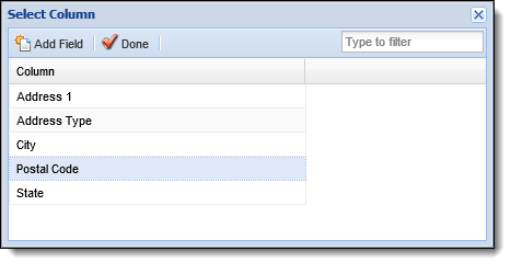
Once all fields and columns have been selected, click . After closing, administrators are taken back to the Columns tab. This tab populates the selected columns and fields.
The order in which the columns appear in the grid determines their order of appearance in the panel. Click a column and drag it to the desired location in the sequence.
. in the screen configuration window to return to the Panels tab.
After a panel has been created, administrators are able to revisit the screen and edit the panels of previously created user-defined screen.
 . to save the modifications and return to the Panels tab.
 |
Panel modifications are not saved until the screen in which the panel exists is saved. |
Administrators are able to delete panels from existing or in-progress user-defined screens.
. |
When deleting panels, the Lifecycle Management Suite does not display a confirmation message. When delete is selected, the panel is deleted. |
When the Buttons tab is enabled, use this tab to manage screen buttons and their attributes.
. A Select Button window appears.. .
.Once a button has been added to a screen, administrators are able to remove them by selecting the button and clicking .
 Finalizing a User-Defined Screen
Once finished configuring the screen, click Save then click the Preview button to see how the screen will appear in the workspace.
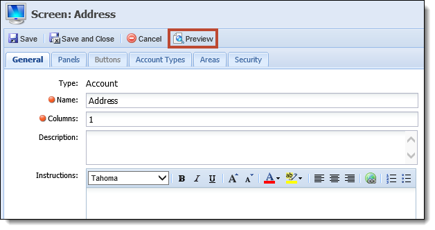
A preview window appears displaying a rendition of the screen. All buttons configured for the screen are disabled and data is not populated in the fields.
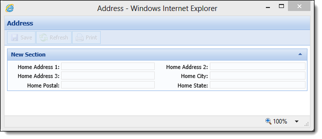
When finished viewing the preview, click the X at the top right corner to close the preview window. Any necessary changes can be made on the Screen window.
|
Previewing a screen can be done at any point during creation of the screen, but is important to perform just prior to clicking Save. Doing so allows mistakes to be found before the screen is opened in the workspace. |
Once all updates have been made to the user-defined screen, click Save and Close to finalize the creation of the screen.
The newly created screen now populates within the Screens page.
Navigate to the Interactions tab to Add, Copy, Edit, or Delete the following interaction types:
and click Hide Paneland identify the conditions in which the panel is to be hidden on the screen. and click Hide Field.and identify the conditions in which the field is to be hidden on screen. and click Hide Row.and identify the conditions in which rows within the panel are to be hidden. and click Validate Field.and identify the conditions, where when true the value entered in the field is invalid.The Copy function enables users to duplicate the logic and structure of an existing Interaction. The existing interaction can be used as a base for creating a new interaction. After copying an interaction, users are able to add, modify or delete contiditions.
.The Edit function enables users to revisit an existing interaction and modify the existing conditions to enhance usability.
.The Delete function enables users to remove an existing interactions and all of its conditions from a screen.
.The Copy function enables administrators to duplicate the structure of an existing user-defined screen. The existing screen can be used as a base for creating a new screen. After copying a screen, users are able to add, modify, or delete screen attributes and then save it with a different name in order to create a new user-defined screen.
. to retain the changes and finalize the creation of a new screen.The Edit function enables administrators to revisit an existing user-defined screen and modify the existing logic/structure to enhance usability.
|
With the exception of Name and Instructions, users are unable to modify the content of System-Defined screens. |
. to finalize the screen modifications.The Delete function enables administrators to remove an existing user-defined screen and all of its existing logic to enhance usability.
|
System-Defined screens cannot be deleted. |
. to determine the background color and style of text that displays in the row for each delinquent account in the Related Accounts panel.
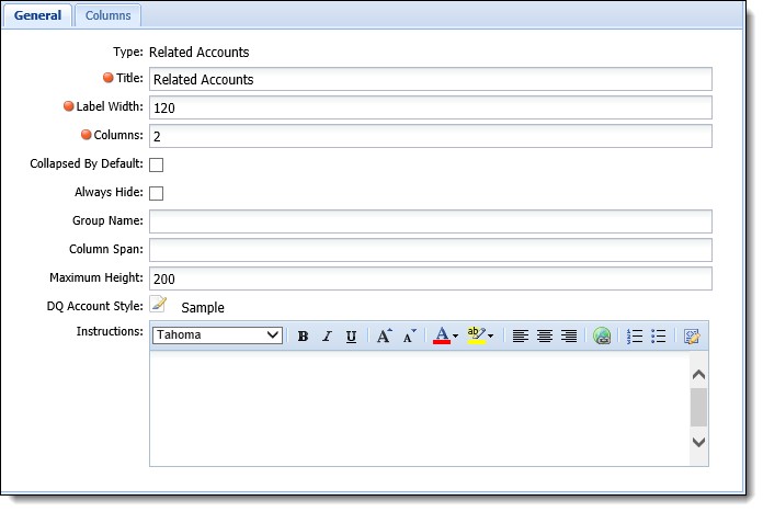
 to the left of the field label and must be completed in order to save the screen.
 icon within the Edit Style column provides administrators with the ability to define Label Style and Value Style attributes for a field.
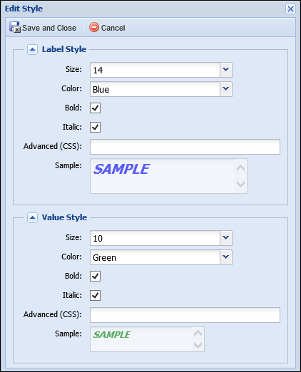
 displays next to the field label in the screen. Click
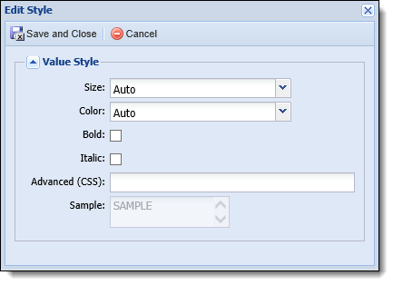
 or
or  to be clicked.
 and collapse a grouping by clicking
  .
.
 to remove the clear the validation message currently entered within the text box.