


Screen Designer
There are three categories of screens within the Framework: System-Defined, Custom and User-Defined. System-Defined screens are prebuilt by Akcelerant to provide out-of-the-box functionality and do not require (or allow) any configuration. Custom screens are coded by the customer or by Akcelerant on behalf of the customer and installed on the customer’s site. A User-Defined screen is created by the customer within Screens.
To view a demonstration of this feature, click here.
 |
Custom screens are not deployed in a Framework general release. |
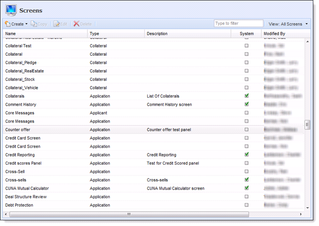
The Screens page within System Management>Lending provides a complete list of all screens used within the Framework’s lending solution. Screens also provide users the functionality to define screens in order to optimize usability and reduce application processing time.
|
The content and descriptions of System-Defined screens, such as the Collaterals, cannot be modified or deleted; however, users are able to change the name of the screen and add supporting instructions. |
To design a user-defined screen navigate to System Management>Lending>Screens. Click Create and select the screen type to be created.
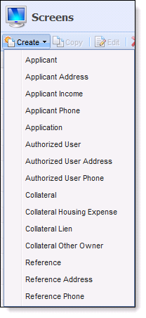
Use the table below to assist making the Screen Type selection:
| Screen Type | Description |
| Applicant | A screen type designed to capture information specific to the applicant (Name, Address, Phone, Employment, Identification). |
| Applicant Address | A screen type designed to capture an applicant’s address information. |
| Applicant Income | A screen type designed to capture an applicant’s income and employment information. |
| Applicant Phone |
A screen type designed to capture an applicant’s phone number information. |
| Application | A screen type designed to capture information specific to the application (Applicant, Loan Terms, Collateral, Pull Credit, Stipulations). |
| Authorized User | A screen type designed to capture information specific to the Authorized User. |
| Authorized User Address | A screen type designed to capture an Authorized User’s address information. |
| Authorized User Phone | A screen type designed to capture an Authorized User’s phone number information. |
| Collateral | A screen type designed to capture an application’s collateral information (Pledge, Vehicle, Real Estate, Stock). |
| Collateral Housing Expense | A screen type designed to capture the expense information for the real estate being used as collateral. |
| Collateral Lien | A screen type designed to capture the lienholder information for the real estate being used as collateral. |
| Collateral Other Owner | A screen type designed to capture the information of any other owners for the real estate being used as collateral. |
| Reference | A screen type designed to capture an applicant’s credit Reference information. |
| Reference Address | A screen type designed to capture the address information of an applicant’s credit Reference. |
| Reference Phone | A screen type designed to capture the phone number information of an applicant’s credit Reference. |
 |
When creating screens institutions have the ability to indicate Read-Only, Recommended and Required fields. Marking fields as Required enables institutions to ensure that validations occur and blank records are not added to an application. |
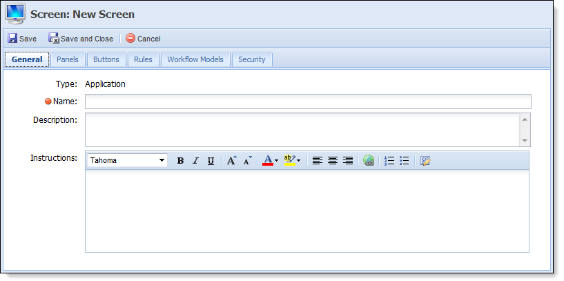
After selecting the Screen Type, the Screen window appears that contains the following tabs:
| Tab Name | Description | ||
| General | Contains basic descriptive information about the user-defined screen. | ||
| Panels |
Contains the functionality to assign user-configured panels and fields to the screen.
|
||
| Rules |
Contains the functionality to assign Validation rules to the user-defined screen.
|
||
| Workflow Models | Contains the functionality to assign this user-defined screen to specific workflow models. | ||
| Security | Contains the functionality to assign this user-defined screen to specific users or groups. |
General Tab
The General tab contains the basic information pertaining to the user-defined Screen. Refer to the table below to assist completing the General Tab.
| Field | Description | ||
| Name | Enter a name unique to the new user-defined screen. | ||
| Description | Enter a description that assists users in identifying the purpose of the user-defined screen. | ||
| Instructions |
Enter instructions that help the user complete the screen.
|
Panels Tab
The panels tab enables the administrator to configure the screen with various types of panels. Panels can be added to organize screen fields into logical groupings.
Select the Panels tab and click Add.
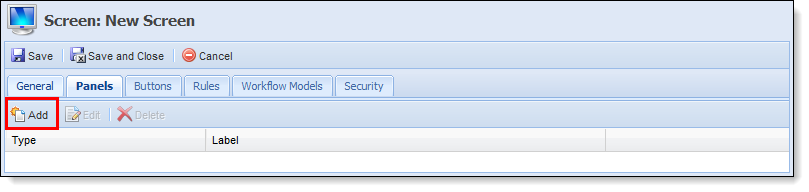
Clicking Add opens the Select Panel. Using the drop-down list, select the Panel Type that is being assigned to the screen. Click OK.

Use the table below to assist in clicking the correct Panel Type:
| Panel Type | Description | System-Defined |
Grid |
Screen Types | ||
| Add On/Refinance | A panel that displays the Add On / Refinance grid and the liabilities eligible to have funds added onto or refinanced. | X | Application | |||
| Additional Applicant | A panel used to capture the information specific to the Joint Applicants and Guarantors such as Name, Address, Phone, Employment and Income Information. | Application | ||||
| Additional Applicant Declarations | A panel that contains the declarations questions and answers for an additional applicant. | X | Application | |||
| Additional Applicant Incomes | A panel used to capture an additional applicant's income information. | X | Application | |||
| Adverse Action | A panel used to capture an application’s adverse action information. | X | Application | |||
| Aggregates | A panel that displays the Aggregates used to render an application decision such as Disposable Income, Total Expenses and Total Income. | X | Application | |||
| Applicant | A panel used to capture applicant fields. | Applicant | ||||
| Applicant Address | Applicant panel designed to capture an applicant’s address information. |
Applicant Address |
||||
| Applicant Addresses | A panel used to capture an applicant’s address information. | X |
Applicant |
|||
| Applicant Income | A panel used to capture applicant income information. | Applicant Income | ||||
| Applicant Incomes | A panel used to capture applicant income information. | X | Applicant | |||
| Applicant Phone | A panel used to capture applicant phone information. | Applicant Phone | ||||
| Applicant Phones | A panel used to capture applicant phone information. | X | Applicant | |||
| Applicant Summary | A panel used to capture a summary of applicant information such as name, account number and core message. | X | Application | |||
| Application | A panel used to capture all configurable application fields such as Applicant information, Loan Terms and Collateral. | Application | ||||
| Associated Application | A panel that displays all applications associated with the current application’s applicant(s). | X | Application | |||
| Authorized User | A panel used to capture authorized user fields. | Authorized User | ||||
| Authorized Users | A panel used to capture authorized user information. | X | Application | |||
| Authorized User Address | A panel used to capture authorized user address information. | Authorized User Address | ||||
| Authorized User Addresses | A panel used to capture authorized user address information. | X | Authorized User | |||
| Authorized User Phone | A panel used to capture authorized user phone information. | Authorized User Phone | ||||
| Authorized User Phones | A panel used to capture authorized user phone information. | X | Authorized User | |||
| Collateral | A panel used to capture collateral information. | Collateral | ||||
| Collateral - Pledge |
A panel used to capture general collateral information for applications secured by a pledge.
|
Application | ||||
| Collateral - Real Estate | A panel used to capture general collateral information for applications secured by Real Estate. | Application | ||||
| Collateral - Stock | A panel used to capture general collateral information for applications secured by stock. | Application | ||||
| Collateral - Vehicle | A panel used to capture general collateral information for applications secured by a vehicle. | Application | ||||
| Collateral Housing Expense |
A panel used to capture collateral housing expense. |
X | Collateral, Collateral Housing Expense | |||
| Collateral Lien |
User configurable panel used to capture collateral lien information. |
Collateral Lien | ||||
| Collateral Liens | A panel used to capture collateral's lien information. | X | Collateral | |||
| Collateral Other Owner | User configurable panel used to capture collateral additional owner(s) information. | Collateral Other Owner | ||||
| Collateral Other Owners |
A panel used to capture the information of the other owner of the subject collateral.
|
X | Collateral | |||
| Collateral Pledges | A panel used to capture pledge collateral information. | X | Collateral | |||
| Collaterals |
A configurable panel that enables users to collect information about any type of collateral.
|
X |
Application | |||
| Core Message | A panel that displays messages returned from the core processor. | X | Applicant, Application | |||
| Counteroffers | A panel that displays all the application's counteroffers. | X | Application | |||
| Debt Protection | A panel that allows a user to make debt protection selections for the current loan application. | X | Application | |||
| Declarations | A panel that contains the declarations questions and answers for an applicant. | X | Applicant | |||
| Fee | A panel that displays an itemized list of all fees applied to the application such as Origination and Appraisal fees. | X | Application | |||
| Funding | A panel that allows a user to fund the current loan application. | X | Application | |||
| HMDA | A panel used to capture the information specific to HMDA reportable loans such as applicant ethnicity and gender. | Application | ||||
| Loan Terms Breakdown | A panel that displays the loan terms used to render a decision such as Requested Amount and Loan Term. | X | Application | |||
| OFAC | A panel that allows users to view and request OFAC information. | X | Application | |||
| Precise ID | Panel to review PreciseID status for all applicants and execute the PID/KIQ processes. | X | Application | |||
| Primary Applicant | A panel that captures the information specific to the Primary Applicant such as Name, Address, Phone, Employment and Income Information. | Application | ||||
| Primary Applicant Declarations | A panel that contains the declarations questions and answers for a primary applicant. | X | Application | |||
| Primary Applicant Income | A panel used to capture primary applicant income information. | X | Application | |||
| Product Offering | A panel that displays a sub-product’s rich text sales script. | X | Application | |||
| Ratios | A panel that displays the Ratios used to render an application decision such as Debt to Income and Loan to Value. | Application | ||||
| Reference | Reference screen used to collect information about the applicant's credit references. | Reference | ||||
| References | A panel used to capture and display an applicant's references. | Applicant | ||||
| Reference Address | User configurable panel used to collect information about the applicant's credit references addresses. | Reference Address | ||||
| Reference Addresses | Reference screen used to collect information about the applicant's credit references addresses. | X | Reference | |||
| Reference Phone | User configurable panel used to collect information about the applicant's credit references contact information. | Reference Phone | ||||
| Reference Phones | Reference screen used to collect information about the applicant's credit references contact information. | X | Reference | |||
| Review Indicators | A panel that displays an application’s Review Indicators such as Disposable Income, Bankruptcy Indicators and DTI. | X | Application | |||
| Rich Text |
A panel that is able to display an informational/instructional message configured by the institution.
|
Applicant, Applicant Address, Applicant Income, Applicant Phone, Application, Authorized User, Authorized User Address, Authorized User Phone, Collateral, Collateral Housing Expense, Reference, Reference Address, Reference Phone |
||||
| Scores | A panel that displays the Scores and Related Credit Models used to render an application decision such as Beacon Model 5.0. | X | Application | |||
| Stipulations | A panel used to capture the stipulations that must be met prior to funding or disbursement. | X | Application | |||
| To-Do |
A panel used to capture all Automatic and Manual To-Dos generated during the application. To-Dos are grouped by General, Decision and Disbursement. Only Manual To-Dos may be cleared in the To-Dos panel. |
X |
X |
Application | ||
| Trade In (Read Only) | A panel used to capture the Trade In information transmitted to the Framework by the auto dealer. | X | Application | |||
| Vendor Channel | A panel that displays the application’s vendor channel. | X | Application |

|
The Panel Types that populate in the drop-down list depend on the Screen Type. |
After selecting the Panel Type and clicking OK, the selected panel opens as a new window. Depending on the Panel Type selected, an administrator may be able to complete the following tabs:
- General
- Fields
- Columns
- Buttons
- Edit Screen
Within these tabs, the administrator is able to customize the panel’s content and appearance with the fields, columns and buttons a user would need to complete an application. The administrator is also able to include a set of instructions for each panel added.
General Tab
The General tab enables users to edit the appearance of the screen and provide user instructions.
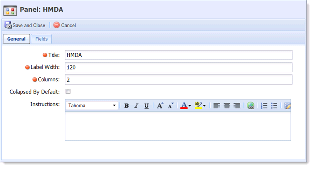
Use the table below to assist with the completion.
| Field Name | Description | ||
| Title | Enter the title assigned to the panel within the user-defined screen. | ||
| Label Width |
Enter the maximum number of pixels the label width is not to exceed. The lower the number, the more area available for entries in the associated fields.
|
||
| Columns |
Enter the number of columns that assigned fields are to populate within.
|
||
| Collapsed By Default | Select the check box if this panel is to be collapsed by default. | ||
| Instructions |
Enter a Rich Text set of instructions to assist users complete the panel.
|
|
The fields within the General tab vary according to Panel Type. The italicized fields are not available with all Panel Types. |
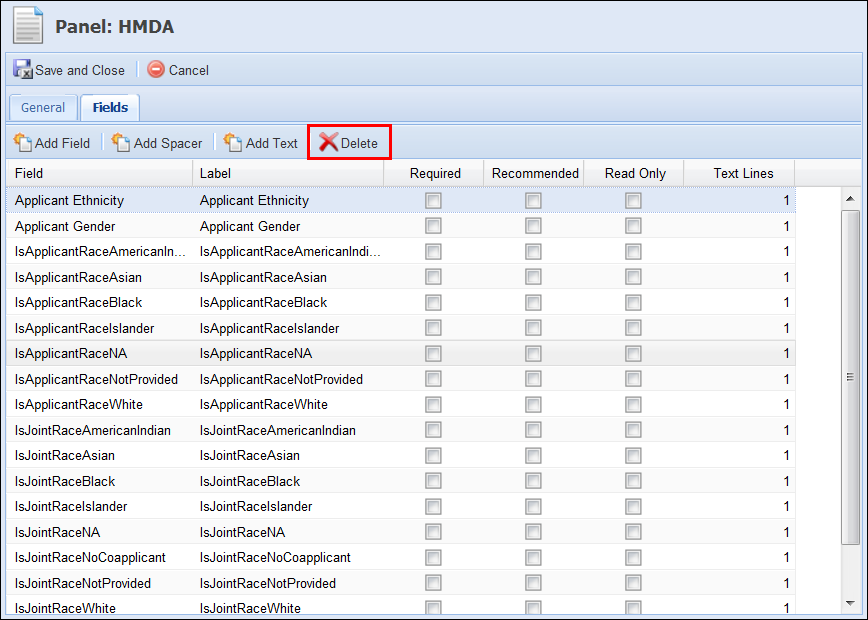
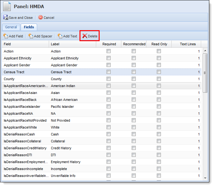
Fields Tab
The Fields tab enables users to select the fields that are to appear within this panel.
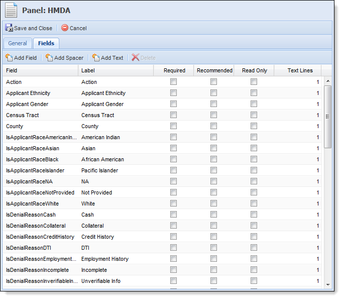
|
The Fields tab only displays if fields are able to be configured for this panel/screen. |
Adding Content
When adding content to a panel, users have the following options:
| Button | Description |
 |
Enables users to select the fields to be added to the panel from the Framework field list. Each field may only be added to a screen/panel once. |
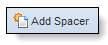 |
Enables users to add spacer fields to the panel. Spacer fields help organize and align fields into logical groupings. |
 |
Enables users to add text fields to the panel. Text fields help organize panels into logical groupings by serving as headings within a panel. Text fields display information in bold font. |
To add fields to the panel, select Add. The Select Field window appears. Locate each field and click Add to individually assign them to the panel.
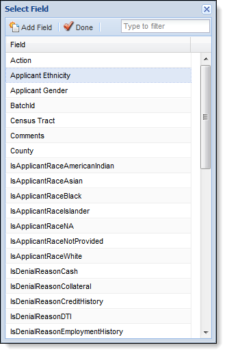
|
When adding fields to a panel or screen, specific fields may only be added to a screen once. The exception to this rule is the Add Space/Text fields. |
When adding fields to the panel, the order in which they are added determines their order of appearance in the panel. Also, to allow the administrator to group corresponding fields together and better organize the fields within the panel, the administrator is able to Add Spacer and Text fields.
Once all fields have been added, click Done. After clicking Done, users are taken back to the Fields tab. This tab is now populated with the selected fields. Drag and Drop the fields into the proper sequence. Once the fields are in the proper sequence, complete the following columns that are associated with the assigned fields:
| Field Name | Description |
| Label | Enter the title of the field as it is to be displayed within the user-defined panel/screen. |
| Required | Select the Required check box if this field must be completed in order to continue processing the application. |
| Recommended | Select the Recommended check box if the completion of this field is suggested. |
| Read Only | Select the Read Only check box if the user is unable to edit the value contained within the fields. |
| Text Line |
Indicates the number of lines the field and its corresponding entry encompass. |
Deleting Fields
Once fields have been added to a panel, users are able to remove them by highlighting the undesired field and clicking the Delete button.
Columns Tab
The Columns tab enables users to select the columns that are to appear within this panel.
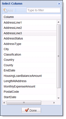
Adding Columns
To add columns to the panel, select Add. The Select Columns window appears. Locate each Column and individually assign them to the panel by clicking Add. Once all columns have been added, click Done.
Clicking Done takes users back to the Columns tab, which is now populated with the selected columns. Drag and Drop the columns into the proper sequence. Once the fields are in the proper position, complete the following columns that are associated with the assigned fields:
| Field Name | Description |
| Header | Enter the title of the column as it is to be displayed within the user-defined panel/screen. |
| Width | Selct the default pixel width of the column. |
Deleting Columns
Once columns have been added to a panel, users are able to remove them by highlighting the undesired column and clicking the Delete button.
Buttons Tab
The buttons tab is only available in certain panel types. It enables users assign buttons to a panel.
|
The Buttons tab only displays if buttons are available to be configured for this panel/screen. |
Adding Buttons
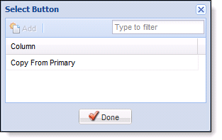
To assign buttons to the panel/screen, click Add. The Select Button window appears. Select the desired button and click Add. Once all buttons have been added, click Done.
Depending on the Panel Type selected, the following buttons are configurable:
| Button | Description | ||
| Add Applicant | Allows users to add the first joint applicant from the core or prior Framework applications via screens and screen flow. Configurable on the additional applicant panel. | ||
| Copy From Primary | Allows users to copy the primary applicant’s address information to an additional applicant. | ||
| Valuate | Allows users to perform collateral valuations. | ||
| Valuation History | Allows users to view valuations that have been processed on collateral. | ||
| Copy Applicant Address |
Allows users to copy the current address information from one applicant to another.
|
Clicking Done takes users back to the Buttons tab, which is now populated with the selected buttons. If multiple buttons have been added, Drag and Drop the buttons into the proper sequence.
Deleting Buttons
Once buttons have been added to a panel, users are able to remove them by highlighting the undesired button and clicking the Delete button.
Edit Screens
The edit screens tab allows the administrator to select an existing screen of the same type that is updated with the information captured within this panel.
To view a demonstration of how Edit Screens affect an application, click here.
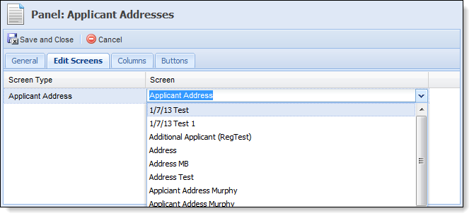
Select the Screen column to populate the drop-down list that contains the available screens. Select the screen that is to be updated by entries to this panel.
|
The Edit Screens tab is not available for all Panel Types. |
Finalizing a Panel
After completing all applicable tabs in the panel window, click Save and Close to return to the save panel design preferences and close the panels window. After returning to the Panels tab, users are able to define additional panels to be added to the screen or move on to the subsequent tabs.
Administrators are able to edit the panels of previously created user-defined screens.
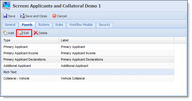
To edit panels:
- Select the existing user-defined screen.
- Select the Panels tab.
- Select the desired Panel and click Edit.
- Make the desired modifications and click Save and Close.
- Update any subsequent panels.
- When finished, click Save and Close to finalize the screen modifications.
Administrators are able to delete the undesired panels from existing or in-progress user-defined screens.
To delete panels:
- Select the existing user-defined screen.
- Select the Panels tab.
- Select the desired Panel and click Delete.
- When finished, click Save and Close to finalize the screen modifications.
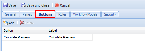
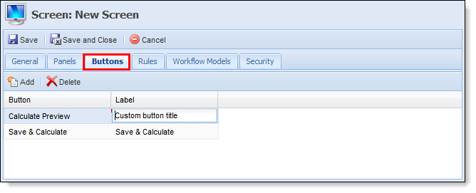
Buttons Tab
The Buttons tab enables users to assign buttons to the Screen. The Buttons tab is only available when building Application screen types.
Adding Buttons
To add buttons to a screen, click the Add Button. Once Add is clicked, the Select Button window opens. Select the desired button and click Add. Once all buttons have been added, click Done.
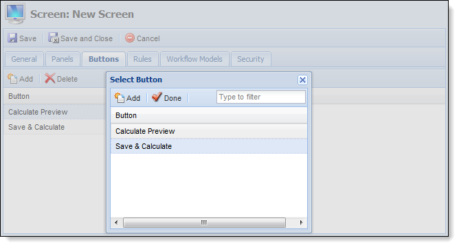
The following buttons are able to be assigned to the screen from the Buttons tab:
| Button | Description |
| Save and Calculate |
Allows users to calculate the values entered within the screen. In addition to saving and calculation values entered on the screen, clicking Save and Calculate also refreshes the screen. |
| Calculation Preview | Allows users to view Calculations, Loan Terms/Draw Period, Details, Repayment Period, Debt Protection Summary and Coverage Summary. |
Once the selected buttons populate in the Buttons tab, users are able to add a custom Button Label. To add a custom label, click the Label column of the corresponding button and add custom text.
Deleting Buttons
Once buttons have been added to a panel, users are able to remove them by highlighting the undesired button and clicking the Delete button.
Rules Tab
The Rules tab enables users to select Validation Rules from a list and assign them to user-defined screens. To view a demonstration of how Validation Rules affect screens, click here.
|
When deleting panels, the Framework does not display a confirmation message. When delete is selected, the panel is deleted. |
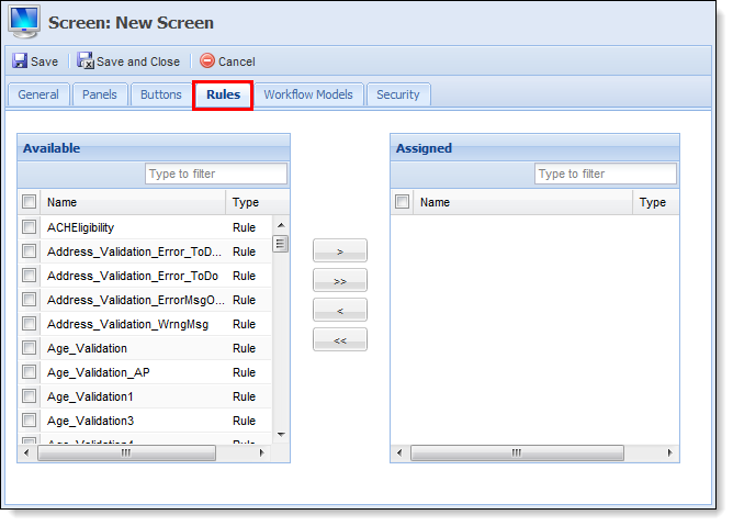
Assign the desired validation rules to the screen. Once all Validation Rules have been added, move on to the next tab in the sequence.
The Rules tab contains two boxes titled Available and Assigned. Assign Validation rules by clicking the rules(s) and making one of the selections.
Workflow Models Tab
The Workflow Models tab enables users to assign the user-defined screen to all or specific workflow models. Use the list of available workflow models to select and assign the screen. Once assigned, the newly created screen is available for selection in the Application Navigator of any assigned Workflow Model.
|
Assigning a screen to a Workflow Model does not assign it to the associated Screen Flow. To assign the user-defined screen to a Screen Flow, navigate to System Management>Lending>Workflow Models and update the Screen Flow tab. |

Once the screen has been assigned to the desired workflows, move on to the next tab in the sequence.
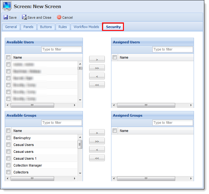
Security Tab
The Security tab enables users to assign the user-defined screen to specified Framework Users and Security Groups.
|
If a User or Group is not specified, the new screen is not accessible to anyone processing an application. |
Once all updates have been made to the user-defined screen, click Save and Close to finalize the creation of the screen.
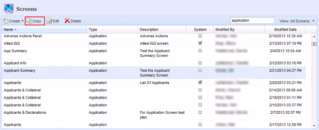
The Copy function enables users to duplicate the logic and structure of an existing user-defined screen. The existing screen can be used as a base for creating a new screen. After copying a screen, users are able to add, modify or delete screen logic and then save it with a different name in order to create a new user-defined screen.
To copy an existing user-defined screen, select the desired screen and click Copy. Once the screen name has been changed and the logic updated, save all changes to finalize the creation of the new screen.
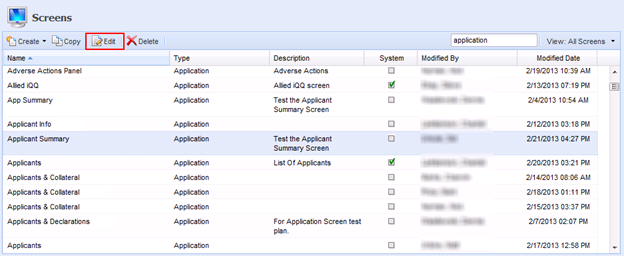
Editing Screens
The Edit function enables users to revisit an existing user-defined screen and modify the existing logic/structure to enhance usability.
To edit an existing user-defined screen, select the desired screen and click Edit. Once the logic has been updated, select Save and Close to finalize the screen modifications.
|
With the exception of Name and Instructions, users are unable to modify the content of System-Defined screens. |
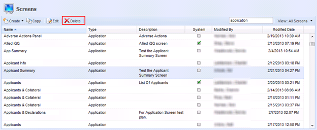
Deleting Screens
The Delete function enables users to remove an existing user-defined screen and all of its logic from the Framework.
To delete an existing screen, select the desired screen and click Delete. A Confirmation Message appears. Click Yes to delete the user-defined screen. Click No to retain the user-defined screen.
|
System-Defined screens cannot be deleted. |
 Screen Building Tips and Tricks
- If the Fields tab is available, at least one field must be assigned to the panel.
- If the Columns tab is available, at least one column must be assigned to the panel.
- A field or column may only be added to a panel/screen once.
- Custom fields may only be added to the user-defined screens.
- A button may only be added to a panel once.
- If numerous screens have been created, users are able to enter keywords and change views in order to filter the list of screens to a smaller list.
- If a screen is configured to collect identical information in two locations, such as a panel and a field, the information may never reflect the accurate data as the information may be overwritten by the data entered in similar field or panel.
An example of this is adding the Primary Applicant Income panel to the same screen that contains the Current Income Start Date field. Since the Primary Applicant Income panel also contains the Current Income Start Date field, the Current Income Start Date information may not reflect the most accurate information as the information entered in the field may be overwritten by the data entered in the panel when the screen is saved. - To configure hyperlinks to open in a new window:
- Navigate to the screen or panel that contains the desired hyperlink.
- Select the Instructions Panel.
- Click the Source Edit button (last one on the right) in the Instructions toolbar.
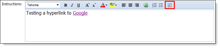
- The text entered in the Instructions field displays in the HTML Code.
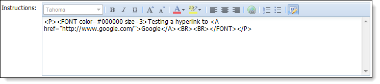
- Locate the code that launches the hyperlink.
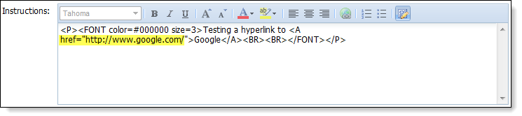
- Enter the following line of code immediately after the URL: target=”_blank”
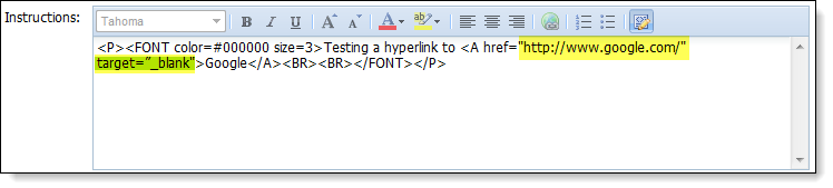
- Save modifications to Instructions.