There are three categories of screens within the Framework: System-Defined, Custom and User-Defined. System-Defined screens are pre-built by Akcelerant to provide out-of-the-box functionality and do not require (or allow) any configuration. Custom screens are coded by the customer or by Akcelerant on behalf of the customer and installed on the customer’s site. A User-Defined screen is created by the customer within Screens.
 |
Custom screens are not deployed in a Framework general release. |
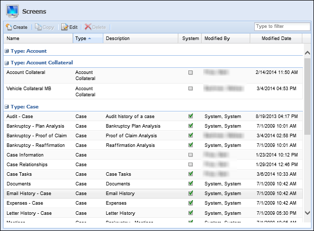
The Screens page within System Management provides a list of all existing screens within the Framework’s collection solution. Screens also provide users the functionality to define screens in order to optimize usability and increase efficiency.
|
The content and descriptions of System-Defined screens cannot be modified or deleted; however, administrators are able to change the name of the screen, add supporting instructions and assign rules and security groups. |
By default, the Screens page sorts all existing screens according to type and displays information about screens within the following columns:
| Column Name | Description |
| Name | The name of the screen. |
| Type | The type of screen. This reflects which option was selected in the Create drop down. |
| Description | If provided, displays a description of the screen. |
| System | If the screen is system-defined, the System check box is selected. |
| Modified | Denotes who made the last modification. |
| Modified Date | Denotes when the last modification was made. |
From the screens page, administrators can create screens such as: Account, Case, Person, Person Address and Person Phone. They can also copy existing screens, edit existing screens and delete screens.
Creating Screens
To create a user-defined screen navigate to System Management>Screens. Click Create and select the screen type from the Screen Type Selection pop-up window.
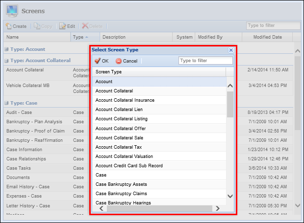
The following screen types are available within the selection window:
Main Screens
Main Screens are screens used to collect account, case and person information with a variety of user-defined panels.
The following screen types are classified as main screens:
| Screen | Description | Available Panels | ||
| Account | Screen type used to view and capture Account, Collateral and Credit Card Sub Record information. |
|
||
| Case | Screen type used to view and capture case information such as bankruptcies, collaterals, foreclosures, legal matters and repossessions. |
|
||
| Person |
Screen type used to view and capture person information such as addresses, employers, payrolls, phone numbers and promises.
|
|
Edit Screens
Edit Screens are used to collect information for grid panels. When adding or editing information in a grid panel, an edit screen is used. Unlike main screens, edit screens are tied to panels and can only be accessed via the associated panels.
For information about the panels associated with Edit Screens, refer to the Panels Tab section within this topic.
The following screen types are classified as Edit screens:
| Screen | Description | Available Panels |
| Account Collateral | Screen type used to capture Account Collateral information, such as insurance, liens, taxes and valuations. |
|
| Account Collateral Insurance | Screen type used to capture insurance information for account collateral. | Insurances |
| Account Collateral Lien | Screen type used to capture lien information for account collateral. | Liens |
| Account Collateral Listing | Screen type used to capture listing information for account collateral. | Listings |
| Account Collateral Offer | Screen type used to capture offer information for account collateral. | Offers |
| Account Collateral Sale | Screen type used to capture sale information for account collateral. | Sales |
| Account Collateral Tax | Screen type used to capture tax information for account collateral. | Taxes |
| Account Collateral Valuation | Screen type used to capture valuation information for account collateral. | Valuations |
| Account Credit Card Sub Record | Screen typed used to capture Credit Card Sub Record information. | Credit Card Sub Record |
| Case Bankruptcy Asset | Screen type used to capture asset information for bankruptcy cases. | Assets |
| Case Bankruptcy Claim | Screen type used to capture claim information for bankruptcy cases. | Claims |
| Case Bankruptcy Hearing | Screen type used to capture hearing information for bankruptcy cases. | Hearings |
| Case Bankruptcy Liability | Screen type used to capture liability information for bankruptcy cases. | Liabilities |
| Case Bankruptcy Party | Screen type used to capture information regarding the parties for bankruptcy cases. | Parties |
| Case Bankruptcy Payment | Screen type used to capture payments information for bankruptcy cases. | Payments |
| Case Bankruptcy Reaffirmation | Screen type used to capture bankruptcy case reaffirmations. | Reaffirmations |
| Case Collateral | Screen type used to capture Case Collateral information, such as insurance, liens, taxes and valuations. |
|
| Case Collateral Insurance | Screen type used to capture insurance information for case collateral. | Insurances |
| Case Collateral Lien | Screen type used to capture lien information for case collateral. | Liens |
| Case Collateral Listing | Screen type used to capture listing information for case collateral. | Listings |
| Case Collateral Offer | Screen type used to capture offer information for case collateral. | Offers |
| Case Collateral Sale | Screen type used to capture sale information for case collateral. | Sales |
| Case Collateral Tax | Screen type used to capture tax information for case collateral. | Taxes |
| Case Collateral Valuation | Screen type used to capture valuation information for case collateral. | Valuations |
| Case Foreclosure Notice | Screen type used to capture case foreclosure notices. | Notices |
| Case Foreclosure Publication | Screen type used to capture foreclosure publication information for cases. | Publications |
| Case Foreclosure Trustee Sale Guarantee | Screen type used to capture Trustee Sale Guarantee information for cases. | Trustee Sale Guarantees |
| Case Legal Filing | Screen type used to capture legal filing information for cases. | Filings |
| Case Legal Hearing | Screen type used to capture legal hearing information for cases. | Hearings |
| Case Legal Party | Screen type used to capture information regarding the legal parties involved in cases. | Parties |
| Case Legal Summon | Screen type used to capture legal summons information for cases. | Summons |
| Case REO Invoices | Screen type used to capture real estate owned invoice information for cases. | Invoices |
| Case REO Rental Income | Screen type used to capture real estate owned rental income information for cases. | Rental Incomes |
| Case REO Rental Terms | Screen type used to capture real estate owned rental term information for cases. | Rental Terms |
| Case Repossession Assignments | Screen type used to capture repossession assignment information for cases. | Assignments |
| Case Repossession Conditions | Screen type used to capture repossession condition information for cases. | Conditions |
| Case Repossession Locations | Screen type used to capture repossession location information for cases. | Locations |
| Case Repossession Notices | Screen type used to capture repossession notice information for cases. | Notices |
| Case Service Request | Screen type used to capture service request information for cases. | Service Requests |
| Person Address | Screen type used to capture address information for persons within the Framework. |
|
| Person Email Address | Screen type used to email address information for persons within the Framework. | Person Email Address |
| Person Employer | Screen type used to capture employer information for persons within the Framework. | Person Employer |
| Person Financial Statement | Screen type used to capture financial statement information for persons within the Framework. | Person Financial Statement |
| Person Payroll | Screen type used to capture payroll information for persons within the Framework. | Person Payroll |
| Person Phone | Screen type used to capture phone information for persons within the Framework. |
|
| Person W2 | Screen type used to capture W2 information for persons within the Framework. | Person W2 |
|
If address, phone and email panels are included in an Overview screen or top area of the workspace, information in these panels cannot be edited as they are read-only. |
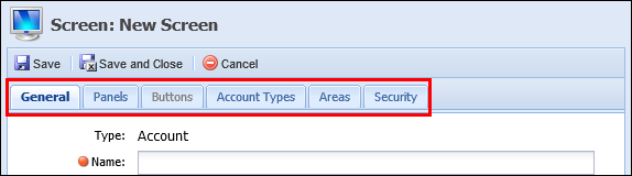
After selecting the Screen Type, the Screen window appears that contains the following tabs:
| Tab Name | Description |
| General | Contains basic descriptive information about the screen. |
| Panel | Contains the functionality to assign user-configured panels and fields to the screen. |
| Buttons | Contains the functionality to assign buttons to the screen. |
| Rules | Contains the functionality to assign rules to the screen. |
| Account Types | Contains the functionality to assign screens to specific account types. |
| Areas | Contains the functionality to assign screens to specific areas. |
| Case Types | Contains the functionality to assign screens to specific case types. |
| Security | Contains the functionality to assign screens to specific users or security groups. |
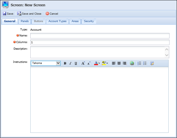
General Tab
The General tab contains the basic information pertaining to the user-defined Screen. Refer to the table below to assist completing the General Tab.
| Tab Name | Description | ||
| Name | Enter a name unique to the new user-defined screen. | ||
| Columns |
Enter the number of columns in which the panels display.
|
||
| Description | Enter a description that assists users in identifying the purpose of the user-defined screen. | ||
| Instructions |
Enter instructions that help the user complete the screen.
|
Panels Tab
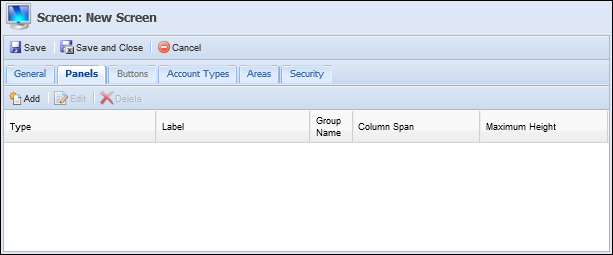
The panels tab enables the administrator to configure the screen with various types of panels. Panels can be added to organize screen content into logical groupings.
The Panels tab is organized into the following columns:
| Column Name | Description |
| Type | Displays the panel type selected when Add after selected. |
| Label | Displays the title of the screen. This value is entered in Title field within the pop-up window’s General tab. |
| Group Name | Displays the panel’s Group Name. This value is entered in Group Name field within the pop-up window’s General tab. |
| Column Span | Displays the panel’s Column Span. This value is entered in Column Span field within the pop-up window’s General tab. |
Within the Panel’s tab, administrators are able to Add, Edit and Delete panels from user-defined screens.
Adding Panels
To add panels to a screen, select the Panels tab and click Add.
Clicking Add opens the Select Panel. Using the drop-down list, select the Panel Type that is being assigned to the screen. Click OK.
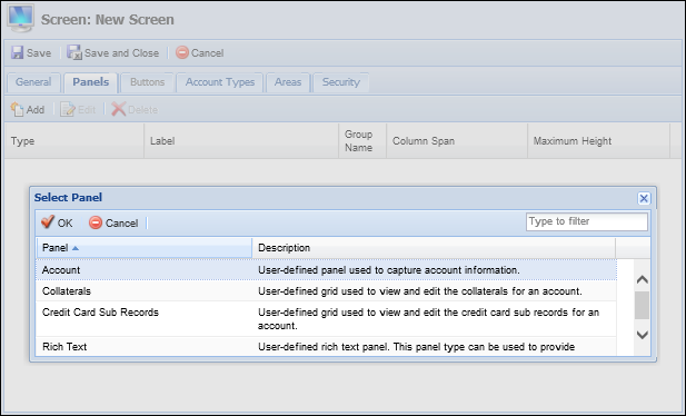
Available Panels
The following panels may be assigned within Screens:
| Panel | Description | Screen | Required Edit Screen Type | Required Fields | Can Have Multiple | System Defined |
| Account | A panel used to capture account information. | Account | X | |||
| Account | A panel used to capture account information. | Person | X | |||
| Addresses | A grid panel used to view all addresses associated with a person. | Person | Person Address | |||
| Assets | A panel used to capture bankruptcy assets associated with a case. | Case Bankruptcy Asset | ||||
| Assignment | A panel used to capture case assignments. | Case Repossession Assignments | ||||
| Bankruptcy Assets | A grid panel grid used to view and edit case bankruptcy assets. | Case | Case Bankruptcy Asset | |||
| Bankruptcy Claims | A grid panel grid used to view and edit case bankruptcy claims. | Case | Case Bankruptcy Claim | |||
| Bankruptcy Hearings | A grid panel grid used to view and edit case bankruptcy hearings. | Case | Case Bankruptcy Hearing | |||
| Bankruptcy Liabilities | A grid panel grid used to view and edit case bankruptcy liabilities. | Case | Case Bankruptcy Liability | |||
| Bankruptcy Parties | A grid panel grid used to view and edit case bankruptcy parties. | Case | Case Bankruptcy Party | |||
| Bankruptcy Payments | A grid panel grid used to view and edit case bankruptcy payments. | Case | Case Bankruptcy Payment | |||
| Bankruptcy Reaffirmations | A grid panel grid used to view and edit case bankruptcy reaffirmations. | Case | Case Bankruptcy Reaffirmation | |||
| Case | A panel used to capture case information. | Case | X | |||
| Case | A panel used to view case information. | Person | X | |||
| Claims | A panel used to capture claims for a case. | Case Bankruptcy Claim | ||||
| Collaterals | A panel used to capture account collaterals. | Account Collateral | Collateral Type | X | ||
| Collaterals | A panel used to capture case collaterals. | Case Collateral | Collateral Type | X | ||
| Collaterals | A grid panel used to view and edit account collaterals. | Account | Account Collateral | |||
| Collaterals | A grid panel used to view and edit case collaterals. | Case | Case Collateral | |||
| Conditions | A panel used to capture case conditions. | Case Repossession Conditions | ||||
| Email Addresses | A panel used to capture person email address information. | Person Email Address | X | |||
| Email Addresses | A grid panel used to view and edit a person's email addresses. | Person | Person Email Address | |||
| Person Employer | A panel used to capture information person employer information. | Person Employer | X | |||
| Employers | A grid panel used to view and edit a person's employers. | Person | Person Employer | |||
| Filings | A panel used to capture case filings. | Case Legal Filing | ||||
| Person Financial Statement | A panel used to capture person financial statement information. | Person Financial Statement | X | |||
| Financial Statements | A grid panel used to view and edit person financial statements. | Person | ||||
| Foreclosure Notices | A grid panel used to view and edit case foreclosure notices. | Case | ||||
| Foreclosure Publications | A grid panel used to view and edit case foreclosure publications. | Case | ||||
| Trustee Sale Guarantees | A grid panel used to view and edit case foreclosure trustee sale guarantees. | Case | ||||
| Hearings | A panel used to capture case bankruptcy hearing information. | Case Bankruptcy Hearing | ||||
| Hearings | A panel used to capture case hearings. | Case Legal Hearing | ||||
| Insurance | A panel used to capture account collateral insurances. | Account Collateral Insurance | ||||
| Insurance | A panel used to capture case collateral insurances. | Case Collateral Insurance | ||||
| Insurances | A grid panel used to view and edit account collateral insurances. | Account Collateral | Account Collateral Insurance | |||
| Insurances | A grid panel used to view and edit case collateral insurances. | Case Collateral | Case Collateral Insurance | |||
| Invoices | A panel used to capture case invoices. | Case REO Invoices | ||||
| Legal Filings | A grid panel used to view and edit case legal filings. | Case | ||||
| Legal Hearings | A grid panel used to view and edit case legal hearings. | Case | ||||
| Legal Parties | A grid panel used to view and edit case legal parties. | Case | ||||
| Legal Summons | A grid panel used to view and edit case legal summons. | Case | ||||
| Liabilities | A panel used to capture case liabilities. | Case Bankruptcy Liability | ||||
| Lien | A panel used to capture account collateral liens. | Account Collateral Lien | ||||
| Lien | A panel used to capture case collateral liens. | Case Collateral Lien | ||||
| Liens | A grid panel used to view and edit account collateral liens. | Account Collateral | Account Collateral Lien | |||
| Liens | A grid panel used to view and edit case collateral liens. | Collateral | Case Collateral Lien | |||
| Listings | A panel used to capture account collateral listings. | Account Collateral Listing | ||||
| Listings | A panel used to capture case collateral listings. | Case Collateral Listing | ||||
| Listings | A grid panel used to view and edit account collateral listings. | Collateral | Case Collateral Listing | |||
| Listings | A grid panel used to view and edit case collateral listings. | Account Collateral | Account Collateral Lien | |||
| Location | A panel used to capture case locations. | Case Repossession Locations | ||||
| Messages | A panel used to display good, bad, warning or information messages regarding the person-in-context. The messages within this panel are driven by Business Rules configured under the Presentation category in System Management > Collections > Rules Management. For more information regarding rule configuration for the Messages panel, please see Properties within the Adding Panels section of this topic. |
Person | X | |||
| Notepad | A panel used to view and edit freeform comments. | Person | ||||
| Notices | A panel used to capture case foreclosure notices. | Case Foreclosure Notice | ||||
| Notices | A panel used to capture case repossession notices. | Case Repossession Notices | ||||
| Offers | A panel used to capture case collateral offers. | Account Collateral Offer | ||||
| Offer | A panel used to capture case collateral offers. | Case Collateral Offer | ||||
| Offers | A grid panel used to view and edit collateral offers. | Account Collateral | Account Collateral Offer | |||
| Offers | A grid panel used to view and edit collateral offers. | Case | Case Collateral Offer | |||
| Parties | A grid panel used to view and edit parties for a case. | Case | ||||
| Parties | A panel used to capture parties associated with a bankruptcy case. | Case Bankruptcy Party | ||||
| Parties | A panel used to capture parties associated with a case. | Case Legal Party | ||||
| Payments | A panel used to capture case payments. | Case Bankruptcy Payment | ||||
|
Person Payroll |
A panel used to capture person payroll information. |
Person Payroll |
X | |||
|
Payrolls |
A grid panel used to view and edit a person's payrolls. |
Person |
Person Payroll |
|||
|
Person |
A panel used to capture person information. |
Person |
X | |||
|
Person Address |
A panel used to capture person address information. |
Person Address |
Address Type |
X | ||
|
Person Phone |
A panel used to capture person phone information. |
Person Phone |
Phone Type |
X | ||
|
Phones |
A grid panel used to view and edit person phone numbers. |
Person |
Person Phone |
|||
|
Primary |
A panel used to capture demographic data for the primary person. |
|
X | |||
|
Promise History |
A panel used to view promise history information. Promises displayed may be edited, but not added. Promises are added by running a workflow and cannot be added directly by a screen. |
Person |
X |
|||
|
Publications |
A panel used to capture case publications. |
Case Foreclosure Publication |
||||
|
Reaffirmations |
A panel used to capture case reaffirmations. |
Case Bankruptcy Reaffirmation |
||||
|
Related Accounts |
A grid panel used to view related accounts. |
Person |
||||
|
Related Accounts |
A grid panel that allows users to view, add and remove case account relationships. |
Case |
||||
|
Related Cases |
A grid panel used to view cases related to a case. |
Person |
X | |||
|
Related Cases |
A grid panel that allows users to view, add and remove case relationships. |
Case |
||||
|
Related Persons |
A grid panel that allows users to view, add and remove case person relationships. |
Case |
||||
|
Related Persons |
A grid panel used to view persons related to a person. |
Person |
X |
|||
|
Rental Incomes |
A panel used to capture rental incomes for a reo rental term. |
Case REO Rental Income |
||||
|
Rental Incomes |
A grid panel used to view and edit case rental incomes. |
Case REO Rental Terms |
Case REO Rental Income |
|||
|
Rental Terms |
A panel used to view and edit case rental terms. |
Case REO Rental Terms |
||||
|
REO Invoices |
A grid panel used to view and edit case reo invoices. |
Case |
Case REO Invoices |
|||
|
REO Rental Terms |
A grid panel used to view and edit case reo rental terms. |
Case |
Case REO Rental Terms |
|||
|
Repossession Assignments |
A grid panel used to view and edit case repossession assignments. |
Case |
Case Repossession Assignments |
|||
|
Repossession Conditions |
A grid panel used to view and edit case repossession conditions. |
Case |
Case Repossession Conditions |
|||
|
Repossession Locations |
A grid panel used to view and edit case repossession locations. |
Case |
Case Repossession Locations |
|||
|
Repossession Notices |
A grid panel used to view and edit case repossession notices. |
Case |
Case Repossession Notices |
|||
|
Rich Text |
A panel used to display rich text messages to users, such as instructions |
|
X | |||
|
Sales |
A panel used to capture collateral sales. |
Account Collateral Sale |
||||
|
Sale |
A panel used to capture collateral sales. |
Case Collateral Sale |
||||
|
Sales |
A grid panel used to view and edit collateral sales. |
Account Collateral |
Account Collateral Sale |
|||
|
Sales |
A grid panel used to view and edit collateral sales. |
Collateral |
Case Collateral Sale |
|||
|
Service Request |
A grid panel used to view and edit case service request. |
Case |
Case Service Request |
|||
|
Service Requests |
A panel used to capture case service requests. |
Case Service Request |
||||
|
Credit Card Sub Record |
A panel used to capture account credit card sub records. |
Account Credit Card Sub Record |
||||
|
Credit Card Sub Records |
A grid panel used to view and edit account credit card sub records. |
Account |
Credit Card Sub Record |
|||
|
Summons |
A panel used to capture case summons. |
Case Legal Summon |
||||
|
Taxes |
A panel used to capture collateral taxes. |
Account Collateral Tax |
||||
|
Taxes |
A panel used to capture collateral taxes. |
Case Collateral Tax |
||||
|
Taxes |
A grid panel used to view and edit collateral taxes. |
Account Collateral |
Account Collateral Tax |
|||
|
Taxes |
A grid panel used to view and edit collateral taxes. |
Collateral |
Case Collateral Tax |
|||
|
Trustee Sale Guarantee |
A panel used to capture case trustee sale guarantees. |
Case Foreclosure Trustee Sale Guarantee |
||||
|
Valuations |
A panel used to capture collateral valuations. |
Account Collateral Valuation |
||||
|
Valuations |
A panel used to capture collateral valuations. |
Case Collateral Valuation |
||||
|
Valuations |
A grid panel used to view and edit collateral valuations. |
Account Collateral |
Account Collateral Valuation |
|||
|
Valuations |
A grid panel used to view and edit collateral valuations. |
Collateral |
Case Collateral Valuation |
|||
|
Person W2 |
A panel used to capture a person's w2 information. |
Person W2 |
X | |||
|
W2s |
A grid panel used to view and edit person w2s. |
Person |
Person W2 |
|||
|
Workflow History |
A grid panel used to view workflow history. |
Person |
X |
After selecting the Panel Type and clicking OK, the selected panel opens as a new window. Depending on the Panel Type selected, an administrator may be able to complete the General, Fields, Edit Screens and Columns tabs.
Within these tabs, the administrator is able to customize the panel’s content and appearance available to the end-user. The administrator is also able to include a set of instructions for each panel added.
General Tab
The General tab enables users to edit the appearance of the screen and provide user instructions.
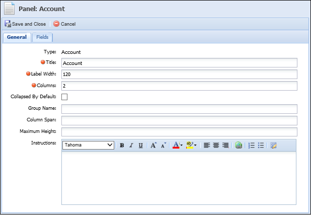
Use the table below to assist with the completion of the General tab:
| Field Name | Description | ||||
| Title | Enter the title assigned to the panel within the user-defined screen. | ||||
| Label Width |
Enter the maximum number of pixels the label width is not to exceed. The lower the number, the more area available for entries in the associated fields. Label Width defaults to 120 pixels and may not exceed 1000 pixels.
|
||||
| Columns |
Enter the number of columns in which fields are organized. At least one column must be added, but no more than four columns can be added to a panel.
|
||||
| Collapse By Default | Select the check box if this panel is to be collapsed by default. | ||||
| Group Name |
If desired, enter the name of group that the panel is to be grouped in. All panels sharing the same Group Name are grouped into a tab layout. Users may select the tab to access the panel.
|
||||
| Column Span |
Enter the number of columns a panel spans within a screen.
|
||||
| Maximum Height |
Enter the maximum number of pixels the panel height may not exceed.
|
||||
| Instructions |
Enter a Rich Text set of instructions to assist users complete the panel.
|
Fields Tab
The Fields tab enables administrators to select the fields that are to appear within this panel.
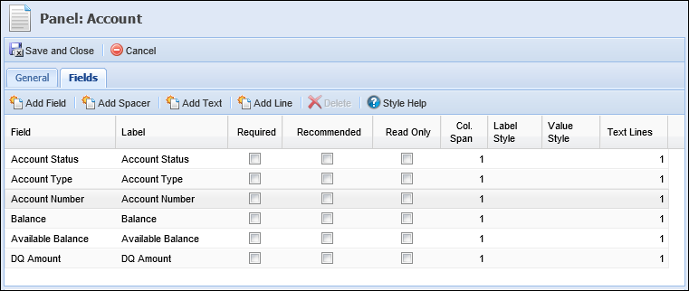
|
The Fields tab only displays if fields are able to be configured for this panel/screen. |
The top of the Fields tab contains a toolbar with the following options:
| Button | Description |
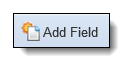 |
Enables users to select the fields to be added to the panel from the Framework field list. Each field may only be added to a screen/panel once. |
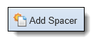 |
Enables users to add spacer fields to the panel. Spacer fields help organize and align fields into logical groupings. |
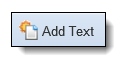 |
Enables users to add text fields to the panel. Text fields help organize panels into logical groupings by serving as headings within a panel. Text fields display information in bold font. |
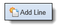 |
Enables users to add a blank line that spans the width of a panel. Line fields help organize fields into logical groupings. |
 |
Enables users to remove fields, spacers and text from the panel design. |
 |
Provides users with guidelines to follow for defining field and column style attributes. |
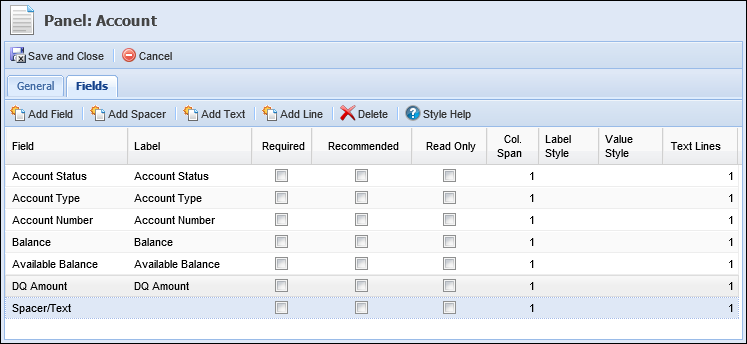
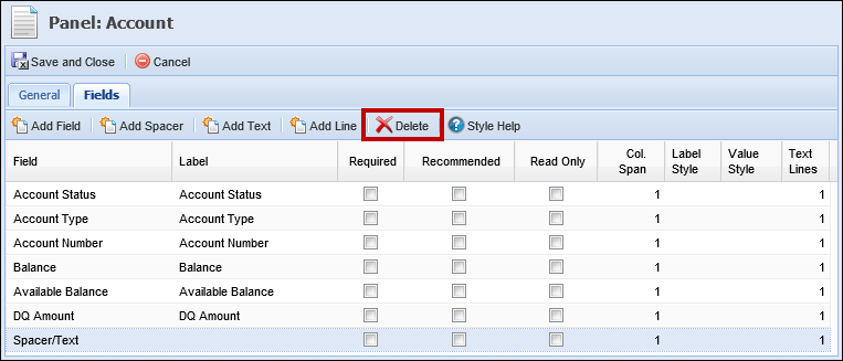
The Fields tab also contains a grid with the following columns:
| Column Name | Description | ||
| Field | A read-only column that displays the column selected. | ||
| Label | An editable column that allows the administrator to enter the title of the field as it is to be displayed within the user-defined panel/screen. | ||
| Required | An editable column that allows the administrator to select the Required check box if this field must contain a value in order to complete the screen. | ||
| Recommended | An editable column that allows the administrator to select the Recommended check box if the completion of this field is suggested. | ||
| Read Only | An editable column that allows the administrator to select the Read Only check box if the user is unable to edit the value contained within the fields. | ||
| Col. Span |
An editable column that allows the administrator to determine the number of columns a field spans within a panel.
|
||
| Label Style | An editable column that allows the administrator to use CSS code to determine how a label renders within the panel. For example, institutions can use CSS code to render text bold, italicized or blue. | ||
| Value Style | An editable column that allows the administrator to use CSS code to determine how a value renders within the panel. For example, institutions can use CSS code to render text bold, italicized or blue. | ||
| Text Lines | An editable column that allows the administrator to indicate the number of lines the field and its corresponding entry encompass. |
Adding Fields
To add fields to the panel, click Add Fields. The Field Selector window appears. Locate each field and click Add to individually assign them to the panel.
|
Fields are organized within a field tree format. Navigate through the folders and sub-folders to locate the desired field or enter the name of the field in the search box at the top of the Field Selector window. |
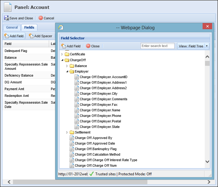
|
When adding fields to a panel or screen, specific fields may only be added to a screen once. The exception to this rule is the Add Space/Text fields. |
The order in which they are added determines their order of appearance in the panel.
Once all fields have been added, click Done. After clicking Done, administrators are taken back to the Fields tab. This tab is now populated with the selected fields. Drag and Drop the fields into the proper sequence. Once the fields are in the proper sequence, complete the following columns that are associated with the assigned fields:
- Label
- Required
- Recommended
- Read Only
- Col. Span
- Label Style
- Value Style
- Text Lines
To add a spacer, click Add Spacer. The spacer is added to the bottom of the field list. The spacer can be dragged and dropped into the proper location.
|
The label of the spacer field defaults to blank, however users may enter a label to display text rather than a spacer field. |
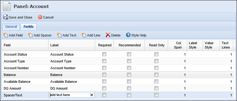
To add a bold text, click Add Text. The text is added to the bottom of the field list. The text can be dragged and dropped into the proper location.
The label of the text field defaults to “add text here.” Overwrite the directions with the desired phrase.
To add a blank line, click Add Line. A blank line is added to the bottom of the field list. This line can be can be dragged and dropped into the proper location.
|
This line spans the entire width of the panel. If a panel is configured to display fields in multiple columns, a blank line is inserted immediately following the preceding field. The next field is placed in the line below the blank line. |
Deleting Fields
Once fields have been added to a panel, administrators are able to remove them by highlighting the undesired field and clicking the Delete button.
Style Help
When creating screens, administrators are able to determine field and column style attributes by entering CSS code in the Label Style, Value Style and Style columns. Click ? Style Help to be provided with guidelines to follow when defining styles for field and column style attributes.
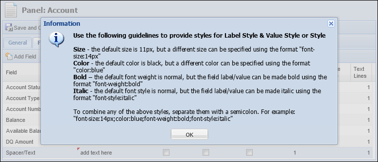
The examples below have also been provided to demonstrate the versatility of CSS within the Framework's screen designer:
| Style | Code | ||
| Font Size | font-size: <enter font size>px For example, entering font-size: 14px produces size 14 font. |
||
| Bold Text | font-weight: bold | ||
| Italicized Text | font-style: italic | ||
| Underlined Text | text-decoration: underline | ||
| Colored Text |
color: <enter color name>
For example, entering color: red produces red-colored text.
|
||
| Colored Background |
background-color: <enter color name>
For example, entering background-color: yellow produces a yellow background.
|
In addition to entering the color name (red), administrators are able to enter the HEX and RBG color code. For example:
| Color Name | HEX | RBG |
| Red | #FF0000 | rgb(0,0,0) |
| Blue | #0000FF | rgb(0,0,255) |
| Yellow | #FFFF00 | rgb(255,255,0) |
| Green | #008000 | rgb(0,128,0) |
| White | #FFFFFF | rgb(255,255,255) |
|
Using a semi-colon ( ; ) administrators may string together multiple CSS values. For example, entering background-color: turquoise; font-weight: bold; color: red produces bold, red text with a turquoise background. |
|
Custom Workflow fields can be added to any Person, Account or Case screen. However if the screen to which these fields are assigned is accessed outside of a workflow, the custom workflow fields are dimmed and unavailable. |
Edit Screens
The Edit Screens tab enables administrators to select the screen that opens when an end-user adds or updates information within a grid panel.
|
If prompted, an Edit Screen must be assigned to a panel. |
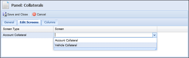
The Edit Screen tab contains the following two columns:
| Column Name | Description |
| Screen Type | A read-only column that displays the screen type available to be selected as the Edit Screen. |
| Screen | An editable column that allows administrators to select the Edit Screen that opens when an end-user adds or updates information within this panel. This drop-down only displays screens matching the screen type associated with the panel. |
To add an Edit Screen, click within the Screen column. A drop-down list containing all available screens populates. Locate and select the desired screen. The screen populates within the Screen column.
Columns
The Columns tab enables administrators to determine the columns that appear within the panel’s table.
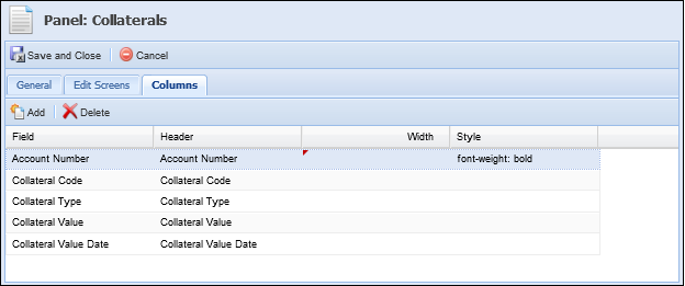
The top of the Columns tab contains a toolbar with the following options:
| Button | Description |
 |
Enables administrators to select the columns to be added to the panel’s table. Each column may only be added once. |
 |
Enables administrators to remove columns from the panel. |
The Columns tab also contains the following three columns:
| Column Name | Description |
| Field | A read-only column that displays the column selected. |
| Header | An editable column that allows administrators to edit the display name of the column selected. |
| Width | An editable column that allows administrators to set the default column width. Enter the default number of pixels the column width is to display as. |
| Style | An editable column that allows administrators to enter CSS code to format how data renders within columns in grid panels. |
Adding Columns
To add columns to the panel table, click Add. The Select Column window appears. Locate each column and click Add Field to individually assign them to the panel table.
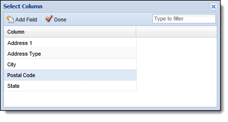
Once all fields/columns have been selected, click Done. After clicking Done, administrators are taken back to the Columns tab. This tab populates with the selected columns/fields. Drag and Drop the fields into the proper sequence. Once the fields are in the proper sequence, complete the following columns that are associated with the assigned fields:
- Header
- Width
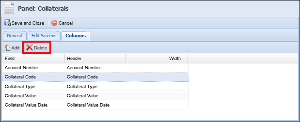
Deleting Columns
Once fields have been added to a panel table, administrators are able to remove them by highlighting the undesired field and clicking the Delete button.
Properties
 |
The Properties tab only displays when configuring Account, Case and Messages panels on Person screens. |
Account and Case Panels on Person Screens
For Account and Case panels, the Properties tab contains a multi-grid that has two boxes: Available Account/Case Types and Assigned Account/Case Types.
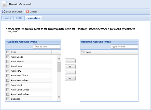
Available Account/Case Types displays all Framework account/case types that have not been assigned to the panel in question.
|
Once an account/case type has been assigned to a panel it is removed from the list of available account/case types and populates within the list of assigned account/case types. |
Assigned Account/Case Types displays all account/case types that have been assigned to the panel in question. The panel will only render for the account/case types within the Assigned Account/Case Types box.
|
Once an account/case type has been un-assigned it is removed from the list of assigned account/case types and populates within the list of available account/case types. |
Use the following buttons to assign and un-assign account/case types:
| Button | Description |
 |
Allows administrators to move a single account type from the Available Account/Case Types box to the Assigned Account/Case Types box. |
 |
Allows administrators to move all available account/case types from the Available Account/Case Types box to the Assigned Account/Case Types box. |
 |
Allows administrators to move a single account/case type from the Assigned Account/Case Types box to the Available Account/Case Types box. |
 |
Allows administrators to move all assigned account/case types from the Assigned Account/Case Types box to the Available Account/Case Types box. |
Messages Panel
|
In order to assign rules to the Messages Panel, the ability to author Business Rules must be enabled for your institution. For more information about how to enable this functionality, please contact your Akcelerant Customer Care Representative. |
Framework Person screens, such as the workspace top area screen and overview tab, can be configured to include a Messages panel in order to display pertinent information about the person in context in the workspace. Administrators can configure business rules to aggregate and organize person and account data, such as the total amount of available funds to transfer or whether a person has open promises and/or a history of breaking promises, to display a good, bad, warning or informational message directly within the panel. Upon opening a screen configured to include this panel, users are able to view these messages and are provided with a more well-rounded view of the person in context in order to improve their collection efforts.
For the Messages panel, the Properties tab contains a multi-grid that has two boxes: Available and Assigned.
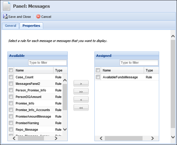
The Available box displays all Presentation rules configured in Rules Manager. The Assigned box displays all rules that have been assigned to the Messages panel. The rules within the Assigned box execute upon opening the screen in a person workspace and display the configured messages within the Messages panel after the screen has loaded.
Use the arrow buttons to assign and un-assign rules to the Messages panel.
Rule Configuration
Rules for the Messages Panel are configured in System Management > Collections > Rules Management. Use the following table to assist with configuring business rules to execute within the Messages panel:
| Action Template | What it Does | Category Selection |
| add message to panel | Adds a Good, Bad, Warning or Information message to a panel for Person screens, such as the screen assigned to the Workspace top area or overview tab. 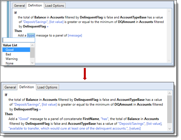 |
Presentation |
|
In order to produce the desired results, select the appropriate entity when authoring a rule. The entity Root.Person is the recommended entity for the Messages panel, but does not reflect the only entity choice. The entity Person.Accounts can be selected to execute the rule on all the accounts related to the person in context and display messages in the Messages panel for each account. The example above was written under the Root.Person entity to populate information within Messages panel as shown below: 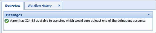 |
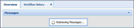
The rules assigned to the Messages panel execute upon opening the person screen. A retrieval message displays within the panel as shown below in the workspace overview tab:
The configured messages appear within the panel once the screen has fully rendered:
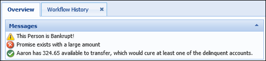
The following icons may appear within the Messages panel to indicate a Good, Bad, Warning or None (Information) message:
 - Good
 - Bad
- Bad - Warning
 - None (Information)
|
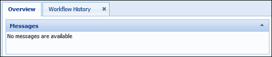
If a Person Screen is configured to include the Messages panel, but none of the rule conditions apply to the person in context, the panel remains on the screen and appears as follows:
|
For more information about authoring rules for the Messages panel, please see the Rule Authoring topic within this Guide.
Finalizing Panel Content
Editing Panels
After a panel is finalized, administrators are able to revisit the screen and edit the panels of previously created user-defined screens.
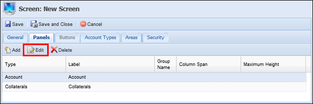
To edit a screen:
- Select the existing user-defined screen.
- Select the Panels tab.
- Select the desired Panel and click Edit.
- Make the desired modifications and click Save and Close.
- Update any subsequent panels.
- When finished, click Save and Close to finalize the screen modifications.
Deleting Panels
Administrators are able to delete the undesired panels from existing or in-progress user-defined screens.
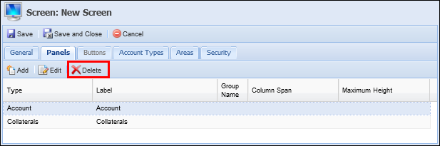
To delete panels:
- Select the existing user-defined screen.
- Select the Panels tab.
- Select the desired Panel and click Delete.
- When finished, click Save and Close to finalize the screen modifications.
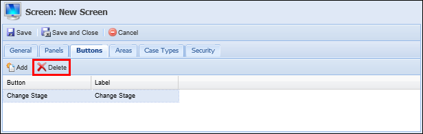
Buttons Tab
The Buttons tab enables the administrator to configure the screen with buttons.
|
The Buttons tab appears grayed-out and is unable to be selected if buttons are not configurable for a screen. |
The top of the Buttons tab contains a toolbar with the following options:
| Button | Description |
 |
Enables administrators to select the buttons to be added to a screen. Each button may only be added to a screen once. |
 |
Enables administrators to remove buttons from the screen. |
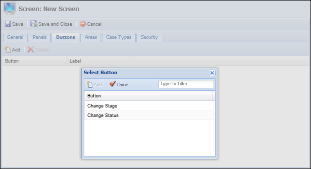
Adding Buttons
To add buttons to a screen, click the Add button. The Select Button window appears. Select the desired button and click Add. Once all buttons have been added, click Done.
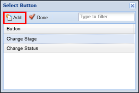
Depending on the Screen Type selected, the following buttons are configurable:
| Button Name | Description | Available Screen Type |
| Change Stage | Allows users to change the stage of a case. | Case |
| Change Status | Allows users to change the status of a case. | Case |
Clicking Done takes users back to the Buttons tab, which is now populated with the selected buttons. If multiple buttons have been added, Drag and Drop the buttons into the proper sequence.
Deleting Buttons
Once buttons have been added to a screen, administrators are able to remove them by highlighting the undesired button and clicking the Delete button.
Account Types Tab
The Account Types tab enables administrators to assign screens to specific account types identified in the Framework.
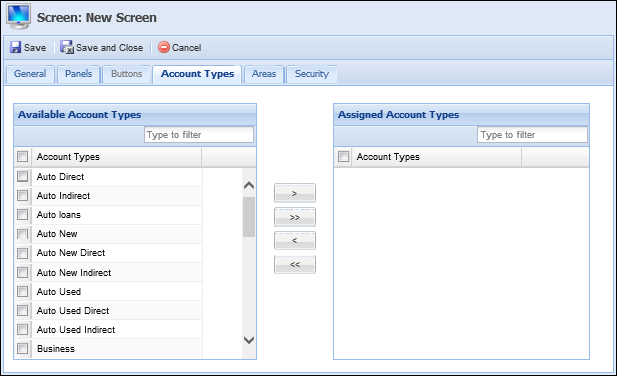
The Account Types tab displays a multi-grid that contains two boxes: Available Account Types and Assigned Account Types. Available Account Types displays all Framework account types that have not been assigned to the screen in question.
|
Once an account type has been assigned to a screen it is removed from the list of available account types and populates within the list of assigned account types. |
Assigned Account Types displays all account types that have been assigned to the screen in question.
|
Once an account type has been un-assigned it is removed from the list of assigned account types and populates within the list of available account types. |
Use the following buttons to assign and un-assign account types:
| Button | Description |
|
Allows administrators to move a single account type from the Available Account Types box to the Assigned Account Types box. |
|
Allows administrators to move all available account types from the Available Account Types box to the Assigned Account Types box. |
|
Allows administrators to move a single account type from the Assigned Account Types box to the Available Account Types box. |
|
Allows administrators to move all assigned account types from the Assigned Account Types box to the Available Account Types box. |
Once the screen has been assigned to the appropriate account types, complete the next tab in the sequence.
Areas Tab
The Areas tab enables administrators to assign screens to specific areas identified in the Framework.
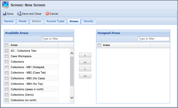
The Areas tab displays a multi-grid that contains two boxes: Available Areas and Assigned Areas. Available Areas displays all Framework areas that have not been assigned to the screen in question.
|
Once an area has been assigned to a screen it is removed from the list of available areas and populates within the list of assigned areas. |
Assigned Areas displays all areas that have been assigned to the screen in question.
|
Once an area has been un-assigned it is removed from the list of assigned areas and populates within the list of available area. |
Use the following buttons to assign and un-assign areas:
| Button | Description |
|
Allows administrators to move a single area from the Available Areas box to the Assigned Areas box. |
|
Allows administrators to move all available areas from the Available Areas box to the Assigned Areas box. |
|
Allows administrators to move a single area from the Assigned Areas box to the Available Areas box. |
|
Allows administrators to move all assigned areas from the Assigned Areas box to the Available Areas box. |
Once the screen has been assigned to the appropriate areas, complete the next tab in the sequence.
Case Types Tab
The Case Types tab enables administrators to assign screens to specific case types identified in the Framework.
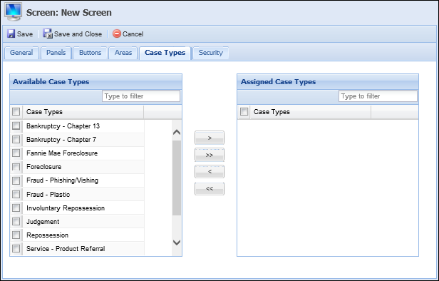
The Case Types tab displays a multi-grid that contains two boxes: Available Case Types and Assigned Case Types. Available Case Types displays all Framework case types that have not been assigned to the screen in question.
|
Once a case type has been assigned to a screen, it is removed from the list of available case types and populates within the list of assigned case types. |
Assigned Case Types displays all case types that have been assigned to the screen in question.
|
Once a case type has been un-assigned, it is removed from the list of assigned case types and populates within the list of available case types. |
Use the following buttons to assign and un-assign case types:
| Button | Description |
|
Allows administrators to move a single case type from the Available Case Types box to the Assigned Case Types box. |
|
Allows administrators to move all available case types from the Available Case Types box to the Case Types box. |
|
Allows administrators to move a single case type from the Assigned Case Types box to the Available Case Types box. |
|
Allows administrators to move all assigned case types from the Assigned Case Types box to the Available Case Types box. |
Once the screen has been assigned to the appropriate case types, complete the next tab in the sequence.
Security Tab
The Security tab enables administrators to assign the screen to specific Framework Users and Security Groups.
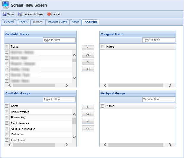
The Security tab contains two multi-grids. The top multi-grid contains two boxes: Available Users and Assigned Users. Available Users displays all Framework users that have not been assigned to the screen.
|
Once a user has been assigned to a screen, it is removed from the list of available users and populates within the list of assigned users. |
Assigned Users displays all users that have been assigned to the screen.
|
Once a user has been un-assigned, it is removed from the list of assigned users and populates within the list of available users. |
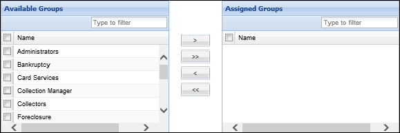
The lower multi-grid contains two boxes: Available Groups and Assigned Groups. Available Groups displays all Framework groups that have not been assigned to the screen.
|
Once a group has been assigned to a screen, it is removed from the list of available groups and populates within the list of assigned groups. |
Assigned Groups displays all groups that have been assigned to the screen.
|
Once a group has been un-assigned, it is removed from the list of assigned groups and populates within the list of available groups. |
|
If a User or Group is not specified, the new screen is not accessible to any Framework user. |
Use the following buttons to assign and un-assign users and groups:
| Button | Description |
|
Allows administrators to move a single user/group from the Available Users/Groups box to the Assigned Users/Groups box. |
|
Allows administrators to move all available users/groups from the Available Users/Groups box to the Users/Groups box. |
|
Allows administrators to move a single user/group from the Assigned Users/Groups box to the Available Users/Groups box. |
|
Allows administrators to move all assigned users/groups from the Assigned Users/Groups box to the Available Users/Groups box. |
Finalizing a User-Defined Screen
Once all updates have been made to the user-defined screen, click Save and Close to finalize the creation of the screen.
The newly created screen now populates within the Screens page.
Copying Screens
The Copy function enables users to duplicate the logic and structure of an existing screen. The existing screen can be used as a base for creating a new screen. After copying a screen, users are able to add, modify or delete screen logic and then save it with a different name in order to create a new user-defined screen.
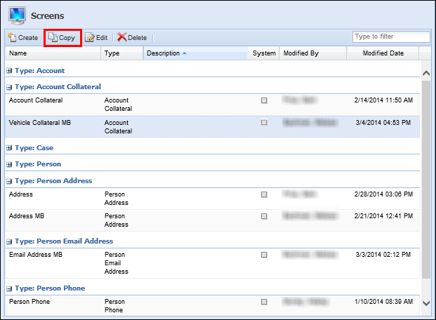
To copy an existing user-defined screen, select the desired screen and click Copy. A copy of the selected screen opens in a new window. Once the screen name has been changed and the logic updated, save all changes to finalize the creation of the new screen.
Editing Screens
The Edit function enables administrators to revisit an existing user-defined screen and modify the existing logic/structure to enhance usability.
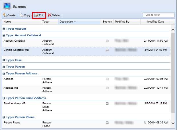
To edit an existing user-defined screen, select the desired screen and click Edit. Once the logic has been updated, select Save and Close to finalize the screen modifications.
|
With the exception of Name and Instructions, users are unable to modify the content of System-Defined screens. |
Deleting Screens
The Delete function enables users to remove an existing user-defined screen and all of its logic from the Framework.
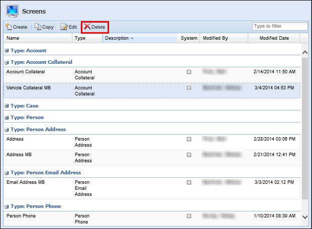
To delete an existing screen, select the desired screen and click Delete. A Confirmation Message appears. Click Yes to delete the user-defined screen. Click No to retain the user-defined screen.
|
System-Defined screens cannot be deleted. |
Screen Building Tips and Tricks
- If the Fields tab is available, at least one field must be assigned to the panel.
- If the Columns tab is available, at least one column must be assigned to the panel.
- A field or column may only be added to a panel/screen once.
- Custom fields may only be added to the user-defined screens.
- A button may only be added to a panel once.
- If numerous screens have been created, users are able to enter keywords and change views in order to filter the list of screens to a smaller list.
Hyperlink Help
To configure hyperlinks to open in a new window:
|
Navigate to the screen or panel that contains the desired hyperlink. |
|
Select the Instructions Panel. |
|
Click the Source Edit button (last one on the right) in the Instructions toolbar. 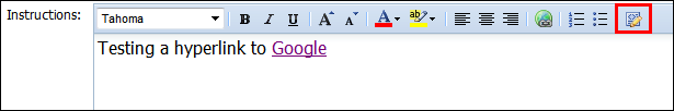
|
|
The text entered in the Instructions field displays in the HTML Code.
|
|
Locate the code that launches the hyperlink.
|
|
Enter the following line of code immediately after the URL:target=”_blank”
|
|
Save modifications to Instructions. |


CSS Help
When creating screens, administrators are able to determine field and column style attributes by entering CSS code in the Label Style, Value Style and Style columns. The examples below have been provided to demonstrate the versatility of CSS within the Framework's screen designer:
| Style | Code | ||
| Bold Text | font-weight: bold | ||
| Italicized Text | font-style: italic | ||
| Underlined Text | text-decoration: underline | ||
| Colored Text |
color: <enter color name> For example, entering color: red produces red-colored text.
|
||
| Colored Background |
background-color: <enter color name> For example, entering background-color: yellow produces a yellow background.
|
In addition to entering the color name (red), administrators are able to enter the HEX and RBG color code. For example:
| Color Name | HEX | RBG |
| Red | #FF0000 | rgb(0,0,0) |
| Blue | #0000FF | rgb(0,0,255) |
| Yellow | #FFFF00 | rgb(255,255,0) |
| Green | #008000 | rgb(0,128,0) |
| White | #FFFFFF | rgb(255,255,255) |
|
Using a semi-colon ( ; ) administrators may string together multiple CSS values. For example, entering background-color: turquoise; font-weight: bold; color: red produces bold, red text with a turquoise background. |
Refining Screens Listing Page
Users are able to configure how screens are sorted and displayed within the screens page. To update these options, click the drop-down arrow next to any column header.

Users are able to select from the following sorting/display options:
| Option | Description | ||
| Sort Ascending |
Sorts the screens listed on the Screens page from A-Z.
|
||
| Sort Descending |
Sorts the screens listed on the Screens page from Z-A.
|
||
| Columns | Allows users to select the columns to be displayed on the Screens page. | ||
| Group By This Field | Allows users to group the listings within the Screens page by the selected column header. | ||
| Show in Groups | Select the checkbox to enable screens to be grouped on the Screens page. |
|
To assist users with locating screens, a filter exists in the top right of the Screens page. Users may enter key words to search for the desired screen. |