Temenos Lifecycle Management Suite - Loan Origination Product Guide
Virtual Capture Screen Designer
| Administrator Guide > Virtual Capture Overview > Virtual Capture Screen Designer |
The Screens page within System Management > Origination > Virtual Capture > Screens provides a complete list of all screens used within Virtual Capture. From this page, administrators are provided with the functionality to define the screens that optimize usability and reduce application processing time for the applicant.
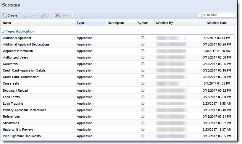
By default, the Screens page sorts all existing screens according to screen type, and displays information about each screen within the following columns:
| Column Name | Description |
| Name | Displays the name of the screen. |
| Type | Displays the type of screen. |
| Description | If provided, displays a description of the screen. |
| System | Displays a  if the screen is system-defined. if the screen is system-defined. |
| Modified By | Denotes who made the last modification. |
| Modified Date | Denotes when the last modification was made. |
Users are able to configure how screens are sorted and displayed within the Screens page. To update these options, click the drop-down arrow next to any column header.Select from the following sorting/display options:
 |
To further assist users with locating screens, a filter exists in the top right of the Screens page. Users may enter key words to search for the desired screen. |
| Option | Description | ||
| Sort Ascending |
Sorts the screens listed on the Screens page from A-Z.
|
||
| Sort Descending |
Sorts the screens listed on the Screens page from Z-A.
|
||
| Columns | Allows users to select the columns to be displayed on the Screens page. | ||
| Group By This Field | Allows users to group the listings within the Screens page by the selected column header. | ||
| Show in Groups | Select this check box to enable screens to be grouped on the Screens page. |
The Screen Designer topic includes the following attributes and instructions to assist administrators with creating, copying, and editing screens:
All Virtual Capture screens share common attributes that are defined when creating, copying, or editing a screen.
General attributes include the basic information pertaining to the screen.
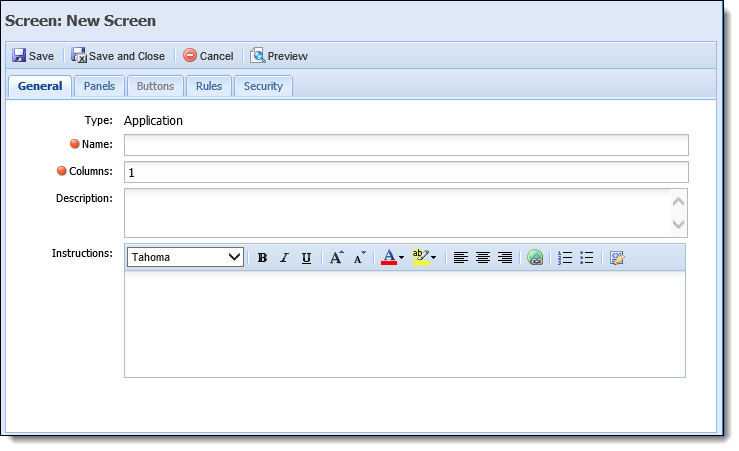
The following General attributes are defined within the General tab:
| Attribute | Description | ||
| Name |
Enter a unique name for the screen. |
||
| Description | Enter a description that identifies the purpose of the screen. | ||
| Instructions |
Enter instructions that help the user complete the screen. When instructions are configured, they appear on the right hand side of the Virtual Capture screen.
|
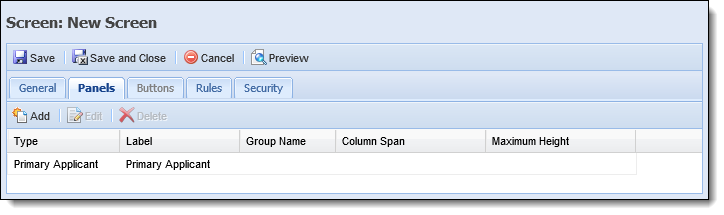
Panels are added to user-defined screens to organize screen data into logical groupings. Panels can be used to not only display information pertinent to an application, but also provide applicants with the ability to enter important data during the application process all within the same screen.
Lifecycle Management Suite panels are categorized as either System-Defined or User-Defined. System-Defined panels provide pre-built functionality that cannot be modified or configured. A User-Defined panel has various configurable properties, such as the title, the number of columns that display, as well as the specific fields that appear within the panel.
The attributes for each panel are defined on the Panels tab. This tab displays an overview of each panel configured to appear on the screen, as well as provides administrators with the ability to Add, Edit, and/or Delete a panel.
The grid within this tab displays the panel type, as well as the Label, Group Name, Column Span, and Maximum Height values defined for the panel in the General panel attributes.
The following table provides an overview of each panel type, including a description of the panel, identification as a system-defined and/or grid panel, as well as the compatible screen type:
| Panel Type | Description | System-Defined | Grid | ||||||||
| Application Screen Type | |||||||||||
| Account Funding Information |
A panel used to display a list of account products associated with an application and the initial deposit amount required to fund and open each account. Applicants have the ability to modify the funding amounts by entering any non-negative dollar amount within the amount field.
|
||||||||||
| Account Funding Payment Options |
A panel used to capture the payment information required to open the account products associated with an application. Based on the Payment Option selected, the corresponding form fields display to applicants for completion. If funding is not required, this panel does not display to applicants.
|
X |
|||||||||
| Additional Applicant |
A panel used to capture the information specific to a Joint applicant or Guarantor, such as Name, TIN, Address, and Applicant Type. From this panel, applicants are provided with the ability to add and remove an additional applicant from a Virtual Capture application.
|
||||||||||
| Additional Applicant Declarations |
A grid panel used to display declaration questions for an additional applicant. From this panel, applicants are provided with the ability to answer the declarations and enter an explanation for each answer.
|
X |
|||||||||
| Application | A panel used to capture all configurable application fields such as Applicant and Decision information. | ||||||||||
| Authorized User 1 | A panel used to capture general information for a primary applicant's first authorized user. | ||||||||||
| Authorized User 2 | A panel used to capture general information for a primary applicant's second authorized user. | ||||||||||
| Collateral - Real Estate |
A panel used to capture general collateral information for applications secured by Real Estate. In addition to the property's location and valuation data, this panel allows applicants to provide: Within Virtual Capture, applicants are able to provide up to three liens within this panel. When configuring the Collateral - Real Estate panel, institutions are able to assign fields for Lien 1, Lien 2, and Lien 3
Within Virtual Capture, applicants are able to provide real estate housing expenses within this panel. When configuring the Collateral - Real Estate panel, institutions are able to assign fields for the following housing expense types:
Within Virtual Capture, applicants are able to provide two Other Owners within this panel. When configuring the Collateral - Real Estate panel, institutions are able to assign name, address and contact information fields for Other Owner 1 and Other Owner 2.
|
||||||||||
| Collateral - Vehicle | A panel used to capture general collateral information for applications secured by a vehicle. | ||||||||||
| Cross-sells | A panel used to display the loan, non-loan, and replacement cross-sells for which the applicant is qualified, as generated through rules. |
X |
|||||||||
| Disclosure | A panel used to display a disclosure, such as Terms and Conditions, to the applicant for acknowledgement during the application process. Upon acknowledgement of the disclosure, a record is added to the Audit History screen available in the Lifecycle Management Suite application workspace. | ||||||||||
| Document Upload |
A grid panel used to display general documents, such as images of driver's licenses and W2 forms, that are associated with an application. From this panel, applicants are provided with the ability to upload additional documents, as well as view all documents associated with the application.
|
X |
X |
||||||||
| Fees | A grid panel used to display loan application fees. From this panel, applicants are provided with the ability to select the fees they wish to include in the total loan amount. |
X |
X |
||||||||
| HMDA | A panel used to capture the information specific to HMDA reportable loans such as applicant ethnicity and gender. | ||||||||||
| ID Authentication |
A panel used to display KBA questions from FIS ChexSystems for a primary applicant. From this panel, applicants are provided with the ability to answer the identity verification questions.
|
X |
|||||||||
| Primary Applicant | A panel that captures the information specific to the Primary Applicant such as Name, Address, Phone, Employment, and Income Information. | ||||||||||
| Primary Applicant Declarations |
A grid panel used to display declaration questions for a primary applicant. From this panel, applicants are provided with the ability to answer the declarations and enter an explanation for each answer.
|
X |
|||||||||
| Reference 1 | A panel used to capture and display an applicant's first reference. | ||||||||||
| Reference 2 | A panel used to capture and display an applicant's second reference. | ||||||||||
| Rich Text | A panel that is able to display an informational/instructional message configured by the institution. The instructions section may also include hyperlinks. By default, hyperlinks open within the Lifecycle Management Suite; however, hyperlinks may be configured to open in a new window. For more information on configuring hyperlinks to open in a new window, see Hyperlink Help. | ||||||||||
| Stipulations |
A grid panel used to display the requirements, such as proof of insurance, that are associated with a loan application. From this panel, applicants are provided with the ability to upload required documents, delete documents, and upload additional required documents, as well as view the required documents associated with the application.
For more information on Stipulations, please see the Stipulations Panel topic of the Loan Origination End-User Guide. |
X |
X |
||||||||
| Web Signature Documents | A panel used to display the documents to be signed using a third party remote signature connector. |
X |
|||||||||
The following attributes can be defined when creating, copying, and/or editing panels:
The General panel attributes enable administrators to edit the appearance of the panel, as well as provide instructions to applicants.
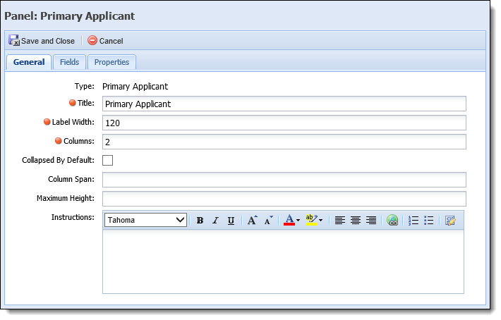
The following General panel attributes are defined within the General tab for each panel type:
| Attribute | Description | ||||
| Title | Enter the title assigned to the panel within the screen. | ||||
| Label Width |
Enter the maximum number of pixels the label width is not to exceed. The lower the number, the more area available for entries in the associated fields.
|
||||
| Columns |
Enter the number of columns in which fields are organized.
|
||||
| Collapsed By Default |
Select the check box if this panel is to be collapsed by default.
|
||||
| Group Name |
If desired, enter the name of the group that the panel is to be grouped in. All panels sharing the same Group Name are grouped into a tab layout. Users may select the tab to access the panel.
|
||||
| Column Span |
Enter the number of columns a panel spans within a screen.
|
||||
| Maximum Height |
Enter the maximum number of pixels the panel height may not exceed.
|
||||
| Instructions |
Enter a Rich Text set of instructions to assist users in completing the panel. When instructions are configured for the panel, an  appears within the screen header. Clicking this icon displays the instructions to the user. appears within the screen header. Clicking this icon displays the instructions to the user.
|
|
The Fields tab is available for the following panels:
|
Field attributes provide the administrator with the ability to configure style attributes and perform the following functions:
| Button | Description |
 |
Enables users to select the fields to be added to the panel from the field list. Each field may only be added to a screen/panel once. |
 |
Enables users to add spacer fields to the panel. Spacer fields help organize and align fields into logical groupings. |
 |
Enables users to add text fields to the panel. Text fields help organize panels into logical groupings by serving as headings within a panel. Text fields display information in bold font. |
 |
Enables users to add a blank line that spans the width of a panel. Line fields help organize fields into logical groupings. |
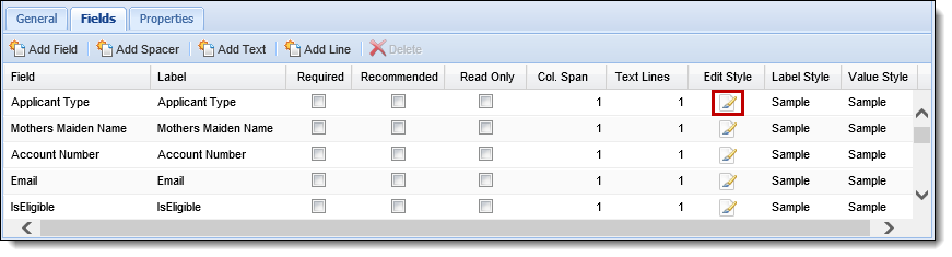
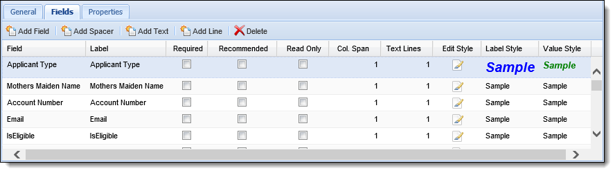
The following Field attributes are defined within the Fields tab:
| Attribute | Description | ||||
| Label | Enter the title of the field to be displayed within the panel/screen. | ||||
| Required |
Select this check box if the field must be completed in order to continue processing the application. Required fields display a
|
||||
| Recommended |
Select this check box if the completion of a field is suggested. While the screen can be saved if recommended fields are left blank, this functionality can be beneficial in ensuring all necessary information in obtained.
|
||||
| Read Only |
Select this check box to restrict the user from editing the value contained within the field. |
||||
| Col. Span |
Enter the number of columns the field spans within a panel.
|
||||
| Text Line | Enter the number of lines the field and its corresponding entry encompass. | ||||
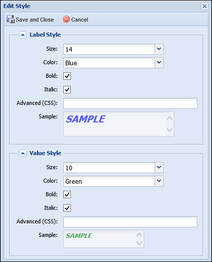
| Edit Style | Clicking  opens the Edit Style window where the Label and Value text can be edited. opens the Edit Style window where the Label and Value text can be edited. |
||||
| Label Style | A non-editable column that allows the administrator to preview the Label text style defined in the Edit Style window. | ||||
| Value Style | A non-editable column that allows the administrator to preview the Value text style defined in the Edit Style window. |
|
For more information on the Edit Style, Label Style and Value Style column, please see the below Edit Style section. The
Clicking
The following Style attributes are defined within the Edit Style window:
Upon saving the style attributes, samples of the Label Style and Value Style are displayed within the grid.
|
|
The Properties tab only displays for the following panels:
|
Property attributes for a panel are defined within the Properties tab. The appearance and behavior of this tab differs according to the panel type. Depending on the panel being configured, this tab may provide system administrators with the ability to determine the visibility of the panel within a virtual application, identify the options that are available for selection within the panel, and/or define messages to be displayed to applicants when the panel renders in Virtual Capture.
The following table provides an overview of each Virtual Capture panel that supports the properties attribute, including a description of the functionality configured within the Properties tab for each panel, as well as an example of how the tab appears for each panel:
| Panel | Properties Configuration | Example | ||||
| Account Funding Information | Allows system administrators to define the message to display within the panel when there are no account products on the application that require funding. |  |
||||
| Account Funding Payment Options | Allows system administrators to determine which funding payment options are displayed within the panel, and define the message to be displayed when only Internal Transfer is selected and the applicant does not sign on using the Single Sign On method. | 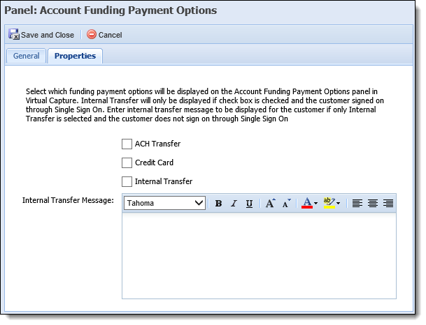 |
||||
|
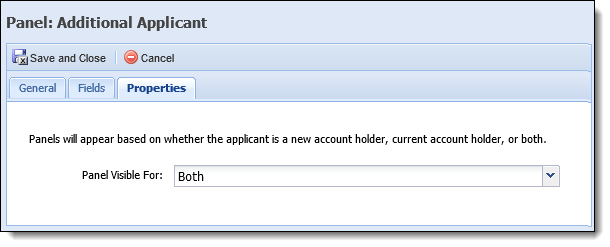
Additional Applicant Application Primary Applicant |
Allows system administrators to determine when the panel appears in an application, based on the applicant's account holder status.
|
 |
||||
| Disclosure | Allows system administrators to define the message that populate when a disclosure is required for a virtual application. | 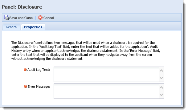 |
||||
| Web Signature Documents | Allows system administrators to define the messages to be displayed when there are documents that need to be signed by the primary applicant, and when all of the document sets have been completely signed. | 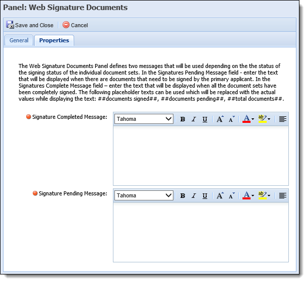 |
|
While the Buttons tab appears within the screen configuration window, the tab is disabled, as the the functionality is not available for Virtual Capture screens. |
Validation Rules execute during the application process to validate and ensure that relevant and accurate data is entered within a screen. Upon execution, these rules automatically test the data entered within a screen and can be configured to issue an error, warning, or information message to prevent or continue the application process.
Rule attributes enable administrators to select Validation Rules from a list and assign them to the screen.
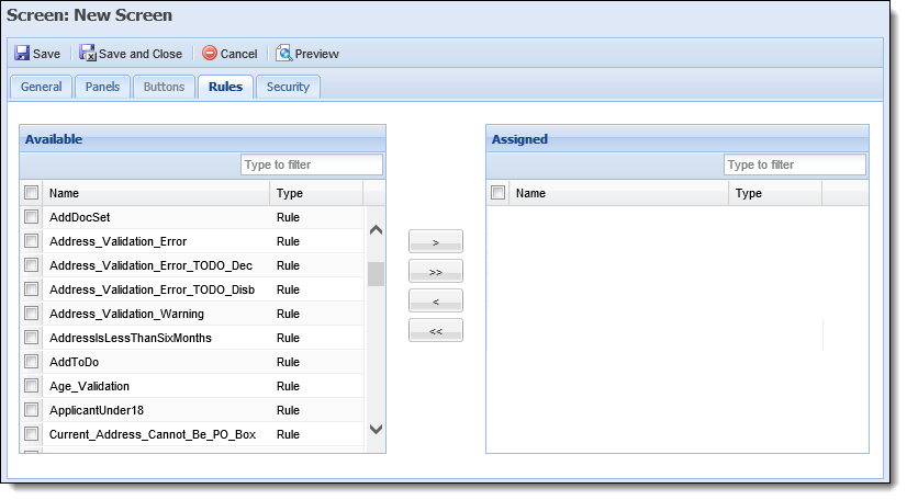
The following Rule attributes are defined within the Rules tab:
| Attribute | Description |
| Available | Displays a list of all Validation Rules configured in System Management > Origination > Rules Management. To assign a Validation Rule to the screen, select a rule from the list and move it to the Assigned box using the arrows that display. |
| Assigned | Displays a list of the Validation Rules assigned to the screen. The assigned Validation Rules execute when Save and Next is selected during the application process. |
|
For more information on Validation Rules and other Rule Categories, please see the Rules Management topic within this guide. |
Security attributes allow administrators to assign the user-defined screen to specific Lifecycle Management Suite Users and Security Groups.
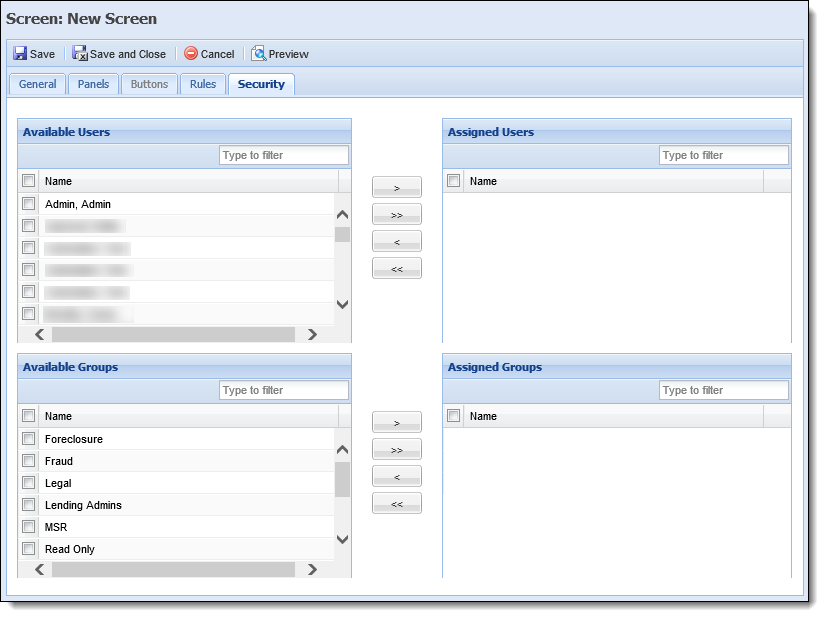
The following Security attributes are defined within the Security tab:
| Attribute | Description |
| Available | Displays a list of all Users configured in System Management > Users and all Security Groups created in System Management > Groups > Security Groups. Assign access to the screen by selecting the desired user(s) and group(s) from the list and moving the name(s) to the Assigned Users/Groups boxes using the arrows that display. |
| Assigned | Displays a list of the Users and Groups assigned access to the screen. Once the screen is saved, it is accessible to the assigned Users and Groups when processing an application. |
|
For more information on User/Security Group permissions, please see the Users or Security Group topics within this guide. |
The Create function enables administrators to define the logic and structure of a user-defined screen. This function provides the ability to configure and customize all screen and panel attributes to meet an institution’s business needs.
To design a user-defined screen, navigate to System Management > Origination > Virtual Capture > Screens and click  .
.
Select the following screen type from the Select Screen Type window:
| Screen Type | Description |
| Application | A screen type designed to capture information specific to the application (Applicant, Loan Terms, Collateral, Stipulations). |
Within the Edit Screen window, define the General screen attributes.
Once all General attributes are defined, navigate to the Panels tab to define panel attributes and perform one of the following actions:
To add a panel to the screen:
 within the Panels tab.
 .
.To begin adding fields to the panel:
- Click
within the Fields tab.
- The Field Selector window appears displaying the available fields organized within a field tree format. Navigate through the folders and sub-folders to locate the desired field or enter the name of the field in the search box at the top of the Field Selector window.
- Double-click on the field or select
- After all fields have been added, click
to exit the Field Selector window and return to the Fields tab.
- Once added, the field populates within the grid that appears on the Fields tab.
When adding fields to a panel or screen, two of the same fields may exist within a screen, if the fields appear in two separate panels with different Properties; one panel set to Account Holder and the other set to Non-Account Holder. If the panels have the same Panel Visible For values, fields may only be added to a screen once. The exception to this rule is the Add Spacer/Text fields.
- The order in which the fields appear in the grid determines their order of appearance in the panel. Within the grid on the Fields tab, drag and drop the fields into the proper sequence. If desired, click
,
, and/or
to add Spacer, Text, and/or Line fields to the panel.
- Within the grid columns, define Field Label, Required, Recommended, Read Only, Col. Span, Label Style, Value Style, and Text Line attributes. For assistance with defining Label and Value Style attributes, click
.
If a screen is configured to collect identical information in two locations, such as when two different panels contain the same field, the field information within one panel may be overwritten by the data entered within the other panel when the screen is saved. To remove a field from a panel:
- Highlight the field within the grid in the Fields tab and click
.
To edit attributes for field label and/or field value style:
- Click
within the Edit Style column for desired field.
- The Edit Style window appears. Within this window, define Label and Value Style attributes.
- When finished defining style attributes, click
. The Label Style and Value Style samples are displayed within the grid in the Fields tab.
- Upon completion of all panel attributes within the Edit Panel window, click
- After returning to the Panels tab, users are able to define additional panels to be added to the screen or move on to the subsequent screen tabs.
Administrators are able to edit the panels of previously created screens.
To begin editing a panel:
 . within the Edit Panel window. within the screen configuration window to finalize the panel modifications.
|
Panel modifications are not saved until a final save is performed within the screen configuration window. |
Administrators are able to delete undesired panels from existing or in-progress screens.
To delete a panel:
. within the screen configuration window to finalize the panel modifications.
 |
When deleting panels, the Lifecycle Management Suite does not display a confirmation message. When delete is selected, the panel is deleted. |
Once all panel attributes are defined, navigate to the Rules tab to assign Validation Rules to the screen.
After all rule attributes have been configured, assign Users and Security Groups access to the screen from the Security tab.
|
If a User or Group is not specified, the new screen is not accessible to anyone processing an application. |
Upon completion of all screen attributes, click  for a view of the completed screen. A preview window appears displaying a rendition of the screen. When finished previewing the screen, close the preview window, and, if necessary, make any changes to the screen.
|
Previewing a screen can be done at any point during creation of the screen, but is important to perform just prior to clicking  . Doing so allows mistakes to be found before the screen is opened in the workspace. . Doing so allows mistakes to be found before the screen is opened in the workspace. |
Once all configurations have been made to the user defined screen, click within the screen configuration window to finalize the creation of the screen.
The newly created screen populates within the grid on the Screens page and is available to display and capture data during the application process.
|
Any changes made within the Virtual Capture Screens page are not applied in Virtual Capture until the web application is refreshed. By default, Virtual Capture is automatically refreshed every 30 minutes to apply the updated configurations from the Lifecycle Management Suite to the Virtual Capture application.
|
The Copy function enables users to duplicate the logic and structure of an existing screen. The existing screen can be used as a base for creating a new screen. After copying a screen, users are able to add, modify, or delete screen logic and then save it with a different name in order to create a new user-defined screen.
 . to retain the changes and finalize the creation of the new screen.
The Edit function enables users to revisit an existing screen and modify the existing logic/structure to enhance usability.
. to finalize the screen modifications.The Delete function enables users to remove an existing screen, and all of its logic from the Lifecycle Management Suite.
. Hyperlink Help
 within the Instructions toolbar. The text entered in the Instructions field displays in the HTML Code.
 icon and must be completed in order to save the screen.
 icon unless configured as required within this attribute.
 icon within the Edit Style column provides administrators with the ability to define Label Style and Value Style attributes for a field.