
Temenos Lifecycle Management Suite - Loan Origination Product Guide
Screen Designer
| Administrator Guide > Screen Designer |
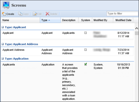
The Screens page within System Management > Origination > Screens provides a complete list of all screens used within the Lifecycle Management Suite’s loan origination module. From this page, administrators are provided with the functionality to define screens that optimize usability and reduce application processing time.
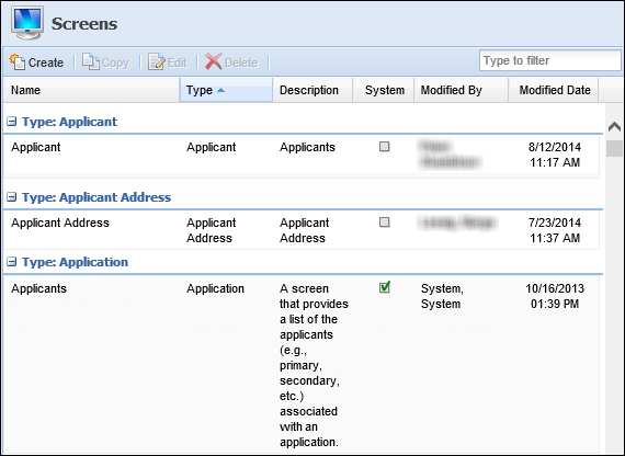
By default, the Screens page sorts all existing screens according to type and displays information about each screen within the following columns:
| Column Name | Description |
| Name | Displays the name of the screen. |
| Type | Displays the type of screen. |
| Description | If provided, displays a description of the screen. |
| System | Displays a  if the screen is system-defined. if the screen is system-defined. |
| Modified | Denotes who made the last modification. |
| Modified Date | Denotes when the last modification was made. |
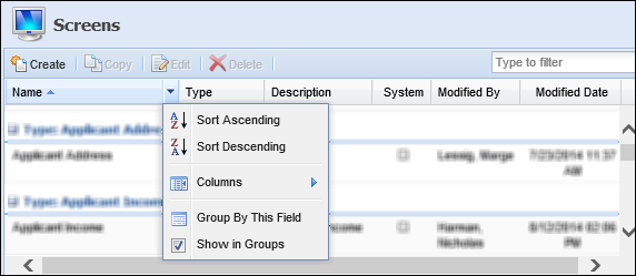
Users are able to configure how screens are sorted and displayed within the Screens page. To update these options, click the drop-down arrow next to any column header.
 |
To assist users with locating screens, a filter exists in the top right of the Screens page. Users may enter keywords to search for the desired screen. |
Select from the following sorting/display options:
| Option | Description | ||
| Sort Ascending |
Sorts the screens listed on the Screens page from A-Z.
|
||
| Sort Descending |
Sorts the screens listed on the Screens page from Z-A.
|
||
| Columns | Allows users to select the columns to be displayed on the Screens page. | ||
| Group By This Field | Allows users to group the listings within the Screens page by the selected column header. | ||
| Show in Groups | Select the checkbox to enable screens to be grouped on the Screens page. |
There are three categories of screens within the Lifecycle Management Suite:
Custom screens are coded by the customer, or by Temenos on behalf of the customer, and installed on the customer’s site.
|
Custom screens are not deployed in a Lifecycle Management Suite general release. |
System-Defined screens are prebuilt by Temenos to provide out-of-the-box functionality and do not require (or allow) any configuration.
|
The content and descriptions of System-Defined screens cannot be modified or deleted; however, users are able to change the name of the screen and add supporting instructions. For more information, please see Editing a Screen. |
Reference the table below for an overview of the System-defined Application screens available for the Lifecycle Management Suite’s loan origination module:
|
Additional system-defined screens may appear within the Screens page when certain connectors are active. For example, the IMM Documents screen is only available when the IMM connector is active. For more information about the system-defined screen(s) related to a connector, please see the applicable Connector Guide. |
| Screen | Description |
| Applicants | A screen that provides a list of the applicants associated with an application. Accessing this screen provides direct access to the Applicants Card View. |
| Assets | A screen that provides a list of assets associated with applicants on an application. |
| Audit History | A screen that provides a detailed history of all changes and actions taken on an application. |
| Authorized Users | A screen that provides a list of authorized users associated with a loan application. Accessing this screen provides direct access to the Authorized Users Card View. |
| Collaterals | A screen that provides a list of collaterals pledged on a loan application. Accessing this screen provides direct access to the Collaterals Card View. |
| Comment History | A screen that provides a list of comments associated with an application. |
| Credit Reporting | A screen that provides a list of the credit reports associated with applicants on an application. |
| Cross-sells | A screen that provides a list of additional products offered during an application. |
| Email History | A screen that provides a list of emails and email recipients sent on an application. |
| Liabilities | A screen that provides a list of liabilities associated with applicants on an application. |
| References | A screen that provides a list of references associated with applicants on an application. Accessing this screen provides direct access to the References Card View. |
A User-Defined screen is created by the customer within Screens.
The following topic provides an overview of Screen attributes and instructions for creating, copying, and editing a user-defined screen.
The Screen Designer topic includes the following attributes and instructions to assist administrators with creating, copying, and editing screens:
All Origination screens share common attributes that are defined when creating, copying, or editing a screen.
|
Button and Workflow Model attributes can only be defined for Application screens. While the Buttons and Workflow Models tabs appear within the screen configuration window for every screen type, they are disabled when not applicable. |
General attributes include the basic information pertaining to the user-defined screen.
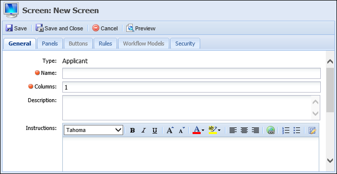
The following General attributes are defined within the General tab:
| Attribute | Description | ||
| Name | Enter a unique name for the user-defined screen. | ||
| Description | Enter a description that identifies the purpose of the user-defined screen. | ||
| Instructions |
Enter instructions that help the user complete the screen. When instructions are configured for the screen, an  appears within the screen header. Clicking this icon displays the instructions to the user. appears within the screen header. Clicking this icon displays the instructions to the user.
|
Panels are added to user-defined screens to organize screen data into logical groupings. Panels can be used to not only display information pertinent to an application, but also provide users with the ability to gather important data during the application process all within the same screen.
Lifecycle Management Suite panels are categorized as either System-Defined or User-Defined. System-Defined panels provide pre-built functionality that cannot be modified or configured. A User-Defined panel has various configurable properties, such as the title, the number of columns that display, as well as the specific fields that appear within the panel.
The attributes for each panel are defined on the Panels tab. This tab displays an overview of each panel configured to appear on the screen, as well as provides administrators with the ability to Add, Edit, and/or Delete a panel.
The grid within this tab displays the panel type, as well as the Label, Group Name, Column Span, and Maximum Height values defined for the panel in the General panel attributes.

The following table provides an overview of each panel type, including a description of the panel, identification as a system-defined or grid panel, as well as the compatible screen type:
| Panel Type | Description | System-Defined | Grid | Screen Type(s) | ||||||
| Add On/Refinance |
A panel that displays the Add On/Refinance grid and the liabilities eligible to have funds added onto or refinanced.
|
X | Application | |||||||
| Additional Applicant | A panel used to capture the information specific to the Joint Applicants and Guarantors such as Name, Current, and Additional Addresses, Phone, Employment, and Current and Additional Income Information. | Application | ||||||||
| Additional Applicant Declarations |
A panel that contains the declarations questions and answers for an additional applicant.
|
X | Application | |||||||
| Additional Applicant Income | A panel used to capture an additional applicant's income information. | X | Application | |||||||
| Adverse Actions | A panel used to capture an application’s adverse action information. | X | Application | |||||||
| Aggregates | A panel that displays the Aggregates used to render an application decision such as Disposable Income, Total Expenses, and Total Income. | X | Application | |||||||
| Applicant | A panel used to capture applicant fields. | Applicant | ||||||||
| Applicant Address | A panel designed to capture an applicant’s address information. | Applicant Address | ||||||||
| Applicant Addresses | A panel used to capture an applicant’s address information. | X | Applicant | |||||||
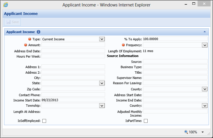
| Applicant Income | A panel used to capture applicant income information. | Applicant Income | ||||||||
| Applicant Incomes | A panel used to capture applicant income information. | X | Applicant | |||||||
| Applicant Phone | A panel used to capture applicant phone information. | Applicant Phone | ||||||||
| Applicant Phones | A panel used to capture applicant phone information. | X | Applicant | |||||||
| Applicant Summary | A panel used to capture a summary of applicant information such as name, account number and core message. | X | Application | |||||||
| Application |
A panel used to capture all configurable application fields such as Applicant and Decision information.
|
Application | ||||||||
| Associated Application | A panel that displays all applications associated with the current application’s applicant(s). | X | Application | |||||||
| At Time of Decision Aggregates | A panel that displays an application's calculated Aggregates at time of decision. |
X |
Application | |||||||
| At Time of Decision Ratios | A panel that displays an application's calculated Ratios at time of decision. |
X |
Application | |||||||
| Authorized User | A panel used to capture authorized user fields. | Authorized User | ||||||||
| Authorized Users | A panel used to capture authorized user information. | X | Application | |||||||
| Authorized User Address | A panel used to capture authorized user address information. | Authorized User Address | ||||||||
| Authorized User Addresses | A panel used to capture authorized user address information. | X | Authorized User | |||||||
| Authorized User Phone | A panel used to capture authorized user phone information. | Authorized User Phone | ||||||||
| Authorized User Phones | A panel used to capture authorized user phone information. | X | Authorized User | |||||||
| Collateral | A panel used to capture collateral information. | Collateral | ||||||||
| Collateral - Pledge |
A panel used to capture general collateral information for applications secured by a pledge.
|
Application | ||||||||
| Collateral - Real Estate | A panel used to capture general collateral information for applications secured by Real Estate. | Application | ||||||||
| Collateral - Stock | A panel used to capture general collateral information for applications secured by stock. | Application | ||||||||
| Collateral - Vehicle | A panel used to capture general collateral information for applications secured by a vehicle. | Application | ||||||||
| Collateral Housing Expense | A panel used to capture collateral housing expenses. | X | Collateral, Collateral Housing Expense | |||||||
| Collateral Lien | User configurable panel used to capture collateral lien information. | Collateral Lien | ||||||||
| Collateral Liens | A panel used to capture collateral's lien information. | X | Collateral | |||||||
| Collateral Other Owner | User configurable panel used to capture collateral additional owner(s) information. | Collateral Other Owner | ||||||||
| Collateral Other Owners |
A panel used to capture the information of the other owner of the subject collateral.
|
X | Collateral | |||||||
| Collateral Pledges | A panel used to capture pledge collateral information. | X | Collateral | |||||||
| Collateral Real Estate Orders | A panel used to add and manage the real estate orders on an application, as well as provide the ability to submit real estate orders to the applicable third party connector. | Collateral, Collateral Real Estate Orders | ||||||||
| Collaterals |
A configurable panel that enables users to collect information about any type of collateral.
|
X |
Application | |||||||
| Core Message | A panel that displays messages returned from the core processor. | X | Applicant, Application | |||||||
| Counteroffers | A panel that displays all the application's counteroffers. | X | Application | |||||||
| Cross-sells | A panel that displays all of the application's existing cross-sells and provides the ability to add new non-loan cross-sells. |
X |
Application | |||||||
| Debt Protection | A panel that allows a user to make debt protection selections for the current loan application. | X | Application | |||||||
| Decision History |
A panel that displays a historical record and details of each decision added to an application.
|
X |
X | Application | ||||||
| Declarations |
A panel that contains the declarations questions and answers for an applicant.
|
X | Applicant | |||||||
| Disbursement Summary | A panel that provides a summary of an application's disbursement. |
X |
Application | |||||||
| Fees | A panel that displays an itemized list of all fees applied to the application. | X | Application | |||||||
| FIS ID Verification |
A panel that enables users to view the results of FIS ID Verification reports.
|
X |
Application | |||||||
| Funding | A panel that allows a user to fund the current loan application. | X | Application | |||||||
| HMDA | A panel used to capture the information specific to HMDA reportable loans such as applicant ethnicity and gender. | Application | ||||||||
| Liabilities |
A panel used to capture and display liabilities for the application.
|
X |
Application | |||||||
| Loan Terms Breakdown | A panel that displays the loan terms used to render a decision such as Requested Amount and Loan Term. | X | Application | |||||||
| OFAC | A panel that allows users to view and request OFAC information. | X | Application | |||||||
| Primary Applicant | A panel that captures the information specific to the Primary Applicant such as Name, Address, Phone, Employment, and Income Information. | Application | ||||||||
| Primary Applicant Declarations | A panel that contains the declarations questions and answers for a primary applicant. | X | Application | |||||||
| Primary Applicant Income | A panel used to capture primary applicant income information. | X | Application | |||||||
| Product Offering | A panel that displays a sub-product’s rich text sales script. | X | Application | |||||||
| Ratios | A panel that displays the Ratios used to render an application decision. | Application | ||||||||
| Reference | Reference screen used to collect information about the applicant's credit references. | Reference | ||||||||
| References | A panel used to capture and display an applicant's references. | Applicant | ||||||||
| Reference 1 | A panel used to capture and display an applicant's first reference. | Application | ||||||||
| Reference 2 | A panel used to capture and display an applicant's second reference. | Application | ||||||||
| Reference Address | User configurable panel used to collect information about the applicant's credit references addresses. | Reference Address | ||||||||
| Reference Addresses | Reference screen used to collect information about the applicant's credit references addresses. | X | Reference | |||||||
| Reference Phone | User configurable panel used to collect information about the applicant's credit references contact information. | Reference Phone | ||||||||
| Reference Phones | Reference screen used to collect information about the applicant's credit references contact information. | X | Reference | |||||||
| Report | A panel used to display a report. |
X |
Application | |||||||
| Loan Review Indicators | A panel that displays all of the review indicators related to an application's Loan decision. | X | Application | |||||||
| Rich Text |
A panel that is able to display an informational/instructional message configured by the institution.
|
Applicant, Applicant Address, Applicant Income, Applicant Phone, Application, Authorized User, Authorized User Address, Authorized User Phone, Collateral, Collateral Housing Expense, Reference Address, Reference Phone | ||||||||
| Scores | A panel that displays the Scores and Related Credit Models used to render an application decision. | X | Application | |||||||
| Stipulations | A panel used to capture the stipulations that must be met prior to funding or disbursement. | X | Application | |||||||
| To-Dos |
A panel used to capture all Automatic and Manual To-Dos generated during the application. To-Dos are grouped by General, Decision, and Disbursement.
Only Manual To-Dos may be cleared in the To-Dos panel. In addition to To-dos, Stipulations appear within the To-do panel. |
X |
X |
Application | ||||||
| Trade-Ins (Read Only) | A panel that displays Trade In information. | X | Application | |||||||
| Trade Ins | A user-defined panel that captures the trade in information transmitted to the Lifecycle Management Suite by the auto dealer. Users may also add, edit, and delete trade in information. |
X |
Application | |||||||
| Vendor Channel | A panel that displays information about the vendor through which the application was created. | X | Application | |||||||
| Vendor Contacts |
A panel that lists all the contacts associated with the CUDL or Dealertrack vendor linked to the application. The contact who originated the application is highlighted in the vendor grid panel. |
X |
|
Application | ||||||
| Vendor Comments | A panel allowing users to view and add vendor comments within the application workspace. The comments added via the Vendor Comments panel are retained in the vendor record. However, to edit or delete an existing comment, users must perform these actions within System Management > Origination > Vendor Management. | X | Application | |||||||
| Vendor Quality Score | A read-only panel that displays all the Quality Scores for the vendor associated with the application. | X | Application |
The following attributes can be defined when creating, copying, and/or editing panels:
The General panel attributes enable administrators to edit the appearance of the panel as well as provide instructions to end-users.
The following General panel attributes are defined within the General tab for each panel type:
| Attribute | Description | ||||
| Title | Enter the title assigned to the panel within the user-defined screen. | ||||
| Label Width |
Enter the maximum number of pixels the label width is not to exceed. The lower the number, the more area available for entries in the associated fields.
|
||||
| Columns |
Enter the number of columns in which fields are organized.
|
||||
| Collapse By Default | Select the check box if this panel is to be collapsed by default. | ||||
| Group Name |
If desired, enter the name of the group that the panel is to be grouped in. All panels sharing the same Group Name are grouped into a tab layout. Users may select the tab to access the panel.
|
||||
| Column Span |
Enter the number of columns a panel spans within a screen.
|
||||
| Maximum Height |
Enter the maximum number of pixels the panel height may not exceed.
|
||||
| Instructions |
Enter a Rich Text set of instructions to assist users in completing the panel. When instructions are configured for the panel, an  appears within the screen header. Clicking this icon displays the instructions to the user. appears within the screen header. Clicking this icon displays the instructions to the user.
|
|
The Fields tab only displays when a user-defined panel is being created. If the Fields tab is available, at least one field must be assigned to the panel. For more information on user-defined panels and the screens that support them, please see the list of available Panel Types. |
Field attributes provide the administrator with the ability to configure style attributes and perform the following functions:
| Button | Description |
 |
Enables users to select the fields to be added to the panel from the field list. Each field may only be added to a screen/panel once. |
 |
Enables users to add spacer fields to the panel. Spacer fields help organize and align fields into logical groupings. |
 |
Enables users to add text fields to the panel. Text fields help organize panels into logical groupings by serving as headings within a panel. Text fields display information in bold font. |
 |
Enables users to add a blank line that spans the width of a panel. Line fields help organize fields into logical groupings. |
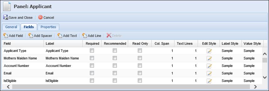
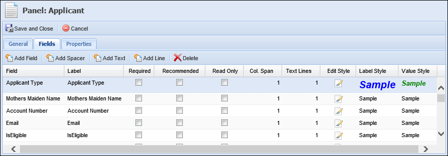
The following Field attributes are defined within the Fields tab:
| Attribute | Description | ||||
| Label | Enter the title of the field to be displayed within the user-defined panel/screen. | ||||
| Required |
Select this check box if the field must be completed in order to continue processing the application. Required fields display a
|
||||
| Recommended |
Select this check box if the completion of a field is suggested. Recommended fields display a
|
||||
| Read Only |
Select this check box to restrict the user from editing the value contained within the field. |
||||
| Col. Span |
Enter the number of columns the field spans within a panel.
|
||||
| Text Line | Enter the number of lines the field and its corresponding entry encompass. | ||||
| Edit Style | Clicking  opens the Edit Style window where the Label and Value text can be edited. opens the Edit Style window where the Label and Value text can be edited. |
||||
| Label Style | A non-editable column that allows the administrator to preview the Label text style defined in the Edit Style window. | ||||
| Value Style | A non-editable column that allows the administrator to preview the Value text style defined in the Edit Style window. |
More information about the Edit Style, Label Style and Value Style columns can be found in the below Edit Style section.
Edit Style
The  icon within the Edit Style column provides administrators with the ability to define Label Style and Value Style attributes for a field.
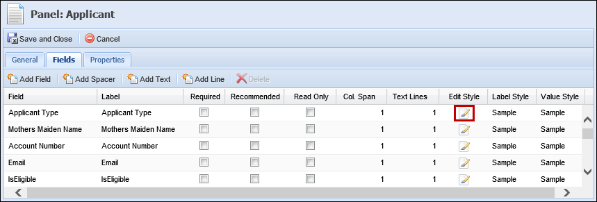
Clicking  opens the Edit Style window:
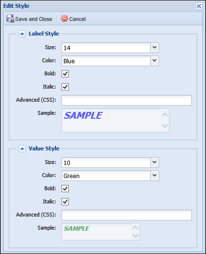
The following Style attributes are defined within the Edit Style window:
| Field | Description |
| Size | Select a size for the label and value text. Auto or size 7 through 16 can be selected. |
| Color | Select a color for the label and value text. Auto (black), Blue, Green, Red or Orange can be selected. |
| Bold | Select this checkbox to bold the label and value text. |
| Italic | Select this checkbox to italicize the label and value text. |
| Advanced (CSS) | Enter CSS code to define the label style and value style attributes. CSS code entered in this text box overrides any other Label or Value style attributes chosen. |
| Sample | The "Sample" text in this box changes dynamically as style attributes are chosen to provide a preview of what the text will look like on a screen. This box cannot be edited. |
Upon saving the style attributes, samples of the Label Style and Value Style are displayed within the grid.

|
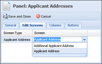
The Edit Screens tab only displays when a grid panel is being created. For more information about grid panels and the screens that support them, please see the list of available Panel Types. |
Edit Screens provide the ability to tie a screen to a grid panel in order to display information captured in the screen within pre-selected columns. This feature allows institutions to capture the maximum amount of information, while taking up minimal screen real estate.
Edit screen attributes enable the administrator to select the screen that opens when an end-user adds or updates information within a grid panel.

The following Edit Screen attributes are defined within the grid that displays in the Edit Screens tab:
| Attribute | Description |
| Screen Type | Displays the screen type available to be selected as the Edit Screen. This attribute is read-only. |
| Screen | Select the Edit Screen to open for an end-user to add or update information within the panel. This drop-down only displays screens matching the screen type associated with the panel. To add an Edit Screen to the panel, click within the Screen column and select the desired screen. |
|
The Columns tab only displays when a grid panel is being created. If the Columns tab is available, at least one column must be assigned to the panel. For more information on grid panels and the screens that support them, please see the list of available Panel Types. |
Column attributes enable administrators to customize the columns that appear within the grid panel.
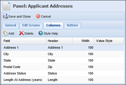
The following Column attributes are defined within the grid that displays in the Columns tab:
|
The Buttons tab only displays if buttons are available to be configured for the panel type being created. Buttons can only be configured to appear within the following panel types:
For more information on the screen types that support the above mentioned panels, please see the list of available Panel Types. |
Buttons provide the ability to perform an action directly within a panel. Button attributes for a panel are defined within the Buttons tab. This tab provides the ability to add and delete panel buttons, as well as lists the name of each button configured to appear on the panel.
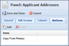
Depending on the Panel Type selected, the following buttons are configurable:
| Button | Description | Panel Type | ||
| Add Applicant | Allows users to add the first joint applicant from the core or prior Lifecycle Management Suite applications via screens and screen flow. | Additional Applicant | ||
| Copy Primary Address |
Allows users to copy the primary applicant’s address information to an additional applicant.
|
Additional Applicant | ||
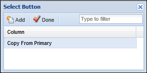
| Copy From Primary | Allows users to copy the primary applicant’s address information to an additional applicant. | Applicant Addresses | ||
| Valuate | Allows users to perform collateral valuations. | Collateral - Vehicle | ||
| Valuation History | Allows users to view valuations that have been processed on collateral. | Collateral - Vehicle | ||
| Copy Applicant Address | Allows users to copy the current address information from one applicant to another. | Collateral - Real Estate |
|
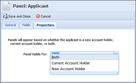
The Properties tab only displays for Applicant and Application panels. For more information on these panels and the screens that support them, please see the list of available Panel Types. |
Property attributes for a panel are defined on the Properties tab. This tab provides administrators with the ability to configure the visibility of a panel within an application. Using the Panel Visible For drop-down list, administrators can define whether or not a panel appears on a screen based on an applicant’s account holder status.
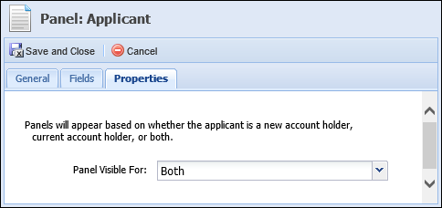
From this drop-down list, one of the following options can be selected:
| Account Holder Status | Applicant Panel Behavior | Application Panel Behavior |
| Both | Panel displays on the screen when the applicant in context is a current or new account holder. | Panel displays on the screen when the primary applicant is a current or new account holder. |
| Account Holder | Panel only displays on the screen when the applicant in context is a current account holder. | Panel only displays on the screen when the primary applicant is a current account holder. |
| Non-Account Holder | Panel only displays on the screen when the applicant in context is a new account holder. | Panel only displays on the screen when the primary applicant is a new account holder. |
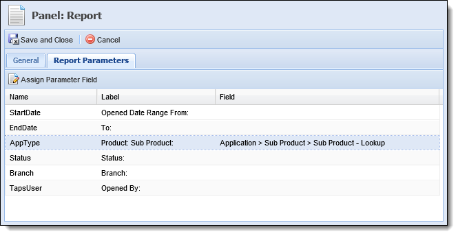
Report Parameter attributes only display when configuring Report panels on Application screens. These attributes are defined within the Report Parameters tab.
The Report Parameters tab allows administrators to define the fields that are used as the default report criteria. Assigning parameter fields when creating the panel provides administrators with the ability to determine the application fields from which report data is pulled and eliminates the need for users to manually select parameters at runtime.
For example, the Application Type parameter can be defined for the Stipulations By Application report. Upon selection, the administrator is able to choose the field in which the Application Type is stored at the Application > Sub Product level on the application. When the panel and report renders in the workspace, the data displayed in the report defaults to include the value in the selected field for the application in context.
 |
Defining parameter fields is optional. If parameter fields are not defined, the parameters are presented to the user for selection when the panel and report is rendered in the workspace. |
|
The parameters populate in the Report Parameters tab based on the report selected for the panel within the General tab. |
|
To ensure the entire report is displayed within the panel when rendered in the workspace, set the Maximum Height to 1500 on the panel's General tab. |
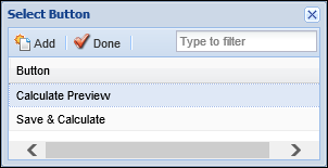
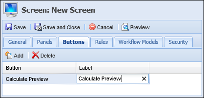
Buttons provide the ability to perform an action directly within a screen. Button attributes enable administrators to add and delete screen buttons, as well as customize the button label that appears within the application.
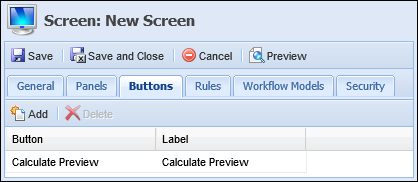
The following Button attributes are defined on the Buttons tab:
| Attribute | Description |
| Button | Displays the name of the Button. This attribute is read-only. |
| Label | Enter the button label to appear within the application. To add a custom label, click within the Label column of the corresponding button and add custom text. |
The table below lists the buttons available to be assigned to Origination screens, as well as a description of their functionality:
| Button | Description | ||
| Save and Calculate | Allows users to calculate the values entered within the screen. In addition to saving and calculating values entered on the screen, clicking Save and Calculate also refreshes the screen. | ||
| Calculation Preview | Allows users to view Calculations, Loan Terms/Draw Period, Details, Repayment Period, Debt Protection Summary and Coverage Summary. | ||
| Post Comment |
Allows users to post a comment to a real estate service order.
|
Validation Rules execute during the application process to validate and ensure that relevant and accurate data is entered within a screen. Upon execution, these rules automatically test the data entered within a screen and can be configured to issue an error, warning or information message to prevent or continue the application process.
Rule attributes enable administrators to select Validation Rules from a list and assign them to the screen.
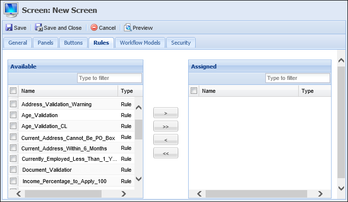
The following Rule attributes are defined within the Rules tab:
| Attribute | Description |
| Available | Displays a list of all Validation Rules configured in System Management > Origination > Rules Management. To assign a Validation Rule to the screen, select a rule from the list and move it to the Assigned box using the arrows that display. |
| Assigned | Displays a list of the Validation Rules assigned to the screen. The assigned Validation Rules execute when Save and Next is selected during the application process. |
For more information on Validation Rules and other Rule Categories, please see the Rules Management topic within this guide.
Workflow Models provide the ability to configure the order in which workflow steps and screens are presented and processed within an application. Workflow Model attributes enable the administrator to assign the user-defined screen to specific workflow models.
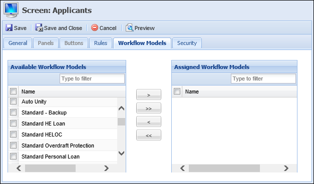
The following Workflow Model attributes are defined within the Workflow Models tab:
| Attribute | Description |
| Available | Displays a list of all Workflow Models created in System Management > Origination > Loan > Loan Workflow Models . Select the desired workflow model from the list and use the arrows that display to move it to the Assigned Workflow Models box. |
| Assigned | Displays a list of the Workflow Models assigned to the screen. Once the screen is saved, it is available for selection in the Application Navigator for the assigned Workflow Model(s). |
For more information on Workflow Models, please see the Workflow Models topic within this guide.
Security attributes allow administrators to assign the user-defined screen to specific Users and Security Groups.
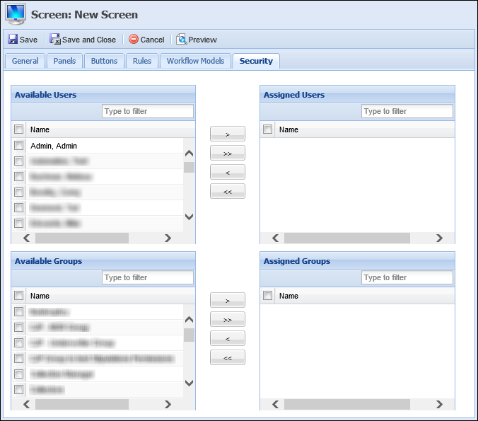
The following Security attributes are defined within the Security tab:
| Attribute | Description |
| Available | Displays a list of all Users configured in System Management > Users and all Security Groups created in System Management > Groups > Security Groups. Assign access to the screen by selecting the desired user(s) and group(s) from the list and moving the name(s) to the Assigned Users/Groups boxes using the arrows that display. |
| Assigned | Displays a list of the Users and Groups assigned access to the screen. Once the screen is saved, it is accessible to the assigned Users and Groups when processing an application. |
For more information on User/Security Group permissions, please see the Users or Security Group topics within this guide.
The Create function enables administrators to define the logic and structure of a user-defined screen. This function provides the ability to configure and customize all screen and panel attributes to meet an institution’s business needs.
To design a user-defined screen, navigate to System Management > Origination > Screens and click  .
.
Select one of the following screen types from the Select Screen Type window:
| Screen Type | Description |
| Applicant | A screen type designed to capture information specific to the applicant (Name, Address, Phone, Employment, Identification). |
| Applicant Address | A screen type designed to capture an applicant’s address information. |
| Applicant Income | A screen type designed to capture an applicant’s income and employment information. |
| Applicant Phone | A screen type designed to capture an applicant’s phone number information. |
| Application | A screen type designed to capture information specific to the application (Applicant, Loan Terms, Collateral, Pull Credit, Stipulations). |
| Authorized User | A screen type designed to capture information specific to the Authorized User. |
| Authorized User Address | A screen type designed to capture an Authorized User’s address information. |
| Authorized User Phone | A screen type designed to capture an Authorized User’s phone number information. |
| Collateral | A screen type designed to capture an application’s collateral information (Pledge, Vehicle, Real Estate, Stock). |
| Collateral Housing Expense | A screen type designed to capture the expense information for the real estate being used as collateral. |
| Collateral Lien | A screen type designed to capture the lien-holder information for the real estate being used as collateral. |
| Collateral Other Owner | A screen type designed to capture the information of any other owners for the real estate being used as collateral. |
| Collateral Real Estate Order | A screen type designed to capture and display information for the real estate service order(s) on an application. |
| Reference | A screen type designed to capture an applicant’s credit Reference information. |
| Reference Address | A screen type designed to capture the address information of an applicant’s credit Reference. |
| Reference Phone | A screen type designed to capture the phone number information of an applicant’s credit Reference. |
| Trade-In | A screen type designed to capture information specific to vehicle trade-ins. |
Within the Edit Screen window, define the General screen attributes.
Once all General attributes are defined, navigate to the Panels tab to define panel attributes and perform one of the following actions:
 .
. .
.
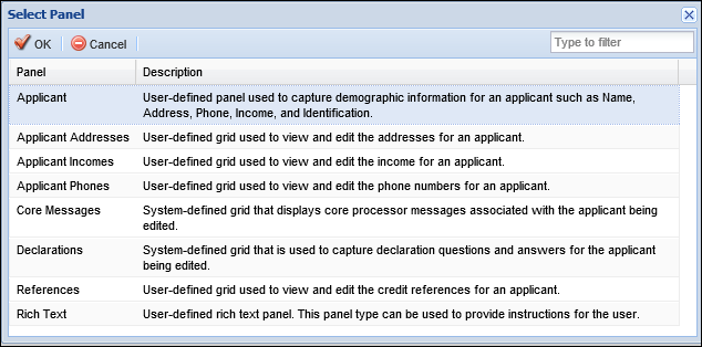
The panel types that display within the Select Panel window depend on the screen type selected. The example above displays the panels available to be added to an Applicant screen. For more information on panel types and the screen types that support them, please see the list of available Panel Types.
Add Fields
- To begin adding fields to the panel, click
within the Fields tab.
- The Field Selector window appears displaying the available fields organized within a field tree format. Navigate through the folders and sub-folders to locate the desired field or enter the name of the field in the search box at the top of the Field Selector window. Double-click on the field or select
Custom fields can only be added to user-defined screens.
- After all fields have been added, click
to exit the Field Selector window and return to the Fields tab.
- Once added, the field populates within the grid that appears on the Fields tab.
When adding fields to a panel or screen, specific fields may only be added to a screen once. The exception to this rule is the Add Spacer/Text fields.
- The order in which the fields appear in the grid determines their order of appearance in the panel. Within the grid on the Fields tab, drag and drop the fields into the proper sequence. If desired, click
- Within the grid columns, define Field Label, Required, Recommended, Read Only, Col. Span, Label Style, Value Style and Text Line attributes. For assistance with defining Label and Value Style attributes, click
.
If a screen is configured to collect identical information in two locations, such as when two different panels contain the same field, the field information within one panel may be overwritten by the data entered within the other panel when the screen is saved. Delete Fields
- To remove a field from a panel, highlight the undesired field within the grid in the Fields tab and click
.
Edit Style
- To edit attributes for field label and/or field value style, click
within the Edit Style column for desired field.
- The Edit Style window appears. Within this window, define Label and Value Style attributes.
- When finished defining style attributes, click
. Select
to disregard the changes. The Edit Style window closes. The Label Style and Value Style samples are displayed within the grid in the Fields tab.
 . The Lifecycle Management Suite's standard Field Selector is displayed. to add it to the Report Parameters tab.
When a field is double-clicked, the Field Selector closes automatically. When selecting a field and clicking .
Add Columns
- To add columns to the panel, select
within the Columns tab.
- The Field Selector window appears displaying the fields available to be added to the panel as columns. Double-click on the field or select
- The field populates within the grid that appears on the Columns tab.
A column may only be added to a panel once.
- Once all columns have been added, click
to exit the Field Selector window and return to the Columns tab.
- The order in which the columns appear in the grid determines their order of appearance in the panel. Within the grid on the Columns tab, drag and drop the columns into the proper sequence.
- Define Column Header, Width and Value Style attributes within the grid columns.
Delete Columns
- To remove a column from a panel, highlight the undesired column within the grid in the Columns tab and click
.
Add Buttons
- To assign buttons to the panel, click
- The Select Button window appears. Select the desired button and click
A button may only be added to a panel once.
- Once all buttons have been added, click
to return to the Buttons tab. The button populates within the grid.
- If multiple buttons have been added, drag and drop the buttons into the proper sequence.
Delete Buttons
- To remove a button from a panel, highlight the undesired button within the grid in the Buttons tab and click
 in the screen configuration window to return to the Panels tab.
 . within the Edit Panel window. within the screen configuration window to finalize the panel modifications.
Panel modifications are not saved until a final save is performed within the screen configuration window.
. within the screen configuration window to finalize the panel modifications.
When deleting panels, the Lifecycle Management Suite does not display a confirmation message. When delete is selected, the panel is deleted.
When the Buttons tab is enabled, select Buttons to define Button attributes for the screen and perform one of the following actions:
- To assign buttons to the screen, click
- The Select Button window appears. Select the desired button and click
- Once all buttons have been added, click
to return to the Buttons tab. The button populates within the grid that appears on the Buttons tab.
- To customize the button label that appears within the application, click within the Label column for the corresponding button and add custom text.
- Once buttons have been added to a screen, administrators are able to remove them by highlighting the undesired button and clicking
Navigate to the Rules tab to assign Validation Rules to the screen.
After configuring Rule attributes, select the Workflow Models tab to assign the screen to specific workflow models.
|
Assigning a screen to a Workflow Model does not assign it to the associated Screen Flow. To assign the user-defined screen to the application workflow, navigate to System Management > Origination > Loan > Loan Workflow Models and update the Workflow Models tab. |
Once all Workflow Model attributes have been defined, assign Users and Security Groups access to the screen from the Security tab.
|
If a User or Group is not specified, the new screen is not accessible to anyone processing an application. |
Upon completion of all screen attributes, click  for a view of the completed screen. A preview window appears displaying a rendition of the screen.
|
Previewing a screen can be done at any point during creation of the screen, but is important to perform just prior to clicking |
|
All buttons configured for the screen are disabled. |
When finished previewing the screen, click the  at the top right corner to close the preview window. If necessary, make any changes to the Screen.
Once all configurations have been made to the user defined screen, click within the screen configuration window to finalize the creation of the screen.
The newly created screen populates within the grid on the Screens page and is available to display and capture data within the application process.
The Copy function enables users to duplicate the logic and structure of an existing user-defined screen. The existing screen can be used as a base for creating a new screen. After copying a screen, users are able to add, modify or delete screen logic and then save it with a different name in order to create a new user-defined screen.
 . to retain the changes and finalize the creation of the new screen.
The Edit function enables users to revisit an existing user-defined screen and modify the existing logic/structure to enhance usability.
|
With the exception of Name and Instructions, users are unable to modify the content of System-Defined screens. |
 . to finalize the screen modifications.
The Delete function enables users to remove an existing user-defined screen and all of its logic from the Lifecycle Management Suite.
|
System-Defined screens cannot be deleted. |
. Custom
 within the Instructions toolbar. The text entered in the Instructions field displays in the HTML Code.
 icon that appears in the field does provide the ability to temporarily unmask the value of the number by hovering over the icon. Navigating away from the icon once again masks the number.
 icon and must be completed in order to save the screen.
 icon unless configured as required within this attribute.
 icon to prompt users to input a value in that field before saving the screen. While the screen can be saved if recommended fields are left blank, this functionality can be beneficial in ensuring all necessary information is obtained.
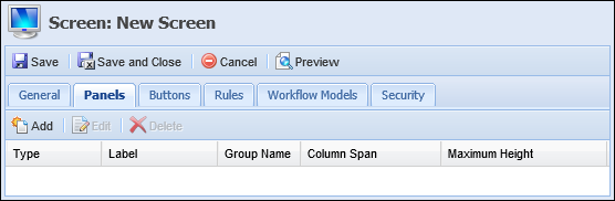


 . Doing so allows mistakes to be found before the screen is opened in the workspace.